Blankfein’s $41m Hamptons pad

A large part of the cachet of the Hamptons is that the money there is quieter, more understated, than in other well-heeled enclaves. The houses are ridiculously expensive, to be sure, but the architecture is low-key, and the interior decoration is beach-informal rather than Park Avenue formal.

Unless you’re Goldman Sachs CEO Lloyd Blankfein, of course. According to Radar, Blankfein’s just dropped $41 million on this place in Southampton, featuring a “cottage” which seats 60 for dinner. Check out the ridiculously ostentatious columns! The gothic fireplace-and-chandelier combo! And are those floor plans on the walls? Maybe some redecoration is in order…

Blankfein6

Blankfein5

(Via)

Posted in Econoblog | 1 Comment

How many companies does Steve Jobs run?

Steve Jobs has never been a normal CEO. He’s best known for running Apple, of course, but that hasn’t stopped him from starting up enormous side projects like NeXT and Pixar. He’s now the single largest individual shareholder in Disney, and probably has more clout there than most executives.

Even Jobs can’t control companies in which he has no job and no ownership, though, right? Wrong. It turns out that all he needs to do is write a letter, as he did back on February 6, expressing the heresy that music companies should sell online the same thing that they sell as CDs: unprotected music. And presto, less than two months later, that’s exactly what’s happened.

It seems that EMI’s Eric Nicoli did get one concession out of Jobs: the unprotected music will cost $1.29 per song, rather than 99 cents for the protected music. In order to make it seem as though you’re not just paying for the lack of DRM, the audio quality will be higher: the unprotected music will be 256kbps, as opposed to 128kbps for the current iTunes inventory.

One piece of good news: You don’t need to buy your music all over again if you want it unencrypted — you can just pay the difference of 30 cents per song. (This is a bit like the recent “complete my album” announcement.)

And one piece of bad news: According to the announcement transcript from CrunchGear, there’s still no sign of any Beatles tracks on iTunes.

Posted in Econoblog | 2 Comments

Newsweek: Still under IP lobby’s thumb

Most of my blog entries are prompted by something I read. If I think it’s wrong, I’ll put up a blog saying why. That’s all fine as far as it goes, but it does mean that if you just went by what I said in public about Dean Baker, say, you’d think I thought he was a bit of a wally. In fact, I respect him highly and read him religiously.

Yesterday, Dean had a blog entry looking at Newsweek, and its coverage of Big Pharma in Thailand:

The drug industry is furious over the possibility that their patent monopolies may not be protected. Newsweek apparently shares the drug industry’s anger, telling readers that “advocates of free trade see Thailand’s move as a big threat.”

Actually, any real advocate of free trade, almost by definition, would have to applaud Thailand’s action. After all, the Thai government is eliminating a government imposed monopoly and allowing drugs to sell at prices that are much closer to their free market level.

Dean is entirely correct here. In fact, I think he lets Newsweek’s George Wehrfritz off too lightly. For Wehrfritz is guilty of much more than a simple mistake of terminology. He explains that Thailand is essentially abolishing patent protection for anti-Aids drugs, cutting their cost by as much as 90%, “by invoking vague World Trade Organization rules that allow governments to void drug patents during public- health emergencies”. He then continues by saying that “experts have likened the WTO drug rules to nuclear weapons—deterrents best never used”. (He never says which experts said this.)

Wehrfritz continues in this vein: “Thailand represents a class of nations that could put a huge dent in drug-company profits if they follow suit,” he writes, and then conjures up a parade of horribles in which not only Thailand but the Philippines and Brazil and Bolivia all start choosing their own citizens’ lives over the profits of foreign drug companies.

Wehrfritz concludes with a chilling vision of “a system regulated by bureaucrats, not markets, in which poor and not-so-poor alike contribute little to the huge cost of R&D for drugs to contain the planet’s killer diseases.” Of course, he never bothers to quantify the amount of money that Big Pharma actually spends on “R&D for drugs to contain the planet’s killer diseases,” because if he did, he’d find that it was embarrassingly small — especially when it comes to killer diseases which kill overwhelmingly in poor and middle-income countries.

In general, news organizations do an atrocious job of presenting a fair and balanced take on any issues pertaining to intellectual property. The IP owners are always right — in Newsweek, in the New Yorker, or in any major media outlet you care to mention. Meanwhile, the blogosphere is full of people like Baker and Lessig who compellingly explain why everything most reporters think they know on the subject is wrong. Viva Blogs — and long may they continue!

Posted in Econoblog | Comments Off on Newsweek: Still under IP lobby’s thumb

Incomprehensible charts in the NYT

I very much admire the anonymous chart-makers at the New York Times. They generally do a magnificent job of presenting information in a clean, easy to understand, and often very clever manner. I wouldn’t be surprised to learn that they’d hired Edward Tufte as a consultant. But boy did they screw up today.

The story that the chart is attached to is perfectly fine. It’s by Damon Darlin, and it’s essentially keyed off the Chris Cagan report which I blogged about a couple of weeks ago. But the chart is dreadful, and the first indication that it’s dreadful is that none of the numbers in the chart are referred to in the story. So even if you read the whole thing, which is 1,500 words long, you’re still none the wiser as to what the chart is supposed to mean.

Anyway, here’s the chart: see if it makes any sense to you. I puzzled over it a long time before giving up — or, rather, before taking another look at Cagan’s report to see if I could work out there what the chart meant.

0331-Biz-Moneyjmp

I applaud the NYT’s willingness to print charts which don’t have time along the x-axis. Such charts are often very interesting, but a lot of newspapers think their readers won’t understand them, and ban them entirely. That’s a bad policy. There are lots of clear charts which don’t have time on the x-axis. But if you don’t have time on the x-axis, you need to take extra care that your chart is clear. And no one did that here.

Anyway, what are these two charts about? The headline should give us a clue: “Teasers Become Burdens”, it says, and the text below it talks about mortgages which were originated between 2004 and 2006 and which are being “reset at higher rates”. So presumably the charts show how people with adjustable-rate mortgages are going to see a spike in rates? Er, no. In fact, the charts don’t even cover mortgages taken out between 2004 and 2006, as is implied by the text. They only cover mortgages taken out in 2005. How do we know this? Because at the top of each chart it talks about “mortgages originated in 2005 resetting through 2010”. Except even that is not really accurate. In fact, the charts only show two things: mortgages originated in 2005 and resetting in 2005 (the yellow line) and mortgages originated in 2005 and resetting in 2007 (the red line). Mortgages resetting in 2006 or 2008 or 2010 aren’t shown at all.

So what’s going on in the first chart? Remember, it only covers loans taken out in 2005. The yellow line shows that over 400,000 such loans had a teaser rate of less than 2%. That’s scary, right? Just think of what those borrowers will be paying when their loans reset! Oh, hang on, the yellow line is loans which reset in 2005 — two years ago. All those borrowers have already been paying the higher, adjustable rate for well over a year at this point. If you look at the red line, which is the loans resetting this year, it turns out that most of them already carry an interest rate of between 6% and 9%. Which means that when the loans reset to a market interest rate, the increase in mortgage repayments will be much smaller.

In no way does the chart show that “millions of borrowers took out adjustable-rate mortgages with low teaser rates that are being reset at higher levels” — if by “are being reset” you mean “are being reset this year” rather than “were already reset in 2005”. In fact, the chart shows that most of the mortgages which are being reset this year had pretty normal initial interest rates in the 6% to 9% range.

A much more relevant chart would show the number of loans originated with teaser rates which are resetting in 2007 — without worrying about when those loans were taken out. But that’s not the chart we’re given.

And what about the second chart? That one actually makes even less sense than the first. It seems that loans with very high initial interest rates make up a very high percentage of loans resetting in 2007, and a very low percentage of loans resetting in 2005. Or something — it’s incredibly unclear, and in fact I would say it’s impossible to work out what the chart is really showing, unless you can see the chart from which it has been taken. (Which I’m helpfully providing below.)

The chart shows that if you take all the 2005-vintage loans with teaser rates below 2%, more than 80% reset that same year, in 2005, while none of them are resetting in 2007. In fact, if you take all the 2005-vintage loans with teaser rates below 5%, the vast majority of them have already reset, and very few are resetting this year. Meanwhile, if you’re someone who took out an adjustable-rate mortgage in 2005 which carried an initial interest rate of more than 10% (!) then there’s a very good chance it will reset this year. What use is this information? None, as far as I can tell. And it certainly isn’t particularly germane to the subject-matter of the story.

What I fear is that people will look at that graph and panic, thinking that it means that lots of loans are resetting to interest rates in the double digits. But that’s not what it means at all. In fact, if you look at it correctly, it’s reasonably reassuring: it shows that people who are seeing their 2005-vintage mortgages reset this year generally do not have low teaser rates. But there’s really no way to work that out just by looking at it.

In any case, here are the tables from which the charts are drawn. I honestly have no idea whatsoever why the New York Times chose these tables rather than any number of more germane other ones from Cagan’s report. For instance, table 10 could have generated a chart of all the loans originated between 2004 and 2006 which are resetting in 2007, along with their initial interest rates. That would have been interesting and useful. These ones are neither.

Table9B

Table8B

Posted in Econoblog | 1 Comment

What would Goldilocks make of Q4 GDP?

Economists are pretty bad at predicting the future (how fast will the economy grow next quarter?). They’re also pretty bad at predicting the present (how fast is the economy growing this quarter?). And, it turns out, they’re equally bad at predicting the past (how fast did the economy grow last quarter?)

In January, economists reckoned that fourth-quarter GDP growth would be 3.0%, but in fact the advance figure came in at 3.5%. In February, that number was revised down to 2.2% — it seems that even in January we really didn’t know what had happened between October and December. And then today, the final number came out. The markets were expecting 2.2% again, but in fact the number is 2.5%. Notes Barry Ritholtz:

Markets rallied on the news that 4 – 6 months ago, GDP was bad, but not quite as bad as previously believed. (So much for the market as a forward looking discounter).

Want to get even more confused? Read Kash Mansori explaining that the upward revision is actually a bad thing: a lot of the upward revision can be attributed to the fact that inventories rose at an annual rate of more than $22 billion. So companies were making things, which boosted GDP; they just weren’t selling them.

Still, all these revisions do put me in mind of Goldilocks. The first report was too high, the second report was too low… could it be that 2.5% is just right?

Posted in Econoblog | 3 Comments

Stock or Not

Some kind of genius: Stock or Not? Josh Reich has written a lovely little web app which puts two charts side by side. One is a real stock, the other is randomly generated. Can you tell which is which? I couldn’t:

Stockornot

Mathematically, one would expect half the people taking this test to get scores over 50%, and half to get scores under 50%. I wonder what it would mean if a significant majority of people, like me, got scores well under 50%? (In fact, I got only one of the first five right: at that point I was down at 20%.)

NB: The app never ends: You can keep on clicking for as long as you like, and it will give you a cumulative total. The more you click, the more accurately the percentage reflects your stock-chart-picking prowess.

Posted in Econoblog | 1 Comment

Alex Ross live!

If you’re under the age of 35, reading this blog, and free on Sunday, I’m pretty sure that the last thing you want to do is schlep up to 92nd Street at the tender hour of 11 in the morning. But you should: the brunch with Alex Ross looks like it’s going to be very good, and they have a special $10 for we young ‘uns (yes, I’m under 35 for a few weeks yet). The 92y blog has a Q&A with Ross, who’s also blogging himself on what the brunch will bring:

I will look at the poetic roots of two works that forever altered the musical landscape: Debussy’s Prelude to “The Afternoon of a Faun” and Schoenberg’s Second Quartet. In Debussy’s case inspiration came from Mallarmé’s gloriously enigmatic long poem “The Afternoon of a Faun” — “the motionless and weary swoon / Of stifling heat” — and in Schoenberg’s case it was Stefan George’s “Rapture”: “I feel the wind of another planet…. I dissolve in sounds, circling, weaving….” I’ll discuss how conventional harmony crumbled underfoot as the composers chased these elusive images.

Ross’s book, for which this event is a very early plug, looks like it’s going to be really good; it grew, I believe, out of this piece of his, which is well worth reading. In any case, I’m the kind of person who judges books by their covers, and this one reminds me of one of my favorite books of all time. I suspect it will have the same great quality of being a reference one can dip in and out of, too.

Book CoverArtintheory2-1

(Full disclosure: I, too, was a bit hesitant about getting up to 92nd Street on a Sunday morning, but then I found out that Alex Ross had included me alongside such luminaries as Terry Teachout and Lizzie Skurnick as a Blogger Worth Inviting — so at that point I felt compelled to go.)

Posted in Not economics | Comments Off on Alex Ross live!

Economics 101

I think we should implement a new corollary to Godwin’s Law — call it McArdle’s Law, after this blog entry at Free Exchange — saying that any time someone mentions “Economics 101” in a debate, they’ve automatically lost. The point of the Free Exchange blog is that people who criticize arguments as being “Economics 101” are generally on the wrong side of the argument. But then again, people who praise arguments as being “Economics 101” are generally equally wrongheaded. For instance:

With rising distressed sales of foreclosed homes and of homeowners unwilling or unable to service their mortgages, the future supply of existing homes will go up this year and next and, given downward price adjustment, the equilibrium level of existing home sales will increase over this year and next. Thus, observation of increases in the sales of existing homes over time – as long as existing home prices fall – will be signs of further distress in the housing market, not improvement. Basic economics 101 suggests that.

Yes, if you’ve taken Economics 101, then a rise in existing home sales is a sign of distress in the housing market. (Does this mean that a fall in existing home sales would be an indication that everything was tickety-boo?) I can see the argument: demand can rise as prices fall, so rising sales can be consistent with housing-market distress. But it’s a bit of a leap from that to saying that they’re a sign of housing-market distress. And it’s a jump of Knievel proportions to say that such an inference is “Economics 101” — and I’m quite happy saying this despite the fact that I’ve never taken an Economics 101 course.

It seems to me that the housing market is not all that different from the stock market in some respects. If you want a good gauge of how the stock market is doing, you look at prices and volumes in the secondary market, not the IPO market. Similarly, existing home sales are a good indication of how the housing market is doing: it’s worth remembering that every homeowner in the country lives in an existing home, which means that it’s the market in existing homes that they’re really invested in. And if existing home sales rise, surely that’s a good thing, ceteris paribus, for the housing market as a whole: it shows that housing prices, even if they’re depressed, are at least realistic and set at a market-clearing level.

Posted in Econoblog | 2 Comments

Felix Salmon to blog for Portfolio

It’s in WWD, so I guess that makes it public: I’ve signed on as the finance blogger for portfolio.com, which goes live in mid-April. It’s a big commitment for me — it really is a full-time job, although I don’t need to go into the office, or anything like that — so from here on in blogging at felixsalmon.com is necessarily going to be more infrequent. More news on permalinks, RSS feeds, etc when it all happens.

UPDATE: Just to be 100% clear about this, I’m blogging for Portfolio, the new Condé Nast business magazine. I am not blogging for Women’s Wear Daily. Sorry for any confusion.

UPDATE 2: Some people seem to fear that I will be hidden behind some kind of subscriber firewall. Fear not! Portfolio.com will be utterly free to all. And I have asked to have a full, untruncated RSS feed, too.

Posted in Econoblog, Not economics | 7 Comments

Counterfeiting statistics, New Yorker edition

As any regular reader of this website knows, all counterfeiting statistics are bullshit. Larissa MacFarquhar’s profile of Harley Lewin in the March 19 issue isn’t online, but it’s a prime example of the problem. I’m sure that what happened is that MacFarquhar got some numbers from trade organizations, and passed those numbers on to the fact checkers, who checked nothing beyond the fact that the trade organizations said what MacFarquhar said they were saying. Only the problem is that MacFarquhar doesn’t attribute her statistics to trade organizations, she simply presents them as plain fact: 2% of all airplane parts installed each year are counterfeit, she says, and 10% of all pharmaceuticals are counterfeit. And, my favorite example of numbers pulled out of thin air suddenly transmogrifying into New Yorker-endorsed fact:

The world market in counterfeit goods in the mid-eighties was only a hundredth of the size that it is now.

Yeah, right. I’ll happily give $1,000 to anybody who can plausibly demonstrate that.

Occasionally MacFarquhar will actually cite a named source, but even then she does so in an utterly credulous way:

“I don’t think it’s an exaggeration to say that counterfeiting is an enormous threat to the future economic health of the US,” Rick Cotton, chairman of the United States Chamber of Commerce-led Coalition Against Counterfeiting and Piracy, says. “Industries driven by intellectual property account for nearly half of our economic growth and drive sixty per cent of the growth of our exports. If the counterfeiting trend continues, it is going to ravage our economy and undermine our future.”

Which assumes, of course, that Rick Cotton knows what the “counterfeiting trend” is. He doesn’t. No one does. But in any case, if these industries are really accounting for half of our economic growth, that’s kinda prima facie evidence that they’re not being “ravaged” by counterfeiting, no? Of course, MacFarquhar never presents any kind of skepticism. If I were being cynical, I’d say that was because she was writing in the Style Issue of the New Yorker, and that such sentiments might risk annoying advertisers. But actually I think that journalists in general simply don’t bother to question these statistics — this is laziness, not conspiracy.

Posted in Econoblog, Not economics | 2 Comments

Sell-side analysis wants to be free!

Merrill Lynch is worried that too many people are reading its research.

Yes, too many. Reports DealBook:

Merrill Lynch said it plans to eliminate all access to its research from nonclients and to put new restrictions on the media’s access to the research. It will also replace some licensing agreements that “erode the value of our written product” with new arrangements that put a fairer price on its reports.

[Update: The statement is here.]

In other words, Merrill is trying to put the toothpaste back in the tube. Rather than embracing the digital era, Merrill is trying with all its might to pretend that nothing has changed, and that it can distribute digital copies of its research to tens of thousands of clients while still somehow ensuring that no one else gets to read it.

How silly.

As for the “fairer price”, does anybody, anywhere, actually pay for Merrill Lynch research? As in a simple cash-for-research transaction? I doubt it, somehow. This is a classic example of something being free to those who can afford it, and utterly inaccessible — at any price — to those who can’t.

What Merrill should be doing is to follow the example of, say, Morgan Stanley’s Global Economic Forum, which has been freely available online for over a decade now. The problem is that sell-side shops like Merrill like to think of their stock research as being actionable: if Merrill puts a “buy” rating on the stock, then the idea is that a large number of Merrill’s clients, impressed with Merrill’s analytical expertise, will rush out and buy the stock. If that’s true, then they would rightly want the research to go to as few people as possible, so that the inevitable uptick in the wake of the rerating wouldn’t move the stock too far. Or something.

The problem, of course, is that sell-side analysts aren’t used as outsourced stock-pickers by buy-side clients. They’re used as sources of information — analysts often have better access to corporate executives than the buy-side has — and as sources of interesting ideas. But the headline “buy” and “sell” ratings are largely ignored. Besides, the few sell-side analysts who do prove particularly adept at picking stocks usually find themselves lured to the buy-side sooner rather than later in any event.

I look forward to the day when the first large investment bank is bold enough to put all its research online for free. That would be the really smart move. Merrill, on the other hand, is simply wrong when it says that the value of its research goes down the more people who read it. That’s not true of the Wall Street Journal, and it’s not true of sell-side research either. Good information is often actually more valuable if it’s widely read.

Posted in Econoblog | 3 Comments

Banks’ real-estate exposure: Nothing to worry about

Whenever there’s a banking crisis, there seems to be a very good chance that preceding it came some kind of property bubble. Banks have a habit of assuming that secured loans are secure loans, and loaning out enormous chunks of their balance sheets to property owners — if the property market crashes, banks can be left in a world of pain.

The problem is that banks never want to turn down large quantities of profitable business, and during a housing boom, mortgages are both profitable and very numerous. If they’re not careful, banks end up with an uncomfortably large proportion of their assets in real-estate loans.

Kash Mansori put a very good post up yesterday entitled “Can Banks Weather the Real Estate Storm?”. He’s relatively sanguine about their financial strength: here’s his conclusion.

Banks are reasonably healthy, though perhaps not as healthy as you might think; it will take a really big wave of mortgage defaults to hurt them significantly, though, unfortunately, not one that is beyond the realm of possibility given the current state of the housing market and household finances; and if the economy slows down more generally at the same time that the mortgage default rates climb significantly, it seems very possible that banks could be in for a rather rocky period.

I look at the same data as Kash and am actually even more constructive. For one thing, Kash includes about $1 trillion of mortgage-backed securities among banks’ real-estate assets. That’s fair enough, but he doesn’t make allowances for the fact that most of those bonds are issued by Fannie and Freddie, and therefore very, very safe; a lot of the rest are likely to be AAA-rated too. So the risky part of banks’ real-estate exposure is certainly smaller than Kash lets on.

Kash also uses a chart of bank equity divided by banks’ total real-estate exposure — a ratio currently standing at about 23% — to conclude that “the huge amounts of capital that banks have at their disposal right now are not that huge compared to their real estate exposure”. I don’t know how he comes to that conclusion, however: the 23% figure seems pretty large to me. I have a feeling he’s looking not at the number, however, but at its first derivative: back in the late 90s, the number was almost 26%. But if the number’s high, it doesn’t really matter if it’s falling, and the propensity of banks to lend to businesses rather than into real-estate in the late-90s shouldn’t be held up as some kind of really great idea. After all, the very next chart from Kash shows banks’ loan write-offs soaring a couple of years later when all those non-real-estate loans went bad — and remember that recovery values on unsecured loans are always much lower than recovery values on secured loans.

Kash reckons that real-estate-related write-offs in a housing downturn could reach $50 billion per quarter, or $200 billion per year. Let’s look at Kash’s own numbers: total residential real-estate exposure is $1.89 trillion. Let’s call it a round $2 trillion if you include risky MBSs. Let’s say that overall delinquency rates reach 10%, and that 30% of delinquent loans go into foreclosure. Let’s further say that the bank takes a loss of 10% on non-foreclosed delinquent loans, and a loss of 50% on foreclosed delinquent loans. (I’m taking all these numbers from the top of my head, so do feel free to offer something more realistic.) Then you have $200 billion of delinquent loans, which suffer a total of $30 billion of losses on the foreclosed loans, and another $14 billion in losses on the non-foreclosed loans, for a total of $44 billion. How Kash gets to $200 billion, I have no idea.

In other words, the banks are fine. And we don’t need to worry about a credit crunch.

Posted in Econoblog | 4 Comments

Classical music sales: booming or collapsing?

Journalism, like any other field, is shy when it comes to admitting ignorance. If a journalist wants to write about a subject, he’ll search and search for a self-proclaimed expert until he finds someone who will opine with enough certainty to be able to form the basis of a story. But the truth, both ontologically and epistemically, is messier than that. And so three cheers for Alex Ross, who has done a serious investigation of the market in classical music, and concluded that “Nobody has the slightest idea what’s going on.”

Ross fingers Brendan Koerner and Bob Tedeschi as journalists all too willing to jump to the conclusion that classical music sales are plunging, even though there’s quite a lot of reason to believe that they’re not. Certainly things like Amazon’s Classical Blowout store are almost irresistible for the classical-music lover: you can find popular fare like Itzhak Perlman playing Vivaldi for $4.99; you can find classic recordings such as Leonard Bernstein conducting the New York Philharmonic in Aaron Copland for $6.97; you can even get Carlos Kleiber conducting the Vienna Philharmonic playing Beethoven 5 & 7 for $8.97. There are dirt-cheap Chopin CDs for $2.98; there’s even a 20-CD set of “Classical Masterpieces of the Millennium” for $29.97. Simon Rattle conducts John Adams for $9.97, and there’s a 2-CD set of Yehudi Menuhin playing no fewer than 12 Bartok violin pieces for the ridiculously low price of $8.97. (That’s a no-brainer for my mother.) If you want Rorem or Hindemith or even Heinrich Schütz’s German Requiem, you’ll find all that more obscure stuff here, too. No wonder that Amazon’s classical sales are booming, especially, as Chris Anderson points out, since the store is expressly designed to carry classical music (with composers, orchestras, soloists, conductors and so forth) rather than trying to use an Artist-Album-Song paradigm.

The classical music world will surely never see another Karajan, who sold 200 million records (and rising). But my gut feeling is that it’s far from dead.

Posted in Not economics | 2 Comments

The $600,000 parking spot

In a post last year, I looked at the value of parking spaces in Manhattan — at least there was a lot of discussion on that subject in the comments. The general upshot was that parking spaces seem to be surprisingly cheap here.

Well, not at 200 Eleventh Avenue they’re not. It’s a new 16-unit condo development where 14 of the units have what the developers are calling an “en-suite garage”. Check out the animation on the website — basically, you drive your car into the building, it goes up in an elevator, and you then drive it into your apartment.

There’s about 300 square feet of apartment space devoted to this en-suite garage. The cheapest apartment in the development right now is priced at $4.7 million for 2,353 square feet — which would value the en-suite garage at $600,000. Now that’s a serious amount of money to pay for a parking spot!

Posted in Econoblog | 1 Comment

Conventional wisdom debunker, cooking with wine edition

“Never cook with a wine you wouldn’t drink.”

You know that, right? It’s drilled into even those of us who don’t cook very much, and from an early age.

But, it turns out, it’s kinda — well, it’s bullshit. The NYT’s Julia Moskin, bless her, actually did some empirical testing, and it turns out that tannins, for instance, which can be great in wine for drinking, “become unpleasantly astringent when cooked”. Hence this delight:

The final test was a three-way blind tasting of risotto al Barolo…

I made the dish three times in one morning: first with a 2000 Barolo ($69.95), next with a 2005 dolcetto d’Alba ($22.95), and finally with a jack-of-all-wines, a Charles Shaw cabernet sauvignon affectionately known to Trader Joe’s shoppers as Two-Buck Chuck. (Introduced at $1.99, the price is up to $2.99 at the Manhattan store.)

Although the Barolo was rich and complex to drink, of the seven members of the Dining section staff who tasted the risottos, no one liked the Barolo-infused version best. “Least flavorful,” “sharp edges” and “sour,” they said.

The winner, by a vote of 4-to-3, was the Charles Shaw wine, which was the youngest and grapiest in the glass: the tasters said the wine’s fruit “stood up well to the cheese” and made the dish rounder. “It’s the best of both worlds,” one taster said, citing the astringency of the Barolo version and the overripe alcoholic perfume of the dolcetto. The young, fruity upstart beat the Old World classic by a mile.

I love any situation where cheaper is better, and cheapest is best. They don’t come along very often, but this is clearly one of them.

Posted in Not economics | 4 Comments

Driving the wrong way down the street

Can New Yorkers drive the wrong way down one-way streets with impunity?

I’ve certainly seen this happen many times. One very frequent place it happens is the south side of Delancey Street, alongside the Williamsburg Bridge between Clinton and Ridge. There’s a lot of free on-street parking on that block, and evidently quite a few of those cars want to go back over the bridge to Brooklyn. In order to do so legally, they need to drive down Delancey to Willett, down Willett to Grand, up Grand to Norfolk, and then finally turn from Norfolk back onto Delancey and over the bridge. If they’re OK driving the wrong way up Delancey, however, they just cruise back to Clinton and make a U-turn straight onto the bridge. This happens all the time.

You also see cars driving the wrong way down Great Jones Street, between Lafayette and Bowery, although not all the way. The reason is that cars pull in to the car park on Great Jones and Lafayette, whose owners also run the smaller car park on Great Jones between Lafayette and Bowery. Rather than drive all the way around via 4th Street, they move cars from the bigger car park into the smaller by simply driving the wrong way down Great Jones.

And then there are the more one-off occurrences. Once, I was biking down Grand Street between Thompson and West Broadway when a car started coming down the street at me, driving west, the wrong way. It was on the other side of the street from me, but I was still startled, and ended up foolishly getting a few bruises when I tried to brake with my left hand (the front wheel) while signalling to the driver with my right hand that he was going the wrong way. Of course it turns out he was well aware of that: he’d just seen a parking spot on Grand, and didn’t want to risk it being gone if he drove around on Watts and Thompson to get there legally.

All of these examples, while being illegal, are not particularly unsafe. But sometimes you hear of something really egregious — and there’s a magnificent example on Streetsblog today.

At 5:52 pm, a heavy-duty truck, probably in the 20,000-lb class, made an illegal left turn from Hudson Street onto Duane Street in lower Manhattan and drove west, the wrong way, on east-bound Duane Street to Greenwich Street. I estimate its speed to have been 20-22 mph. At the T-intersection of Duane with Greenwich, the truck slowed only enough to negotiate a left turn. This block of Duane Street, where I live, is heavily pedestrianized, and in fact pedestrians had to scatter to avoid being struck in the striped crosswalk running from the southeast corner of the T-intersection to the northeast corner.

The crazy thing about this is that it actually makes no sense. Apparently the truck was “fleeing a traffic jam” on Hudson Street — which means that it was trying to go north. But Greenwich Street goes south — which means the truck would have been better off going east, the right way, on Duane over to northbound Church. Alternatively, if he was trying to get to the West Side Highway, he could have just stayed on Hudson a few more blocks until he got to N Moore, and then taken N Moore all the way over. As it is, he probably had to take Greenwich south to Chambers and then Chambers over to West Street, which I can’t imagine saved him much if any time.

In any case, the good news is that there was a pair of traffic cops standing right there, on the corner of Duane and Greenwich, who saw the whole thing. What are the chances? Well, it doesn’t really matter, because the bad news is that they did absolutely nothing about it. When Streetsblog reader Charles Komanoff wrote to the NYPD asking, essentially, “WTF???,” he was told that the traffic cops “were assigned to enforce parking regulations and were not trained to issue moving violation summonses.”

In other words, New Yorkers can drive the wrong way down one-way streets, even if they’re passing traffic cops, with impunity — the only thing they have to worry about, it would seem, is traffic cops in cars or on motorbikes, who are presumably “trained to issue moving violation summonses”. And people complain about cyclists behaving badly.

Posted in Not economics | 1 Comment

How can a retail investor borrow yen?

An interesting comment just appeared on an old blog of mine:

Can you explain, how can a individual investor borrow yen to buy CAD$?

It’s a good question. The fact is that there is a huge universe of investment opportunities which are simply not available to individual investors, and the situation is getting worse. The financial markets love coming up with interesting and innovative new structures for investors to buy, often based on credit default swaps or mortality indices or something equally obscure — and while hedge funds pile in, individual investors are left out in the cold, stuck with crappy old equities. It’s weird — there’s pretty much no riskier investment than buying an individual stock, but retail investors can do that pretty easily, and can even, with a bit more difficulty, buy options on individual stocks. But if they want a much lower-risk investment like an AAA-rated tranche of a CDO, fuhgeddaboudit.

The carry trade is a bit like that: while borrowing yen is a no-brainer for a hedge fund, it’s much harder for an individual. And even if your local bank was willing to lend you yen, I’m sure they’d do so only at a ridiculously high interest rate.

Even if you had a bank willing to do some kind of JPY-CAD swap for you, I still can’t see how an individual can really do this trade with nothing but a bunch of margin. The long side is easy, of course — just go along to Everbank and open a foreign-currency account. But the short side is much harder. You’d think with all the crazy mortgages on offer in the US, someone would have had the bright idea of offering mortgages in yen. But so far, to my knowledge, that hasn’t happened.

Posted in Econoblog | 12 Comments

NYT factoid of the day

In the case of breaking news, especially during daytime hours, stories are edited through our Continuous News Desk, which has a separate editing staff but no designated copy editors.

Which just makes me want to know who writes the headlines online.

Apparently this is changing, and will change more when the NYT moves into its new building. Even then, however, the website and the newspaper will be very much separate organisations.

Posted in Not economics | Comments Off on NYT factoid of the day

Is wine really an investment?

Via Alphaville, I found myself today at Decanter’s wine investment guide — something which made for a very interesting read, given that I have just finished a book on Robert Parker. Parker will tell anyone who’ll listen that they should never buy wine as an investment, but that doesn’t stop guides like this being written, and millions of dollars being “invested” in wine by people who have no intention of ever drinking it. You can see why, when Decanter supplies them with prose like this:

In the last 20 years fine wine has also outperformed a number of equity and fixed income indices including the FTSE 100. For long term investors (as opposed to shorter term speculators) a well chosen and balanced wine portfolio should provide annualised returns of 10-12% per annum.

Wine is less volatile than stocks and shares, making it a less risky investment.

That’s right, I can get double-digit returns with lower volatility than the stock market — where do I sign up?

Of course, if you look at the guide with a critical eye, it seems much less impressive. Consider this kind of thing, for instance:

There are relatively few (perhaps only about 75 in total) investment grade labels… Bordeaux represents 90% of the wine investment market and should take the lion’s share in any portfolio… the Rhone remains undervalued as a region and has yet to really establish its investment credentials… Port is no longer regarded as a good investment bet… New and Old World ‘Cult’ wines from California, Australia and Bordeaux ‘garagistes’ are not the darlings of the market that they once were and are best avoided in the current climate.

If you then look at Decanter’s list of “10 great investment wines (and 10 not-so-good)”, everything becomes a lot clearer. The great investment wines, by definition, are the wines which went up the most in price over the past two years. And — guess what — 2005 and 2006 were great years for anybody investing in Bordeaux, and were not so great for people investing in the Rhone, or in Port, or in New World wines. In general, the outperformers are the wines you’ve heard of (Lafite, Latour, Margaux), while the underperformers carry names like Conseillante, Valandraud, and Mondotte.

With hindsight, it’s easy to construct a reason why this should have been the case: many of the newer buyers came from China and Japan, where buyers use Parker to pick the best vintages of the best Bordeaux, rather than to seek out obsucre garagistes. In California, a bottle of Araujo might have more cachet than a bottle of Lafite, because it’s harder to find and, in California, being an international luxury brand is not necessarily considered a good thing. On the other hand, international luxury brands have no better market than Asia — so you can look at the recent rise in price of 1986 Lafite as a luxury-brand story as much as you can see it as a wine-investment story.

In any case, the idea that wine which is undervalued should not be bought as an investment just goes to show me, at least, that wine is not really an investment. A good investor tries to pick undervalued assets, while if you believe the Decanter article, the best thing to do in the wine market is to avoid them. In other words, wine investors are basically momentum investors, working on the greater fool theory. Which generally works until it doesn’t.

But look on the bright side: at least all of this means that there are still lots of really good wines which aren’t being “collected” and therefore bid up to $5,000 per case and beyond. Which in turn means that those of us who buy wine to drink it, rather than to make money, still have a wide range of very good values to choose from.

Posted in Econoblog | 5 Comments

Adventures in mortgage hype, Breaking Views edition

I popped over to Breaking Views just now to see what they had to say about Barclays buying ABN Amro, and what’s the big top headline? “Subprime meltdown echoes dotcom death spiral“.

The story itself is pretty smart and sober, as one would expect from its author (and friend of felixsalmon.com) Antony Currie. I have no idea whether Antony had any part in writing that headline, but for getting both “meltdown” and “death spiral” into one six-word hed, I hereby award Breaking Views the first Housing Hysteria Award (these, collectively, are known as the Nouriels). Congratulations Breaking Views!

Posted in Econoblog | 5 Comments

How long can nominal house prices fall?

Me, yesterday:

The chances of a nominal fall in house prices over the next five years are, I think, de minimis.

Well, I certainly seem to have got that one wrong. First dsquared and then BR, in the comments, pointed out that six-year periods of nominal house-price depreciation are by no means unprecedented. BR even points to a very useful page showing median house prices in Southern California, which is so interesting I’ve turned it into a graph:

Socal

Remember, this is Southern California, not bubblicious Japan. Indeed, compared to what’s happened to prices over the past few years, the run-up in prices from 1986 to 1990 seems positively modest. And yet, between 1991 and 1996, the median home price in Los Angeles fell by 21% — and that’s in nominal terms. In real terms, of course, the drop was even greater.

Now, one thing I really hate is people who look at charts and reckon they can work out what prices will do in the future based on what they have done in the past. They can’t — and the chart above really tells us nothing about where house prices in Southern California or anywhere else are going. On the other hand, it does show, quite clearly, that house prices can fall quite a lot in nominal terms over a period of many years. If it’s happened before, it can happen again.

Posted in Econoblog | 3 Comments

Glitches

My computer went to sleep last night, and never woke up! It was working great when I went to bed, but this morning it was quite dead, and refused all attempts at coaxing it into waking up. I was meeting the fabulous Megan McArdle for a coffee on 57th Street anyway, so I took the opportunity to take the computer into the friendly cube-shaped computer hospital on 59th and 5th. They muttered darkly about a logic board, and took the computer away for surgery; with any luck, I should have it back by the weekend, but until then I have to get used to working again on my old desktop. No great hardship.

I’m mostly backed up; the main things I lost were all the tabs I had open in Firefox, ready to get turned into fabulous blog entries today; and one half-written new blog entry about mortgage equity withdrawal, which I haven’t the heart to rewrite. If you’re interested, go here: Calculated Risk has everything you need to know. The upshot is that using CR’s numbers, 2007 GDP is likely to be about 0.8% lower than it would have been if mortgage equity withdrawal remained at 2006 levels.

Posted in Not economics | 4 Comments

Dean Baker vs Chris Cagan

I have a lot of respect for the research of Christopher Cagan at First American CoreLogic. His latest paper, a 118-page study of the impact of ARM adjustment, was picked up by the Wall Street Journal, in a story which itself was picked up by Dean Baker:

The WSJ decided to highlight a 3-month old study to tell readers that everything is fine with the mortage market… the problem with the WSJ assessment is that it is based on the assumption that house prices do not fall. If prices fall by 10 percent, then Cagan projects that the default rate would be more than 70 percent higher and the losses to the financial system would more than double.

How plausible is it that house prices don’t fall from their December 2006 level? Well, the National Association of Realtors data show that the median house prices has fallen 3.1 percent over the last year…

Does anyone think that house prices won’t fall in 2007?

I’d point out that the study is dated March 19, it’s not three months old. And the assumption that house prices do not fall is not an assumption that they do not fall in 2007: it’s an assumption that they do not fall over the next six years. Which, frankly, is an eminently reasonable assumption. Median house prices are volatile in the short term, and might well go down in 2007. But the chances of a nominal fall in house prices over the next five years are, I think, de minimis.

Baker also ignores a lot of pretty good news in Cagan’s report. First, he shows how limited the reset problem is:

The analysis anticipates a total of 1.1 million foreclosures with losses of about $112 billion, spread over six years or more. Our mortgage lending industry extends about $2 trillion of loans yearly, so these losses represent less than one percent of total lending. This will clearly not break the mortgage industry.

Even if prices fall by 10% and foreclosures reach 1.86 million — over six years, remember — we’re still not talking major systemic impact.

What’s more, the problem of negative equity seems to be getting better, not worse:

As of December 2006, 6.9 percent of the properties had negative equity, which is better than the 9.4 percent having negative equity (as of September 2005) found in the previous study published in February 2006. Although values have fallen in some markets during the intervening time, they have risen in other places, particularly on a year-to-year basis.

There’s another interesting datapoint, too: in the last study, 29% of the mortgages originated in 2005 had negative equity. In this study, just 9% of the mortgages originated in 2005 had negative equity, and less than 18% of the mortgages originated in 2006 had negative equity. Why is that? It’s because, contra Baker, prices did actually rise in 2006. If you look at the NAR report he’s citing, the 3.2% drop is from January 2006 to January 2007. But the same report says that the median sales price in 2006 was actually 0.6% higher than the median sales price in 2005, and there was even a 0.8% rise between January 2006 and December 2006. As prices rise, both foreclosure rates and negative equity rates fall.

(For much more on the old study and negative equity, take a look at this old post of mine from February.)

There’s much more in the study, which I would highly recommend to anybody who’s seriously interested in the relationship between interest rates, adjustable-rate mortgages, and foreclosures. Here’s Cagan’s conclusion, which I think is decidedly solid:

In conclusion, this study shows that the time-honored truths of economics are true after all. Risky investments are in fact less secure than traditional investments, and should be valued as such. This sounds too obvious to mention, but it should be disregarded at one’s peril. For short periods of time, under special market conditions such as the surging prices of 2004 and 2005, the old adages stood away from the market in temporary abeyance; but as time went on the time-tested fundamentals of economics have reasserted themselves.

Another time-honored economic truth is that residential real estate is properly a matter for the long term. Traditionally, people purchase their homes to live in and enjoy for a period of several years or even for a lifetime. Strategies with a short time horizon, such as flipping, can produce great profits but also carry risks. People who undertake fixed rate loans that they are able to pay, and hold their homes for several years or more, can in most cases expect to do quite well.

It is legitimate to enter a home with adjustable-rate financing, but borrowers and lenders should consider what the payments are likely to be in a few years as well as initially. If the future payments can be sustained and not only the initial payments, and if significant negative amortization is avoided, buyers can use adjustable-rate loans with confidence. Those who purchase, borrow, lend and invest following basic and proven virtues are likely to be rewarded for their wisdom.

Posted in Econoblog | 4 Comments

LA question

I’m now back from LA. Everybody there loves it, and frankly they’re welcome to it. The way that everybody needs to drive everywhere for everything is just not my style at all. But I do understand the attraction of LA, especially to Londoners who never get weather like that. One thing really puzzles me, however:

Why don’t rich Los Angelenos have drivers?

The advantages of having a driver are obvious. You never need to worry about parking. You never need to worry about drinking and driving. You can get as engrossed in multimedia multitasking as you like — you can even watch dailies or shorts on your in-car entertainment system while stuck in traffic. And: you’re automatically eligible for the carpool lane!

God knows there are loads of people in LA with more than enough money to hire a driver, but very few of them ever seem to do so. Any idea why that might be?

Posted in Not economics | 6 Comments

Whither mortgages and housing?

Markets fell on Tuesday, on fears, we are told, about weakness in mortgages and housing; this prompted Brad Setser to ask me whether I’m still as sanguine as I used to be on such matters. I couldn’t reply on Wednesday, since I went to Disneyland instead — I can highly recommend the Indiana Jones ride, if you find yourself there for whatever reason. While I was there, the market went back up again. As ever, my main conclusion from all this is that no one should ever draw any conclusions from one-day market moves.

All the same, I might as well get down here for the record what I think about mortgages and housing, because although I think that the bears have some enormous holes in their arguments, that doesn’t necessarily make me bullish.

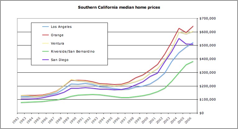
I basically start with the observation that the run-up in housing prices in recent years has been seen all over the world: from Spain to South Africa, from Ireland to Australia. Not everywhere has participated: there’s been a lot more price appreciation in Shanghai than there has been in Stuttgart. But there’s clearly some kind of global force — let’s call it “liquidity”, for lack of a better term — which has been driving asset prices in general, and housing prices in particular, upwards. What’s more, by the standards of many of these countries, the run-up in US home prices has been relatively modest.

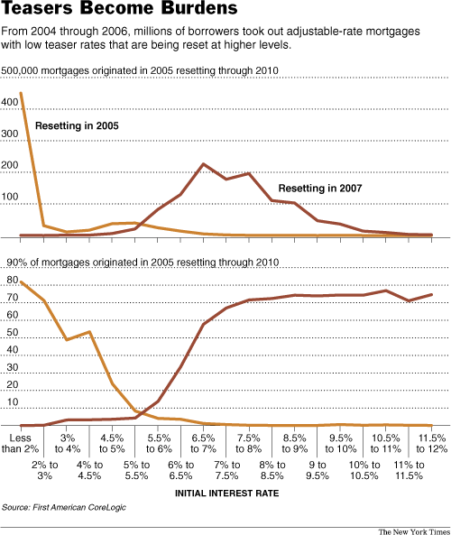
Let’s now take another look at the US. I don’t deny for a minute that the number of defaults on subprime mortgages, especially subprime mortgages of the 2006 vintage, is eye-poppingly high, and rising. What’s more, given the fact that originators have tightened up their underwriting standards substantially (and correctly), many mortgage holders are going to find it hard to refinance their adjustable-rate mortgages when they reset. This could drive default rates even higher, if the rates on those mortgages go up a lot. Home prices are still substantially above their 2004 levels, however, so the real problem is largely confined to mortgages originated in 2005 and 2006.

Now, it’s easy to paint a picture whereby defaults on recent-vintage mortgages cause a more generalized tightening in credit markets along with a plunge in housing prices as supply goes up and demand goes down. I do accept that, in theory, this could happen. But before I believe the prognostications of those who say it will happen, I want to see some indication that their model of supply and demand and housing prices actually reflects reality. Specifically, I want to see whether it explains the rise in housing prices over the past few years.

The big mistake that I think a lot of the housing bears are making is that they’re confusing correlation with causation. Yes, subprime credit has increased substantially in recent years. And yes, housing prices have gone up. But that doesn’t mean that the former caused the latter. Indeed, there are a good reasons to believe that the increase in subprime credit did not cause the run-up in housing prices. For one thing, housing prices started rising before the increase in subprime credit. For another, much of the increase in subprime credit was concentrated in depressed areas such as Michigan and Ohio, which accounted for 15% of all US foreclosures in January. And it’s precisely those areas which did not see a run-up in housing prices. Meanwhile, the market in New York City co-ops, for instance, has been booming (and shows few if any signs of slowing down) despite the fact that because those units are “non-conforming”, it has always been incredibly difficult to get a subprime mortgage on them. Finally, the rise in subprime credit in the US was not matched by a rise in subprime credit in places like South Africa and China, which saw much greater price increases — so whatever forces drove housing prices up globally are probably sufficient in themselves to explain the increase in housing prices in the US.

Now, one of those forces is doubtless an increase in the availability of credit generally, if not subprime credit in particular. If housing prices rose on a tide of global liquidity, then they can fall if and when that tide starts going out. For the time being, however, there are no signs that is happening. Yes, there are problems in one localized sector of the US mortgage market. But credit markets globally are still as tight as they’ve ever been. And the US subprime market is simply not big enough to affect global credit markets in any substantial way.

At the margin, then, problems in the US subprime sector will surely have some effect on the US housing market — although, obviously, the effects will be greatest where the concentration of subprime loans is at its highest. But I still think that the big drivers of the US housing market in the recent present will continue to be the big drivers of the US housing market in the near future — which does give me some cause for optimism.

One thing is certain, however: foreclosures will continue to rise, which will be personally devastating to hundreds of thousands, if not millions, of homeowners. These personal tragedies will resonate on Capitol Hill, and the federal government might step in to help those individuals out — which might, in turn, help mitigate the economic effects of the foreclosures. What’s more, all the talk of hundreds of billions of dollars being “lost” in foreclosures is a mite misleading: all that equity has already been lost by the time the foreclosure proceedings begin.

The big losers will be the holders of the equity tranches of MBSs and subprime-backed CDOs, as well as those subprime originators who find themselves holding a bunch of scratch-and-dent loans they thought they’d sold already. So it makes perfect sense that subprime mortgage originators are closing shop. But I’m not shedding too many tears for them: they made a lot of money in the boom years, and then they relaxed their underwriting standards far too much at the end of 2005 and the beginning of 2006. They deserve to bear the consequences.

As for the holders of MBS and CDO equity, we’re talking very, very sophisticated investors and financial institutions here, who are almost without exception both willing and able to bear those losses. I see no systemic risks there.

Looking forwards, the number of subprime loans originated will go down, which means that issuance into the subprime MBS market will fall. That’s fine. As the yields on those subprime MBSs rise and the underwriting standards on them tighten, there will be enough demand for them to meet supply. So I’m not particularly worried there, either.

The one big event risk, which hasn’t happened yet, is a mass downgrade of MBSs carrying BBB and BBB— ratings, to junk status. If that happens, there will be forced selling of those MBSs by institutional investors who are not allowed to own speculative-grade debt, and spreads are likely to gap out substantially. Given how the markets managed to cope with the Ford and GM downgrades, however, I think they could probably cope with this as well. (Remember that Ford and GM bonds are unsecured, and therefore have much more room to fall.) What’s more, at this point there’s no indication that such a mass downgrade is going to happen.

Overall, then, I’m sanguine about the US mortgage and housing markets. There will be large losses, which will generally be sustained by entities well able to afford them. On an individual level, there will be some tragic losses of much-loved homes. But on a systemic level, I think there is relatively little to worry about.

Oh, and one last thing: there’s an argument that US GDP growth has been reasonably healthy of late mainly because of the amounts of equity that consumers are taking out of their homes and spending in shops. If they stop doing that, goes the argument, then the US faces recession — and house prices never do well in a recession. Again, my response is simple: show me, plausibly, the degree to which home equity withdrawal boosted GDP growth in recent years. Then we’ll have a good idea how much it could affect GDP growth on the downside.

Posted in Econoblog | 9 Comments