
I very much admire the anonymous chart-makers at the New York Times. They generally do a magnificent job of presenting information in a clean, easy to understand, and often very clever manner. I wouldn’t be surprised to learn that they’d hired Edward Tufte as a consultant. But boy did they screw up today.
The story that the chart is attached to is perfectly fine. It’s by Damon Darlin, and it’s essentially keyed off the Chris Cagan report which I blogged about a couple of weeks ago. But the chart is dreadful, and the first indication that it’s dreadful is that none of the numbers in the chart are referred to in the story. So even if you read the whole thing, which is 1,500 words long, you’re still none the wiser as to what the chart is supposed to mean.
Anyway, here’s the chart: see if it makes any sense to you. I puzzled over it a long time before giving up — or, rather, before taking another look at Cagan’s report to see if I could work out there what the chart meant.
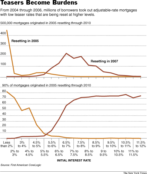
I applaud the NYT’s willingness to print charts which don’t have time along the x-axis. Such charts are often very interesting, but a lot of newspapers think their readers won’t understand them, and ban them entirely. That’s a bad policy. There are lots of clear charts which don’t have time on the x-axis. But if you don’t have time on the x-axis, you need to take extra care that your chart is clear. And no one did that here.
Anyway, what are these two charts about? The headline should give us a clue: “Teasers Become Burdens”, it says, and the text below it talks about mortgages which were originated between 2004 and 2006 and which are being “reset at higher rates”. So presumably the charts show how people with adjustable-rate mortgages are going to see a spike in rates? Er, no. In fact, the charts don’t even cover mortgages taken out between 2004 and 2006, as is implied by the text. They only cover mortgages taken out in 2005. How do we know this? Because at the top of each chart it talks about “mortgages originated in 2005 resetting through 2010”. Except even that is not really accurate. In fact, the charts only show two things: mortgages originated in 2005 and resetting in 2005 (the yellow line) and mortgages originated in 2005 and resetting in 2007 (the red line). Mortgages resetting in 2006 or 2008 or 2010 aren’t shown at all.
So what’s going on in the first chart? Remember, it only covers loans taken out in 2005. The yellow line shows that over 400,000 such loans had a teaser rate of less than 2%. That’s scary, right? Just think of what those borrowers will be paying when their loans reset! Oh, hang on, the yellow line is loans which reset in 2005 — two years ago. All those borrowers have already been paying the higher, adjustable rate for well over a year at this point. If you look at the red line, which is the loans resetting this year, it turns out that most of them already carry an interest rate of between 6% and 9%. Which means that when the loans reset to a market interest rate, the increase in mortgage repayments will be much smaller.
In no way does the chart show that “millions of borrowers took out adjustable-rate mortgages with low teaser rates that are being reset at higher levels” — if by “are being reset” you mean “are being reset this year” rather than “were already reset in 2005”. In fact, the chart shows that most of the mortgages which are being reset this year had pretty normal initial interest rates in the 6% to 9% range.
A much more relevant chart would show the number of loans originated with teaser rates which are resetting in 2007 — without worrying about when those loans were taken out. But that’s not the chart we’re given.
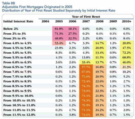
And what about the second chart? That one actually makes even less sense than the first. It seems that loans with very high initial interest rates make up a very high percentage of loans resetting in 2007, and a very low percentage of loans resetting in 2005. Or something — it’s incredibly unclear, and in fact I would say it’s impossible to work out what the chart is really showing, unless you can see the chart from which it has been taken. (Which I’m helpfully providing below.)
The chart shows that if you take all the 2005-vintage loans with teaser rates below 2%, more than 80% reset that same year, in 2005, while none of them are resetting in 2007. In fact, if you take all the 2005-vintage loans with teaser rates below 5%, the vast majority of them have already reset, and very few are resetting this year. Meanwhile, if you’re someone who took out an adjustable-rate mortgage in 2005 which carried an initial interest rate of more than 10% (!) then there’s a very good chance it will reset this year. What use is this information? None, as far as I can tell. And it certainly isn’t particularly germane to the subject-matter of the story.
What I fear is that people will look at that graph and panic, thinking that it means that lots of loans are resetting to interest rates in the double digits. But that’s not what it means at all. In fact, if you look at it correctly, it’s reasonably reassuring: it shows that people who are seeing their 2005-vintage mortgages reset this year generally do not have low teaser rates. But there’s really no way to work that out just by looking at it.
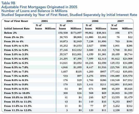
In any case, here are the tables from which the charts are drawn. I honestly have no idea whatsoever why the New York Times chose these tables rather than any number of more germane other ones from Cagan’s report. For instance, table 10 could have generated a chart of all the loans originated between 2004 and 2006 which are resetting in 2007, along with their initial interest rates. That would have been interesting and useful. These ones are neither.
sweet jesus those are some bad charts