Schwarzenegger wins

In the end, the election wasn’t a farce. Everyone thought that Arnold Schwarzenegger

would win with fewer votes than Grey Davis, and that didn’t happen. In fact,

it looks as though he got

an outright majority of the votes, despite running against more than 130

opponents, a large number of whom were members of his own political party. An

impressive showing by any measure.

The knee-jerk reaction across the pond (and, indeed, in many liberal enclaves

in the US) will be to start talking about how the US is a laughingstock once

again – this crazy so-called democracy where the president got fewer votes

than his opponent, where the election was decided by the Supreme Court, where

Clint Eastwood and Sonny Bono and Jesse Ventura and now Arnold Schwarzenegger

win elective office.

But in fact there were good

reasons to vote for Schwarzenegger, and a lot of those who bemoan the fact

that Davis wasn’t allowed to serve out his term are the same people who would

desperately love to see the same fate befall Hugo Chavez, in Venezuela.

For me, though, the most interesting parallel is with Argentina. Schwarzenegger

was clearly the beneficiary of a general disgust with politics as usual –

a sentiment which will resonate strongly with the vast majority of Argentines.

In California, as in Argentina, politics is dominated by two enormous political

parties, both of whom are desperately constrained due to their debts to special

interests. And in California, as in Argentina, the voters shunned a once-in-a-generation

opportunity to elect an independent candidate.

I’m not saying that Arianna Huffington would have made a better governor of

California than Arnold Schwarzenegger, although it’s entirely possible. And

I’m not saying that Elisa Carrio would have made a better president of Argentina

than Nestor Kirchner. But I am saying that both of them got comprehensively

steamrollered by political machines which were, by all accounts, completely

discredited.

The people who voted for Schwarzenegger yesterday are the same people who voted

for John McCain the Republican primaries in 2000, or who are going to vote for

Howard Dean in the forthcoming Democratic primaries. They’re protesting against

the status quo by voting for candidates who talk tough yet still stand firmly

within the two-party system, and who will do nothing to change it. For the two-party

system is much bigger, and much stronger, than any candidate, and it will outlast

them all.

That, of course, is a Very Bad Thing. The special interests will continue to

rule Sacramento (and Washington, for that matter), and the prospects for meaningful

reform are distant at best. But the irony is that the alternative is even more

chilling: the only thing worse than strong political parties is weak political

parties. A large part of the problem in Venezuela is that Chavez used popular

hatred of the political parties to tear them down and construct a new system

where there basically isn’t any coherent political opposition to him at all.

And one look at the list

of Italian prime ministers since the war tells you everything you need to know

about a system where everybody spends their entire time fighting everybody else:

after decades of chaos, you end up electing a spectacularly corrupt businessman

who is so rich he can buy an entire country.

The ideal, I think is somewhere in between. I’m no expert on Canadian politics,

but I have a feeling that they have it pretty much right. An entire political

party (the Conservatives) can self-destruct and it doesn’t seem to matter very

much; meanwhile, for all the craziness and shouting, Quebec is still, somehow,

part of the country.

Plus, of course, Canada had the most dapper

premier that north America has ever had. I can’t imagine Arnold in

a tuxedo, doing the tango.

Posted in Politics | 1 Comment

Blogging is hard

Publishing on the internet has never been as easy as the technoütopians would have it. (This week, I’ve decided to maximise my use of the diaeresis: see this MemeFirst entry if you want to know why.) And after fiddling around with felixsalmon.com for a few hours yesterday, I’m more pessimistic than ever about the prospects for the web becoming the great democratic leveller which it looked set to become when I first got online.

The problem is that every time a difficulty is solved and the road onto the web becomes easier, a new development takes place somewhere else which only serves to make life more complicated than it was before. What used to be an easy publishing system with high barriers to entry is now a much more complex publishing system with lower barriers to entry. As a result, web publishing remains largely confined to the overeducated urban elite – precisely the population which had the greatest access to more old-fashioned media.

While I was tweaking this site (more on that later), Oliver Willis was at BloggerCon in Boston, and had this to say:

During one of the Saturday sessions a member of the audience referred to the assembled crowd as “utopia”. Now, yes, I loved the blog camaraderie but quite frankly I don’t want to be the only black person in utopia. I was the only black person in that room, and was one of a few minorities. I’m not whining about that, but simply stating the fact that a technology that is mostly the pursuit of upper middle class white males does diddly to change the real world.

I don’t think Oliver is right: there are many technologies which are mainly the pursuit of upper middle class white males and which have undoubtedly changed the world. Space travel is one obvious example. But he does make the excellent point that blogging is essentially giving a voice to the kind of people who were not exactly muzzled in the past.

The depressing thing is that the barriers to web publishing at this point are not cultural so much as they are technical. Most people are capable of sending an email or posting on some kind of web-based bulletin board. Most people are not capable of setting up a halfways-decent weblog. I’m hoping TypePad (which officially launched today) will help change this, but the fact remains that if you want to do any real messing about with how your website is put together, you need to essentially become a coder.

When I first started browsing the web, on a Sun workstation running Mosaic, it was really incredibly easy to understand. You would write text, basically, and then put <h> tags around headlines, <strong> or <em> tags around things you wanted to emphasise, and so on. Images were a little bit harder, but not much. You basically just marked up your text to show whch elements were which, and let the browser do the rest.

But it wasn’t long before the designers got in on the act. They didn’t care about making sure that text was correctly marked up – they cared about what it looked like when it was rendered in a browser. From demand came supply, and it wasn’t long before rogue tags like <b>, <i> and, of course, the dreaded <flash> started turning up in HTML. These things said nothing about the text itself, and attempted instead to dictate how it was seen by the reader.

Now while all these developments were OK in and of themselves, the problem was that most websites wanted to be one step ahead of everybody else. The browser makers, led by Netscape and Microsoft, rushed to support all manner of increasingly recondite code, and web pages became more and more complex, to the point where the vast majority of commercial websites are completely incomprehensible when viewed as source code. A lot of the markup was automatically generated by software like FrontPage which generally erred on the side of specificity rather than simplicity, with the inevitable bloatful consequences. And we’ve long since passed the point where the markup actually takes up more bandwidth than the content, which I’m sure was something that Tim Berners-Lee never envisaged.

By this point, your own personalised website was a pretty easy thing to get: rather than having to provide name servers yourself, you could pay a for-profit company to do all that kind of thing for you. But once people started having to pay for domain names, the internet, fueled by the dot-com bubble, became a corporate playground, further and further removed from its original inception as a democratic network. The vast majority of us were lurking viewers, and the vast majority of web traffic went to a handful of sites with enormous market capitalisations.

The advent of blogging, which coincided with the bursting of the stock-market bubble, was meant to change all that. Easy web publishing tools put everybody on an equal footing, and we could all have our own place where we could print whatever we liked.

The problem was that web publishing technology had moved on, and a plain-bones HTML site simply wouldn’t hack it any more. I can think of one reasonably-trafficked site which is bog-standard hand-codeable HTML, but if anybody less famous were to go down that route I can’t imagine that anybody beyond their friends would come back very often. Besides, the presence of things like “&nbsp;&nbsp;&nbsp;&nbsp;&nbsp;” in the source code betrays the fact that even this ultra-basic blog was actually generated not by hand but by computer.

If you want something a bit sexier, then you start running into an alphabet soup of what are, essentially, programming languages you need to learn. XHTML, PHP, RSS, CSS – all of these things are very, very user-unfriendly. On top of that, if you use a blogging tool like MoveableType, you need to deal with all of their idiosyncratic coding as well.

What I’m talking here is infinitely more complex and counterintuitive than old-fashioned markup. It does wonderful things, of course – I can change the whole look and feel of this site without having to reënter any of the content, for instance – but it also comes at great cost. There’s been a kind of arms race when it comes to web-based tools, and anyone using only HTML is essentially using a penknife to compete with a laser-guided cruise missile.

The thing is, penknives are easy to understand and control, while cruise missiles aren’t.

Take felixsalmon.com as an example. It’s powered by Moveable Type, which had to be installed on my server. Even MT themselves admit that’s non-trivial: I got my techy friend Stefan in Sweden to do it. Then you have page templates, which the brave toss out and rebuild anew, but which I just tweak to try to get things vaguely as I’d like them. That involves looking at code like this, and working out what it does and how I might want to change it.

<div id=”banner”>

<h1><a href=”<$MTBlogURL$>” accesskey=”1″><$MTBlogName$></a></h1><p></p>

<span class=”description”><$MTBlogDescription$></span>

</div>

That’s real code from the template for this homepage, by the way. See those <div> tags? I half-understand what they do; I have no idea what the <span> tag does.

But that’s not the half of it: in order to really change the look and feel of the site, you need to mess about in something called the Stylesheet. That’s written in something called CSS, and looks a bit like this:

.blogbody a,

.blogbody a:link,

.blogbody a:visited,

.blogbody a:active,

.blogbody a:hover {

font-weight: normal;

text-decoration: underline;

}

Of course, all those curly brackets and full stops and spaces and colons are absolutely vital, and it takes quite a bit of chutzpah to go in and try to change stuff, especially when you don’t really have a clue what you’re doing.

Yesterday I decided that since I’d already changed my blog to php from html (don’t ask: I don’t really understand myself), I might as well make use of it and include links to recent stories I’d posted on MemeFirst. The results are up in the top left hand corner of the page. This took about three hours, altogether, first of all googling around the web trying to find the right tool to do what I wanted, then trying to install it, and then getting it to look like what I wanted it to look like. If you’re interested, I used a set of PHP functions written by Jason of the Trommeter Times, and the instructions for installation, in full, are “it’s really pretty simple and should be self-explanatory.”

Without Stefan, I could never have done it; with him, it was still very difficult. Here’s some of my PHP code, to give you an idea of what I was dealing with:

if ($tagName == “ITEM”) {

printf(“<li><a target=’_blank’ href=’%s’>%s</a><br

/></li>\n”,

trim($link),htmlspecialchars(trim($title)));

if (strlen ($description) > 0) {

printf(“%s<br />”,htmlspecialchars(trim($description)));

}

Trust me, it’s just as forbidding as it looks. And yes, the type of people who come up with this stuff really do think that it’s self-explanatory. (I might add that they’re also the type of people who think it’s really funny that PHP stands for PHP: Hypertext Preprocessor. Yes, it kind of recurses infinitely back into itself.)

We’re living in a world, as Virginia Postrel likes to point out, where cleaning ladies advertising their services compete largely on the strength of the graphic design on their flyers. Anybody with a PC can come up with something pretty beautiful pretty easily, and many do.

But when it comes to web design, there’s nothing easy about it. If you want complete control over your flyer for janitorial services, you’ve got it. If you want complete control over the look and feel of your website, you have to either jump straight into the deep end of geekdom, or get a geek to do it for you. Of course, geeks often like to throw all manner of horrible bells and whistles into websites just because they can and because it means they can charge more, so most people like to do the web-designing themselves if they possibly can.

Given all that, it’s hardly surprising that bloggers tend to be overeducated urban graduates, who are less likely to be intimidated by all those $‘s and ==‘s, and who in any case have relatively easy access to web designers and the ready cash with which to pay them. But it doesn’t bode well for the future growth of blogging.

I am convinced that just as the web-publishing revolution is supposedly going full speed ahead, it has ironically never been harder to publish your own stuff on the web. Blogging is not going to include very many genuinely marginalised voices unless and until someone writes some powerful and yet easy-to-use software which makes things like setting up templates as easy as formatting a document in Word.

To be honest, I don’t think that’s possible: there are so many variables now in the code for web pages that you really can’t just keep things simple any more.

For that reason, then, I think that bloggers are going to remain an elite subset of the already-elite group of web users for the foreseeable future. It’s just too bloody difficult to ever become really popular.

Posted in Culture | 16 Comments

School of Rock

OK, it hasn’t been the best year for movies. But it’s still worth noting that

the two best films of the year thus far have been PG-13 romps aimed at children

and their parents. After the box-office phenomenon that is Pirates

of the Caribbean, we now have School

of Rock, the fabulous new film from Richard Linklater and Jack Black.

Upon reflection, it’s not exactly surprising that filmmakers sometimes create

their best material when they’re working under the constraints of the children’s

genre. Certainly Robert Rodriguez, whose latest

film is a complete disaster, has never come close to the triumph of Spy

Kids. Or compare E.T.

to The Color Purple:

’nuff said.

I’ve had a hell of a time trying to persuade my friends to go see Pirates:

they have no interest, they say, in seeing a Disney film – one based

on a theme-park ride, no less – which is mainly famous for starring

a scenery-chewing Johnny Depp. And I can see what they mean, when they put it

like that. But it’s their loss, since the film is one of the greatest action-adventure

movies since the Indiana Jones franchise reached the end of its natural life.

Somehow I have a feeling that pushing people to see School of Rock

will be less difficult. For one thing, it has the Linklater name attached, although

weirdly he’s absent from the branding of the film – maybe Paramount reckons

that the Linklater fanbase will simply come out through word of mouth alone.

Then, of course, there’s Jack Black, someone who’s retained a large quantity

of street cred despite selling out about as much as it’s possible to do.

In any case, the thirtysomethings most definitely turned out for this film.

I saw it on a Sunday night without thinking twice about whether I might be able

to get a ticket, but the theatre was people-sitting-in-the-aisles sold out.

And not a kid in sight.

The opening credits alone are a masterpiece of comic filmmaking: Jack Black

on stage, channelling every rock god from Jimmy Page to Mick Jagger, eventually

swan-diving, stripped to the waist, into the outstretched arms of his imaginary

fanbase. Not the kind of fanbase you ideally want to crowd-surf on, it must

be said.

Amazingly, things rarely flag from there on in. The ridiculous plot is just

sturdy enough to carry us through: our stout hero blags himself a job at a posh

school, where he sets up a crash course in Sticking it to The Man for his coddled

10-year-old charges. The kids, of course, carry the day, and by the end everybody’s

happily riffing together as the long list of music featured in the film scrolls

its way up the left-hand side of the screen.

Just as Depp carries Pirates, Black is this film. He’s working

with some excellent actors, from Joan Cusack to the extremely talented children

in the band, but it’s his genuine and infectious energy which keeps the audience

rapt – and in stitches. He’s the overgrown adolescent we all flatter ourselves

to think we are still in touch with inside ourselves, and he manages to paper

over crater-sized plot holes through sheer force of personality alone.

Whether he’s quoting Whitney Houston in a desperate attempt to construct an

educational philosophy, or improvising a "Math is good" song in order

to explain away the electric guitar in the corner of the classroom, Black has

a natural’s comic timing. But this film couldn’t work with any old comedian:

Black gives it genuine rock credibility as well. True fact: while Linklater

couldn’t get Led Zeppelin to let him use their eponymous song in Dazed and

Confused, Black managed to persusade them to allow "Immigrant Song"

to be used in School of Rock.

I urge you to grab some friends, have a couple of drinks, head down to your

local multiplex, and whoop it up in this movie. You will have a fantastically

good time, and come out with a renewed appreciation for both Black and Linklater.

Linklater actually starred in Spy Kids: he knows at first hand that

what might look at first glance like selling out can in fact be the catalyst

for innovative, first-rate filmmaking. Here’s hoping that more people follow

his lead. Failing that, we might at least have a revival

of air guitar.

Posted in Film | 2 Comments

Blog timeliness (for Terry Teachout)

Back when Slate first launched, its editor, Michael Kinsley, fresh from the

New Republic, was still in magazine-metaphor mode. Do you remember his welcome

note?

We use page numbers, like a traditional print magazine,

and have tried to make it as easy as possible either to "flip through"

the magazine or to and from the Table of Contents.

SLATE is basically a weekly: Most articles will appear for a week. But there

will be something new to read almost every day. As a general rule the Back

of the Book, containing cultural reviews and commentary, will be posted Mondays

and Tuesdays, the longer Features will be posted Wednesdays and Thursdays,

and the front-of-the-book Briefing section will be posted Fridays.

Well, the page numbers didn’t last long, and neither did the conceit that Slate

was "basically a weekly". Without a printing schedule or the US Postal

Service to worry about, such things largely cease to have any importance. But

still, when bloggers migrate to the web from print media, they often like the

idea of a publishing schedule, and get a bit agitated when it goes out of kilter.

One of the best new bloggers is the Wall Street Journal’s Terry

Teachout, who worried

on Tuesday that

For the rest of the week, I’ll be posting entries not in my usual exqusitely

well-organized magazine-type style (i.e., five or six items posted shortly

after midnight), but whenever I can grab a few spare minutes to write and

publish something on the fly.

Today, however, he started

thinking that even though people read their WSJ first thing in the morning,

they might not necessarily want all of Terry Teachout’s material then as well:

I’d be interested in knowing whether you prefer the old magazine-style package

of early-morning posts or are equally happy with intermittent postings throughout

the day, so long as they add up to a daily diet of comparable caloric value.

Your thoughts?

Well, my thoughts, Terry, are that the whole point of blogging is

to put up material as and when you write it. felixsalmon.com, for instance,

is not a "weekly": if you came here today and tried to read everything

from the past week, that would come to more than 7,600 words of material –

which is way more than anybody wants to read on one website at one time. On

the other hand, it’s not a "daily": most days it’s not updated at

all. What I do have is an RSS

feed which lets people know when the site’s been updated, and which solves

all the problems. I get to publish irregularly without worrying that I’m disappointing

return visitors who will find nothing new, and my readers get all my content

when it is hot off the presses.

Now, that said, RSS is a very young technology, and most people have yet to

adopt it. So while weblogs should all have an RSS feed (yes, even yours), it’s

probably reasonable to go on the assumption that most of your visitors are simply

people who have bookmarked your site or followed a link to it.

I can definitely see that the diurnal cycle is a natural one, and that some

people might well have a list of weblogs that they check every day. But for

these people, it doesn’t matter when you post your material: when they come

at a certain time of the day, they’ll see the last 24 hours’ content, read it,

and move on.

There is one blogger in particular

that I can think of who used to regularly post exactly one piece every day.

(Recently, that schedule has changed, because he’s been on the road; who knows

whether or not he’ll return to it.) He might well want to try to post at roughly

the same time every day, because his pieces are often very topical, and because

he would want a daily visitor to always see something new. But neither of those

considerations really apply to you. In fact, posting in a clump just after midnight

makes your postings less topical, not more so: you have to save them

up in order to post them at a later hour.

I also note that you are quite keen to increase the number of visitors to your

site. Well, I can tell you that if someone knows for sure that there won’t be

any new content, there’s no chance they’re going to go back a second time. An

irregularly-updated weblog, on the other

hand, will often have much higher visitor numbers, because people check back

when they have a spare minute to see if anything new has appeared. (And a lot

of us have a lot of spare minutes, I can tell you: I wouldn’t be surprised to

hear that the vast majority of blog surfing is conducted by bored office workers.)

What’s more, one of the greatest things about blogs in general is that they’re

much more personal than, say, the Wall Street Journal. Updating a website shortly

after midnight every day is not personal: it’s mechanical. It also mitigates

against the kind of impulsive postings which might not go down in internet history

but which help to build community: the things which give your audience an idea

of who you are and what makes you tick. "Ohmigod I just heard George Plimpton

died," maybe followed by a personal anecdote, is not exactly newspaper

material, but it’s perfect for a weblog. I put

something up on MemeFirst the minute I heard Edward Said died, for instance,

which certainly helps to identify the kind of things that the site is interested

in.

But it’s not just newsy stuff which I’m talking about here. Just a week ago,

Virginia Postrel used up her devoted readers’ precious bandwidth with a posting

asking "Why are the trash cans in hotel rooms so small?". And her

devoted readers loved her for it, just like Andrew Sullivan’s readers like it

when he talks about that bloody beagle of his. That kind of thing – in

moderation, of course – helps build a following, but our own self-censorship

mechanisms start to kick in if we try to save something like that for

posting after midnight. It might be what we’re thinking at the time, but it

certainly doesn’t look, on second reading, like something worth publishing for

posterity.

So the upsides to publishing on an as-and-when basis are many: your site stats

increase, your readers become more loyal (if only because they visit you more

often), your blog becomes more blog-like and less like a daily newspaper column,

and it also, when it wants or needs to, becomes more timely. What are the downsides?

For you, I’d say the main one would be that blogging would become more of a

full-time occupation. At the moment, you might be doing your regular job during

the day and then settling down in the evenings to do the blog, maybe after having

mulled a number of different possible topics in the back of your head over the

course of the day. If you change posting habits then you might find yourself

blogging during hours of the day in which you had intended to do something else.

That said, no-one’s going to mind if you don’t update between the hours of

nine and five, or if you do so only very occasionally. Do what works best for

you, because that, I can guarantee you, is going to be what works best for your

readers. I would only urge you not to sit on blog postings for hours after you’ve

written them, just because you want to wait until a certain hour before you

post. I simply cannot see why that does either you or your readers any favours

at all.

Posted in Media | 10 Comments

Music videos on DVD

DVD is a great medium: there’s a virtually limitless list of films available,

they look much better than they do on VHS, and you can do things like freeze-frame

much more effectively. But until now, the market has been dominated by the major

theatrical distributors. If you want to rent a movie which came out in theaters

for a couple of weeks and then bombed, that’s easy. Everything else, on the

other hand, is almost impossible to find.

There are three types of DVD I’ve long wished to be able to find, with very

little luck. The first is art films, ranging from short pieces by Bill Viola

or Bruce Nauman to feature-length films by Andy

Warhol or Rebecca Horn.

It’s understandable why these films would be difficult to find, however:

they’re sold at extremely high prices in very small editions through art galleries,

and a generally available perfect copy would severely dilute the edition.

The second is made-for-TV material, especially documentaries. There are amazing

documentaries out there, but most of them appeared once or twice on television

and have since become all but impossible to see. Much more effort goes into

making a good feature-length documentary than goes into writing a magazine article,

but future researchers on any subject are generally confined to the latter,

because the television material is stuck, inaccessible and unindexed, in a basement

somewhere.

The third is music videos. On a dollars-per-minute basis, these are probably

the most expensive films regularly made, and enormous amounts of effort and

creativity are put into them. Yet very few make it onto television, and even

fewer are available once the single in question is no longer in the shops. Real

classics, like Michael Jackson’s Thriller or Peter Gabriel’s Sledgehammer

(now there’s a song no one would remember if it wasn’t for the video)

exist largely in our memories these days: we can’t rummage around among old

DVDs for them in the same way that we can with our music collection.

(I could add a fourth category here, of television commercials, but while they

can be very clever and funny, I personally have no particular desire to watch

a whole DVD’s worth of them.)

I have friends in Los Angeles who are very plugged in to the music-video production

scene, and who collect pirate copies of such things in much the same way as

people in the art scene have illicit collections of art videos. But these copies

are invariably on VHS. It’s also possible to get DVDs featuring collections

of an individual recording artist’s work. The problem with going down that route,

of course, is that it’s the music which drives the video selection, and not

the other way around, meaning that a lot of the videos are very average in quality.

(One exception can be found here,

and another here).

But now, thanks to Spike Jonze, there’s a whole new company, The Director’s

Label, devoted to releasing the best work of the best music-video directors.

Better yet, the first three releases, coming out at the end of October, also

happen to be the best three music-video directors working today. The press release,

complete with trailers for each of the DVDs, can be found here.

The

subject of the first DVD, of course, is Jonze

himself. Jonze first appeared on the scene making skateboard videos, but

his unique visual imagination soon made him one of the most celebrated and accomplished

music-video directors ever. The Beastie Boys started hiring him on a regular

basis: they’re the kind of artists who really care about making their music

videos into self-standing artworks in their own right.

This DVD features all the Jonze classics. The Beastie Boys’ Sabotage

is a hilarious send-up of 70s cop shows, while Fatboy Slim’s Weapon of Choice

is probably the best place in cinematic history to see just how good a dancer

Christopher Walken really is. The cover features a still from Wax’s California,

a slow-motion sequence of a man on fire, running, which once seen is impossible

to forget.

Jonze stands apart from the other directors in the series in that he isn’t

really known for his cutting-edge use of technology. That said, he spent a lot

of effort inserting Weezer into the Happy Days TV show for Buddy Holly,

and did their Undone video entirely in one take.

The

second DVD is Michel

Gondry. Gondry has come to fame more recently, largely thanks to Björk,

who has used him in half a dozen videos. Their first collaboration was on Human

Behaviour, a video which singlehandedly made Gondry’s name with a wonderfully

skewed fairy tale featuring Björk as a hunter who eventually winds up inside

a bear’s stomach.

Gondry also directed the wonderful Kylie Minogue video of Come Into My

World. Shot in a Parisian suburb, it shows Kylie dancing and skipping around

a crossroads again and again – and each time she circles, another Kylie

joins her, until there are four Kylies in all. And it’s not only Kylie who replicates,

it’s also the townsfolk, each of whom is a small little story unto themselves.

It’s the kind of video which can happily be watched over and over again for

the dozens of small things you miss the first few times.

But Gondry is more than just a high-tech wizard: consider probably his most

celebrated video, for the White Stripes’ aggressively low-tech Fell in Love

With a Girl. Done entirely in old-fashioned Lego, the very rawness of the

animation pefectly echoes the stripped-down nature of the song, and deservedly

makes it to the cover of the DVD.

Finally,

there’s Chris

Cunningham. The fact that he’s part of this series at all is particularly

impressive, because he’s considered an artist in his own right, and sells his

work through art galleries. His longest and most expensive piece of video art,

Flex, is actually featured on this DVD, which bodes well for the wider

availability of other artists’ work.

If the American Jonze is associated with the Beastie Boys and the Frenchman

Gondry is associated with Björk, then the Englishman Cunningham is very

much linked with Aphex Twin. There’s a problem here, in that Aphex Twin is not

particularly commercially successful, which means that Cunningham’s videos have

even less chance than most of being seen. What’s more, Cunningham’s vision in

his Aphex Twin videos is genuinely shocking, disconcerting, and scary: these

aren’t simply clever and imaginative works, they’re also the kind of thing which

can give you nightmares.

So it’s Björk who makes it onto the cover of this DVD, since Cunningham’s

video for her All is Full of Love is probably the most-watched thing

he’s ever made. It’s technically flawless, especially considering the technology

which went into it way back in 1999. It’s also stunningly beautiful, with a

white porcelain Björk robot building another one and falling in love with

her.

I can’t wait for these DVDs to be released, and I’m very much looking forward

to seeing who Jonze will choose to be the next director tapped for a retrospective.

Still, between the three DVDs, there’s 20 hours of material here, so that should

be enough to keep me occupied for the time being.

Posted in Culture | 3 Comments

PowerPoint

Who will stick up for PowerPoint? It’s always been the subject of low-level

grumblings, and Lance Knobel points

out that the World Economic Forum, in Davos (usually), has long had a "deep-rooted

aversion" to allowing it into presentations. But ever since Edward Tufte

came out with his 24-page

jeremiad on the subject of slideware generally and PowerPoint specifically,

it’s got even worse press than usual.

The New York Times chimes

in today, with an article centered on Tufte’s criticism of the use of PowerPoint

within NASA. Tufte points to a PowerPoint presentation which was given to senior

managers while the Columbia was still orbiting, on the subject of whether or

not the famous piece of foam had caused serious damage.

Among other problems, Mr. Tufte said, a crucial piece of information —

that the chunk of foam was hundreds of times larger than anything that had

ever been tested — was relegated to the last point on the

slide, squeezed into insignificance on a frame that suggested damage to

the wing was minor.

The independent board that investigated the Columbia disaster devoted an entire

page of its final report last month to Mr. Tufte’s analysis. The board wrote

that "it is easy to understand how a senior manager might read this PowerPoint

slide and not realize that it addresses a life-threatening situation."

In fact, the board said: "During its investigation, the board was surprised

to receive similar presentation slides from NASA officials in place of technical

reports. The board views the endemic use of PowerPoint briefing slides instead

of technical papers as an illustration of the problematic methods of technical

communication at NASA."

In a recent issue of Wired Magazine, Tufte recapitulated his message in a short

article, but the editors had a harder time finding anybody who would stand

up for the accursed software. They ended up alighting on David Byrne, who’s

been playing around with PowerPoint for a while now, and who has just released

a book and DVD called Envisioning

Emotional Epistemological Information. The title, of course, is direct nod

of the head to Tufte, whose second book is entitled simply Envisioning

Information. Byrne’s

Wired article is whimsical, showing a few slides from PowerPoint presentations

he’s put together, with sardonic commentary on each:

I began this project making fun of the iconography of PowerPoint, which wasn’t

hard to do, but soon realized that the pieces were taking on lives of their

own. This whirlwind of arrows, pointing everywhere and nowhere -each one color-coded

to represent God knows what aspects of growth, market share, or regional trends

-ends up capturing the excitement and pleasant confusion of the marketplace,

the everyday street, personal relationships, and the simultaneity of multitasking.

Does it really do all that? If you imagine you are inside there it does.

Wired magazine, which is now part of the Condé Nast empire, went crazy

over Byrne’s PowerPoint pieces. They put up huge flat-screen multimedia presentations

in the lobby of their magnificent office building in Times Square, and then

sponsored a talk between Byrne and Lawrence Weschler at the 92nd Street Y. (They

also had a dinner at Lever House and a big after-party in Byrne’s honour, but

I wasn’t invited to those.)

The effect of all this attention was to make Byrne’s work seem very important

– a groundbreaking new direction in visual art, perhaps, or maybe even

an effective counterpoint to Tufte’s grumblings. The headline on the article,

after all, is "Learning to Love PowerPoint".

But at the 92nd Street Y, it rapidly became apparent that Byrne basically agrees

wholeheartedly with everything Tufte is saying. He started off with a series

of PowerPoint slides designed expressly to make us laugh at the medium and its

limitations, and then went on to explain how it was those very limitations which

attracted him to PowerPoint as an artform.

At the unveiling of the pieces in the Condé Nast building, he said,

one of the building’s tech-support types went up to him and asked why he hadn’t

created his pieces in Flash rather than PowerPoint, since using Flash would

have been so much easier. The answer, Byrne said, was precisely that using PowerPoint

was hard and that the software was decidedly buggy: when you run a series of

slides together with music in a slideshow, as Byrne does, you can’t be entirely

sure how the slides are going to morph into each other, or exactly at what point

in the show the music is going to kick in. There’s an element of chance there:

the same presentation, run on a slightly different computer, can create a significantly

different result.

I can see the attraction of that kind of thing to an artist, and in fact the

best bits of Byrne’s slide presentations are precisely the bits where PowerPoint

proves buggiest: the jerky dissolves from one frame into another, say, or the

bizarre points at which the presentation freezes for no obvious reason. But

even Byrne admits that the whole thing is a bit of a con, really: the main reason

that some people find the presentations artistically interesting is that moving

images combined with music are nearly always compelling enough to hold attention.

That’s why music videos are so successful. We can’t watch one on mute for very

long, and much of the music might not be to our taste, but put the two together,

and we’ll happily watch.

Byrne once described his music as a way of forcing people to listen to his

lyrics, and in these works he’s doing much the same thing. He uses a Ligeti

piece, say, as a way of keeping attention while putting together an allusive

series of slides on the subject of phrenology.

In the real world, of course, almost no one uses music in their PowerPoint

presentations, and the only sound in the room is usually the presenter droning

on monotonously, laboriously reading out every last word on every last slide.

And as the NASA investigative board – as well as the journalists covering

the story – found out, a lot of the time PowerPoint presentations are

simply printed out or emailed in lieu of distributing a conventionally-written

report.

Every few months I give out various awards in my guise as the Latin America

correspondent for Euromoney, and I get dozens of submissions from banks who

think they deserve a gong or two. If I didn’t put my foot down on a regular

basis, nearly all of these submissions would be in PowerPoint form: 3MB or 4MB

files which, if they don’t crash my computer completely, certainly slow it down

and make reading the submission a painfully laborious process.

Banks like sending PowerPoint submissions because they can insert all manner

of pretty corporate logos and country maps, but a lot of what they’re doing

is simply inertia: "submission" is more or less synonymous with "PowerPoint

presentation" these days.

Of course, there should be a world of difference: PowerPoint was never designed

to convey information on its own. The most interesting part of Byrne’s appearance

at the 92nd Street Y, for instance, was not his PowerPoint pieces, but rather

the presentation which he put together expressly for the talk. He had a series

of slides, some interesting, some funny, but he made sure that they complemented

what he was saying, rather than reflecting it. He understands that PowerPoint

is a tool which can be used as part of a presentation and that it is emphatically

not the same as the presentation itself. In fact, I would go as far as to say

that a good PowerPoint presentation (and such things do exist) should be pretty

much incomprehensible to anybody seeing only the slides and not listening to

what the presenter is saying. (Of course, there are always exceptions.)

The best example of a great PowerPoint presentation that I can find on the

web is this one by Lawrence

Lessig, which can also be reached from this

page if you’re having any difficulties with audio or video. But Lessig is

not the only high-profile master of the medium: Steve Jobs has long been legendary

for his Stevenotes, one of which is online here.

What Lessig and Jobs have in common is that they talk with conviction and enthusiasm

for their subject, and give carefully-written speeches which are more or less

free-standing. Have a look at Lessig’s lectures:

they read like speeches, and are clearly written in a very different manner

to his academic papers.

Those speeches are then enhanced with PowerPoint’s visuals, which can be used

to drive home a message even as Lessig himself is saying something a bit more

subtle.

Unfortunately, the tens of millions of people with PowerPoint generally aren’t

good speechwriters, and invariably don’t have any speechwriters available to

construct their presentations for them. So they resort to PowerPoint’s helpful

content wizard. There’s a whole default presentation called "Communicating

Bad News", for instance, which includes slides like this.

Never mind the fact that the graphics are appalling, this kind of hand-holding

is almost guaranteed to end up producing presentations of astonishing superficiality,

with, as Tufte would put it, "a rate of information transfer asymptotically

approaching zero".

No content wizard is ever going to be able to make people sit down and work

out an interesting and compelling way of communicating information, and no gussied-up

graphics are going to turn a bad presentation into a good one. (That’s why Keynote,

Apple’s competition to PowerPoint, is not going to do much good for anyone.)

And yet PowerPoint can still, very occasionally, be a powerful tool for enhanced

communication. I’d just make a few (bullet) points, with a tip of the hat to

Hasan:

  • A series of slides will never turn a bad speech into a good one. So start

    with the speech, and then use the slides to illustrate it, rather than the

    other way around.

  • If you’re reading your slides, they have too much information on them.
  • Graphs and tables are perfect material for slides. Just remember what you

    learned in The Visual

    Display of Quantitative Information, and avoid Excel or PowerPoint defaults.

  • It is not necessary for every slide to be self-explanatory, but, on the

    other hand, you do not need to go out of your way to explain every slide.

    The slides and the speech are parallel and complementary information streams:

    use each to convey the information it’s best suited for.

Finally, and most importantly,

  • Write out your speech in advance, and think about how it

    will be received: place yourself in the position of a listener. Jokes are

    always good, and remember that now you have the extra option of throwing in

    visual jokes as well as verbal ones. Enjoy yourself, and the chances are that

    your audience will enjoy themselves too.

Posted in Culture | 5 Comments

The WTC backlash

I promise – promise – that this will be absolutely, positively,

my last WTC post. This week, anyway. My piece yesterday

was in response to some good questions which were asked back in January and

which I felt I could take a stab at answering. But today there’s a whole new

slew of WTC pieces, which are extremely disparaging and skeptical about the

Libeskind plan, and which deserve a considered response.

Clay

Risen, Greg

Allen, and Megan

McArdle have all written variations on a theme: basically that the WTC site

has been hijacked by the forces of commercialism and is doomed to become a horribly

commerical real-estate development with nary a thought for the greater good.

Much of what they write is sheer rhetoric: it’s hard to argue with a bald assertion

like Risen’s statement that "because of the fast-waning public interest

in the rebuilding, the entire process is at risk of disaster." But there

are a few misconceptions in these pieces which are worth correcting.

Risen, for instance, says that

Last week Westfield, the Australian mall corporation that held the retail

rights to the World Trade Center, took a cash settlement and pulled out, throwing

a screwball at the rebuilding negotiations.

This is completely topsy-turvey: Westfield had been adamant that it wanted

contiguous retail space – it is a mall operator, after all – and

that shops on streets were unacceptable. With Westfield’s departure, the rebuilding

negotiations become a lot easier, not more difficult. It’s hard to see how Risen

can think otherwise, unless he’s so blinded by prior conviction that automatically

all news must be bad news.

Risen also says that the Port Authority, the city, and the federal government

are at fault for refusing to force Larry Silverstein "into a cash settlement

or demanding that he agree to trade for a lease on similar properties elsewhere."

He’s echoed by McArdle:

In the event that more office space is needed in lower Manhattan, there are

other places to put it. There are several underutilized sites in the area,

such as the lot which before 9/11 housed a tiny Orthodox Church and a large

parking lot, both destroyed in the collapse. If the city wanted to, it could

use its power of eminent domain, and an expedited approval process, to give

Mr. Silverstein enough land to replace all the office space he lost.

Is it really possible that McArdle hasn’t even looked at the plans

which she decries as silly and incoherent? The lot she’s talking about is smaller

than one of the footprints of one of the WTC towers. Each

tower had about 4 million square feet of office space, and that was building

much taller than the 70 or so stories which is the practical maximum for a new

office building. Silverstein would find it very difficult to get a building

of much more than 1 million square feet out of that site, and completely impossible

to get anywhere near 2 million square feet. What he’s entitled to, on the other

hand, is 10 million square feet. The kind of land area needed to reach that

total is simply not available in Manhattan’s business districts, eminent domain

or no. The only place it exists is at the WTC site.

Now, Risen’s right that, in theory, Silverstein could be bought off with a

cash settlement rather than office space. But he doesn’t seem to understand

the cashflow situation here: far from the taxpayer giving money to Silverstein

to go away, Silverstein is actually the central, necessary source of funds for

rebuilding the WTC site in the first place. It is Silverstein who held the insurance

contracts on the World Trade Center, you see, and without those insurance proceeds,

nothing is going to get built on the site at all.

McArdle would like that: she just wants the entire site grassed over, with

nothing there at all. It’s one of those proposals, a bit like building the Gaudí

tower or rebuilding the original towers just as they were, which has a certain

amount of conceptual appeal but is completely unrealistic. For one thing, Silverstein

has a contractual right to his office space. For another, the Port Authority

simply can’t operate without the income from the site – and that doesn’t

mean just the PATH trains, it also means JFK and LaGuardia airports, as well

as Brooklyn’s ports. The financial cost to New York City and the states of New

York and New Jersey would be in the high billions – this is not money

which is in any sense available.

McArdle is also unhelpful when it comes to defining exactly what she means

by "the site". From what she writes, it would seem to be the 16 acres

bounded by Vesey, Church, Liberty and West streets. But the very existence of that

site is testament to everything which was bad about 1970s planning: the only

urban site in Manhattan which is nearly as big is Rockefeller Center. Steets

like Greenwich and Fulton were idiotically destroyed when the World Trade Center

was built, and it makes all the sense in the world to bring them back and help

restore street life to lower Manhattan. Leaving the entire 16 acres as empty

space would be a huge "fuck you" to the residents of Battery Park

City and the inhabitants of the World Financial Center, who, trust me, do not

appreciate being stuck on the wrong side of a major highway without any real

interaction with the rest of the city.

It would also be an act of desperation and unbridled pessimism. McArdle declares

that "it seems we can’t" have a great new building, without explaining

why we can’t have a great new building, why Libeskind’s plans preclude one,

or what buildings in the world actually are great and new. Is there something

about Santiago Calatrava she doesn’t like? After all, he’s been commissioned

to design one of the greatest of the new buildings on the site, and certainly

the one which virtually all visitors to the area will enter at some point. But

no, McArdle is so certain that we can’t have something good that she’d rather

have nothing at all. For me, that is not the way that New York City, the capital

of the world, should behave or believe.

It’s also worth pointing out that the area bounded by Greenwich, Fulton, Liberty

and West Streets is enormous in and of itself, and that if a large chunk of

it is going to be green, then it will be much larger than any other park downtown.

A memorial competition is going on right now to design the area in the best

possible way, completely untouched by Silverstein or any commercial considerations.

The only buildings in that quadrant will be cultural, and will be carefully

incorporated into the plan by whomever wins the memorial competition. McArdle

can’t criticise the winner of the memorial competition, of course, because it

hasn’t been announced yet, but why not have a little bit of faith that we’ll

end up with something better than nothing?

Libeskind’s plan does lots of things which will be great for New York. It will

unify neighborhoods which currently have almost no interaction with each other,

from the area south of Liberty Street all the way up, via Battery Park City

and Tribeca, to Chinatown. It will provide a crucial new transportation hub,

and much-needed new cultural facilities – more than 100 cultural organisations

have applied for homes there. It understands that New York City is the ultimate

urban environment, and that skyscrapers belong here – and to

that end, it will restore the skyline and give this town the tallest building

in the world for the ninth or tenth time. It also allows for the construction

of new office buildings – something which you’d think would be unexceptionable

in New York, but which all the critics seem to consider prima facie

deplorable.

Writes Risen:

The rebuilding of the World Trade Center site is of singular importance in

the history of America’s urban environment. It is the moment when the

world of private development, in the form of Larry Silverstein and his dreams

of profit-maximizing skyscrapers, invaded the public realm. It is up to the

city’s political leaders, then, to do something before Silverstein’s

actions set a precedent.

He’s wrong: the whole reason that Silverstein is involved in the World Trade

Center rebuilding to begin with is precisely because it was a commercial development.

New York City has always had an enormous amount of private development, and

it is private development which is responsible for it being one of the greatest

cities in the world. The only reason that the site is in the public realm at

all is because the Port Authority is a state-owned organisation, and that the

destruction of September 11 affected the public as a whole and not just a couple

of tall commercial buildings. But to take a 16-acre site in the middle of the

USA’s third-largest central business district and to use it either for nothing

or for purely public works would be lunacy of the highest order.

Posted in Culture | 3 Comments

WTC: Your questions answered

Back from a long weekend, there’s lots of fabulous new stuff I want to blog

about, but first I want to get the last of the WTC stuff off my chest. My last

post, on the design revisions, got a lot of inbound links, largely, I think,

because the mainstream media isn’t giving this story the detailed coverage it

deserves. Part of the problem is that the news trickles out slowly, and there’s

no real news hook to hang a big WTC story on.

Anyway, the excellent World New York linked

to me on Thursday, and pointed me back to some questions

he’d asked back in January. They’re good questions, so I’m going to try to answer

them here. He’s particularly keen on what he calls the "six-foot view,"

something he says which seems to have been overlooked in the site plan so far.

Never mind what the buildings are going to look like from the Statue of Liberty,

he says: what are they going to look like from six feet away?

This is a very good question, and one that no one can answer, largely because

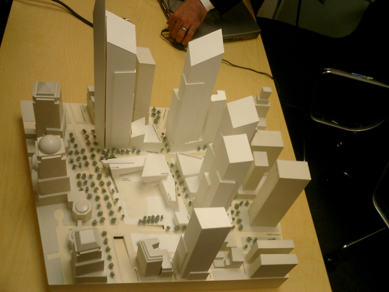
none of the buildings have been designed yet. The site plan is basically just

that – a master plan for the site as a whole – and only two of the

buildings even have architects: Santiago Calatrava for the train station and

David Childs for the Freedom Tower. I’m a much bigger fan of Calatrava than

I am of Childs, who’s responsible for the AOL Time Warner monstrosity currently

being constructed at Columbus Circle. But I’m also cautiously optimistic about

the six-foot view in general, and can answer some of the questions posed in

January.

When you stand a body’s length from the skin of the building,

what do you see? What is happening at the street level? Are there windows to

peer in? Are there newsstands? Benches? Bike racks?

At street level, the office towers are going to read largely as retail space.

The idea is to surround the core of the buildings with shops, which enhance

street life. The towers themselves are largely set back from the street, so

they’ll be very hard to see without craning your neck. Obviously, shops nearly

always want as many windows as possible, so yes, there’ll be lots of those.

And as for street furniture like newsstands, benches and bike racks, I’m sure

they’ll be there too. Libeskind is adamant that this become a vibrant new residential

neighborhood and not a soulless central business district. The absence of things

like bike racks is usually a result of no one taking responsibility for such

things. In this case, contrariwise, everybody from the Port Authority and the

LMDC to the city and state of New York is falling over themselves to make sure

that the district works as a pleasant place to live, work, and visit. You’re

much more likely to get bickering over the kind of bike racks to install than

you are to have their necessity overlooked entirely.

Can five tourists walk abreast and still leave room for accelerated

New Yorkers watching their Bostonians?

Insofar as this is possible anywhere in Manhattan, it will be possible here.

The new streets – Greenwich and Fulton – are first and foremost

for pedestrians, with wide sidewalks and lots of trees. There’s a lot of greenery,

too, on the revamped Liberty Street. Even West Street will be great if it gets

buried, although I have to admit I’m not holding my breath on that one.

Are there shops visible from the street—local shops, preferably?

The first part of the question is an easy yes, but the second part is tougher.

The WTC site is not going to grow organically like most of the rest of the city:

it’s going to be built by developers who are going to market it as a hot new

retail destination. Westfield America, the mall operator who ran the shops in

the World Trade Center, is no longer involved, but someone else will surely

take over responsibility for the retail part of the site as a whole. And given

that there’s going to be 600,000 square feet of retail to fill, I have a feeling

that the chain stores we had there before are likely to come back, maybe with

a big department store anchor. The new site won’t feel like a shopping mall

in the way the old one did, but it probably will feel like a shopping mall in

the way the Upper West Side does at the moment. I think that a large number

of national chain stores is an inevitability, if only because – obviously

– there can’t be any small local shops who have been there for generations.

Judging by the World Financial Center, there might be a few independent restaurants,

but the shops are likely to be pretty bland and corporate. Still, Century 21

is still going to be right there on Church Street, and a walk up Fulton Street

to Nassau Street will bring you back to the realm of unique New York retail.

Have piss corners been avoided? Piss corners: you know, those uncomfortable

places where the grand façades come together like wrinkled wallpaper

in a room’s corner, barely hidden, but magnets for dirt, like derelicts

and drunks and trash itself, corners which are inevitably doomed to become pissoirs.

Have windowless and doorless walls been avoided?

Since virtually all the street frontage is going to be retail, I think you’re

ok on the piss-corners and blank-walls front. While you do occasionally see

rubbish in a storefront’s doorway, the kind of thing you’re talking about usually

happens in business districts without a retail presence.

Have delivery bays and trash areas been made as small as possible,

and placed on the least active side of the building? Better, have they been

placed inside the building, in a courtyard or basement?

They’ve been placed underneath the buildings, off a subterranean road

which can only be accessed by trucks which pass a special security area to the

south of Liberty Street. The solution is pretty much ideal from a street-life

perspective: there should be no trucks on Fulton or Greenwich at all.

Have the trees been given room to grow? Or will they forever be saplings,

replaced in their tiny basins when they grow too large? What does the space

look like at night? Is it dead? Is it safe? Or does it become just another passing-through

area for those who have to be there rather than want to be there?

I’m sure the trees have been given room to grow: the LMDC has the best consultants

in the world on such matters. At night, the idea is that the area is going to

be a cultural center, with a performing arts center, restaurants, and all the

other things which will make people want to go there in the evenings, rather

than simply get out of there once the work day is over. The financial district

always has been pretty bleak at nights and weekends, but I’m hoping the new

WTC plan will change all that.

Are the public spaces contiguously external and internal?

Yes: Cortlandt Street, which becomes a pedestrianised internal shopping precinct

when it crosses Church Street, is a good example. There are multiple levels

to the plan, and a lot of what you call contiguousness between external and

internal: for instance, you can walk from the World Financial Center through

to the new train station along wide pedestrian pathways which continue all the

way up to Broadway and beyond. It’s hard to say for sure, because much of the

detailed design work hasn’t been done yet, but the idea is very much to have

a light-filled and pleasant walk around the non-memorial areas of the site which

makes it very easy to get to, say, the World Financial Center or the various

PATH and subway lines. The 600,000 square feet of retail is on many different

levels, from below ground to above it, and no one has any interest in recreating

the fluorescent nightmare that was the original shopping mall. The retail presence,

indeed, is likely to provide another easy way of getting from the below-ground

areas to street level and back, just as you used to be able to walk from the

subway to the street through Borders rather than going up the public staircase.

Are the memorial areas level with the street? Are all the public areas

entered through wide, welcoming gateways?

The memorial competition is ongoing, and no one will know for sure what it’s

going to look like until the results are announced. But at the moment, the memorial

area is sunk about 30 feet below street level, so that it’s separated from the

bustle of the street life. The slurry walls and a new waterfall will give it

auditory isolation, so that you don’t feel like you’re in the middle of a city

while you’re there, and people on the street will probably be able to go about

their business without feeling that they’re intruding on an important spiritual

experience. As for the gateways, again, that’s unclear. They won’t be there

at the beginning, but as the site plan progresses and more of the buildings

get built, they should start appearing.

It’s certainly the case that architects like thinking big, and that if you’re

designing the world’s highest building you might not spend quite the optimum

amount of time thinking about whether people are going to be able to chain their

bikes to lampposts. Some people are mistrustful of all grand plans, and are

much happier if neighborhoods are just left to develop on their own, but that’s

impossible in this situation, and the LMDC is surely the next best thing. For

the time being, I’m confident that these questions are being asked and that

we’ll be pleasantly surprised by the results as they begin to appear. The problem

is one of timing: since everything can’t be constructed at once, what will the

streets be like when they first open? My fear is that they’ll be a little too

pristine, too much like the new piers in the Hudson River Park, without any

New York City grittiness. I don’t want to see the suburbanisation of downtown

New York spread from Battery Park City to the WTC site, but I have to admit

I don’t have any bright ideas about how to prevent that.

Posted in Culture | 3 Comments

The refined WTC site plan

It’s been over seven months since Daniel Libeskind was officially

chosen as the architect in charge of the World Trade Center site, and a

lot of us have been wondering what, if anything, has been going on. Well, today

we got our answer: a lot, and it’s pretty much all good. Contra Eward

Wyatt’s alarmist

reporting last week, the changes which have been made since February are

nearly all for the better, and we have now moved, as Kevin Rampe, the CEO of

the Lower Manhattan Development Corporation, said today, "from a great

vision to a great plan".

The

most important element of the revised

plan –I took a photo of the model, which you can click on for a bigger

version – is the fact that the fate of the Deutsche Bank building (formerly

the Bankers Trust building) is no longer in question. That land is needed and

will be taken – negotiations with Deutsche Bank are ongoing,

but it was made very clear today that the bank will be forced to sell by eminent

domain if necessary. Added to that, a small parcel of land next door, which

used to house St Nicholas’ Church, faces the same fate.

The new land gives Libeskind a lot more breathing room, opening up an L-shaped

parcel which, it turns out, is vital for all manner of reasons. At the moment,

the Deutsche Bank building runs all the way from Albany Street to Liberty Street

(the southern boundary of the World Trade Center site), obliterating Cedar Street

between Greenwich and Washington. In the new plan, the L will be cut the other

way, with Cedar Street restored, creating a large park to the south of the World

Trade Center Site bounded by Cedar, Greenwich, Liberty and West Streets. Washington

Street, which currently runs all the way to Liberty Sreet, will now stop at

Cedar.

The plan at the moment – although this can change – is to build

a new Saint Nicholas’ Church more or less where the old one used to be. Otherwise,

however, the new two-block-long site will be largely empty: called Liberty Street

Park, it will be a place to sit and relax near the new office towers, close

to but not part of the memorial across the street. The really interesting stuff

goes on below the new park – both in terms of up-down and in terms of

north-south.

For the reintroduction of Cedar Street creates a new city block between Cedar,

Greenwich, Washington and Albany, all of which will be taken up with a new tower

(Tower 5) housing some 1.7 million square feet of office space. The 10 million

square feet of office space which now need to be rebuilt in total can be spread

out over much more space, giving the new towers a bit of breathing room, and

allowing small floor plates. What that means in practice is that the towers

are more commercial, since it’s easier to rent out more smaller floors than

it is fewer big ones; it also means that they don’t read quite so much as a

wall of buildings separating the World Trade Center site from the rest of lower

Manhattan.

The initial spiralling design remains; indeed, the addition of a fifth tower

(which was actually in Libeskind’s plans all along, albeit not quite as far

south as it is now) only serves to emphasise the visual path along the towers’

rooftops, from the 57-storey new building slowly up to the 70-storey office

block which makes up the base of the new Freedom Tower. The Freedom Tower (Tower

1) itself remains unchanged in Libeskind’s imagining, although there will surely

be a lot of negotiating between him and the architect, David Childs. Everybody

is adamant, however, that the symbolic 1,776-foot height will remain, as will

the off-center spire designed to echo the torch of the Statue of Liberty.

Now that the two towers on the south-east corner of the site can be made much

smaller, the revised design has much more freedom to play with their placement

on their city blocks. They can now spriral out, away from the recreated Greenwich

Street, with Tower 4 taking up the south-west corner of the block between Greenwich,

Liberty, Church and Cortlandt Streets.Cortlandt Street actually plays an important

role in the new plan: it now extends, as a pedestrian shopping precinct, all

the way to Greenwich Street. The narrowed-down Tower 4 leaves a lot of space

in the rest of the block for a major retail presence – enough for a big

department store, or any other kind of anchor tenant that the new retail developer

might want.

The new plan takes full advantage of the fact that Westfield America, who had

the rights to run the new retail space, has now pulled out entirely, being bought

off, essentially, by the LMDC and the Port Authority. Westfield specialises

in mid-Western shopping malls, and was adamant that it wanted large amounts

of contiguous retail space much like the dingy mall which was destroyed on September

11. That was never going to happen, but Westfield was always a major thorn in

Libeskind’s side, and its departure from the scene is a great relief to everybody

who has high hopes for this project. Now, a lot of the retail space is arranged

vertically rather than horizontally: going down to the concourse level of the

new train station, and going up two or three stories from street level.

To the north of Cortlandt Street, Tower 3 is nestled next door to just that

train station, basically on the corner of Church and Dey. While Tower 4 sits

on Greenwich Street, Tower 3 sits on Church Street, giving a bit more west-east

movement to the spriral. Again, there’s space for large-floor-plan retail between

Greenwich Street and the new tower, which should be easily incorporated into

the station, which is being designed by the great Spanish architect Santiago

Calatrava.

The north edge of the train station is the southern edge of the Wedge of Light,

which is now actually slightly larger than it was in February. On the other

side of this great public plaza, Tower 2 stands right on what should be one

of the greatest crossroads in the world: the corner of Fulton and Greenwich,

September 11 Place. Because Greenwich Street is not north-south so much as northwest-southeast,

Tower 2 is well to the west of Tower 4, and brings the spiral back towards the

great Tower 1 over on West Street.

But back to Liberty Street Park: what’s going on underneath it is actually

more important than what’s going on to its south. Office buildings need truck

access, you see, and there simply wasn’t any way to build secure truck ramps

and parking facilities within the confines of the World Trade Center site –

especially if the wishes of the families of the September 11 victims were to

be upheld, and nothing – not even an underground truck ramp – could

be built on the footprints of the Twin Towers. So now Liberty Street Park is

essentially a pretty, green roof for a massive truck-security operation which

then leads to an underground road which has access to all five towers in a big

loop. It’s crucially important infrastructure, and an elegant solution to a

seemingly intractable problem.

It’s very clear that a lot of very driven people are working extremely hard

to get a visionary plan built – at least in its initial stages –

within a very compressed timeframe of just four years from now. It’s also clear

that the Port Authority is a central player in this process: while in general

increasing the number of cooks tends to spoil the broth, no one’s really talking

any more about removing the Port Authority from the rebuilding by swapping its

World Trade Center land for the land which New York City owns under JFK and

LaGuardia airports. Indeed, New York City and Michael Bloomberg seem quite content,

at the moment, to take a back seat and let the LMDC and Port Authority do most

of the heavy lifting. That’s probably wise: the single most important person

in the whole scheme remains George Pataki, and there’s no point stepping on

his toes and telling him how to do things at this stage.

With the departure of Westfield America and the clear determination to take

control of the Deutsche Bank site, this plan really looks as though it is actually

going to get built. It’s expensive, of course, and the chances are that West

Street will not be buried underground despite desperate attempts by Libeskind

and the LMDC to get the funding to do that. The Freedom Tower will be on West

Street, where it makes architectural sense, and not next to the train station,

where Larry Silverstein wants it; the rest of the towers, so long as they’re

basically the right height, shouldn’t pose much of a problem.

We have yet to see even the most preliminary ideas of what the memorial might

look like, of course, and if that turns out to be a big and ambitious scheme

then chunks of the site plan as it presently stands could well change substantially.

Especially in the area of the footprints, the present scheme is extremely vague,

to give as much freedom as possible to the memorial designers. The exposed slurry

wall will certainly remain; the waterfall on the south-east corner of the site

probably will; and the rest is completely uncertain.

But even ignorant of what’s going to go in the middle, it’s clear that New

York is going to have a vibrant new downtown, complete with a set of new skyscrapers

which actually work – instead of compete – with each other. Anybody

who’s been to the Toronto Dominion Center knows what can happen when office

towers work in unison: it’s pure architectural poetry, and elevates the space

and the spirit. Today, I’m more confident than ever that such a thing can happen

in New York City.

Posted in Culture | 15 Comments

Lost in Translation

Lost in Translation is a

film about loneliness, featuring two individuals drawn to each other partly

by the pull of genuine attraction but mainly by the push of having no other

respite from their loneliness. Sofia Coppola, who wrote and directed, tries

as hard as possible to maximise the isolation of her two central characters:

she holes them up in a featureless luxury hotel in Tokyo; disorients and alienates

them with jetlag and the screaming, flashing, neon world outside; confuses them

with incomprehensible Japanese culture, and annoys them with dreadful fellow

westerners in the hotel.

Most devastatingly, however, Coppola gives both of them wedding rings, and

sees to it that their loneliness comes not despite their married status, but

because of it.

Charlotte (Scarlett Johansson) is a young bride with rather too much time on

her hands, married to a successful photographer (Giovanni Ribisi) who is so

busy that at first he doesn’t pick up on her despair. Later, he simply disappears

altogether to a photoshoot elsewhere in the country, leaving his wife alone

in the Park Hyatt Tokyo. Bob Harris (Bill Murray) is a film star with a wife

back home who’s far to preoccupied with interior decoration and school runs

to be able to lend him a sympathetic ear. While she’s better than he is at methods

of communication – she’s a master of the fax and the FedEx package –

she’s miles away, both physically and emotionally, from hearing his desperate

cries.

The hotel itself is a main character in the film, providing comforts and annoyances

in equal measure, and it’s not clear which is more alienating. The self-propelled

curtains and whirring fax machines are bad, and the elliptical trainer with

a mind of its own is worse, but the double glazing and enormous bathtubs have

a much more deadening effect on anybody who – like the protagonists in

this film – is doing little more than hanging around the hotel killing

time.

Bob is an American film star who has travelled to Japan in order to pick up

an easy $2 million for endorsing Suntory whiskey. He hates himself for selling

out, he’s repulsed by the Suntory people he has to deal with, he’s being forced

to stay an extra couple of nights in the hotel so that he can go on a dreadful

Japanese talk show, he can’t sleep, he can’t have any kind of conversation with

his wife; hell, he can’t even go for a swim in the hotel’s pool without having

to watch some ridiculous aquasthenics class. It’s got to the point where the

annoyances are even self-inflicted: he’s set his cellphone to the most annoying

conceivable ring, maybe on the grounds that feeling angry is better than feeling

nothing at all.

Murray’s performance is about as good as screen acting gets. His face is one

of the most versatile instruments in Hollywood: most of the time, in this film,

there’s really no need for him to talk at all. Here is a man who can turn a

bland advertising slogan into an angry and yet hilarious denouncement of what

he has become, filled to bursting with sarcasm and loathing, just by using his

eyes. Johansson can’t compete, but luckily Coppola doesn’t ask her to: the role

of Charlotte is a lot softer, and the 18-year-old actress does an excellent

job in presenting Murray with a yin to his yang.

It takes a long time for Bob and Charlotte to befriend each other. Both have

found a certain measure of miserable solace in their solitude: Bob sits drinking

whiskey at the hotel bar, while Charlotte, a Yale philosophy graduate, has been

reduced to listening to cheesy cod-philosophical spiritual self-help CDs through

world-excluding headphones. When she stumbles across some kind of shinto ceremony,

she’s reduced to tears by the fact that she feels nothing at all.

But because they have nothing to do and no one else to turn to, Bob and Charlotte

end up spending a lot of time together, especially those long sleepless nights

in a strange and foreign land. Tokyo, here, is a noisy, colourful, exotic place,

somewhere it’s nice to be able to have a fellow westerner with whom to escape

from your Japanese friends with a predilection for lap dancers or the vapid

Hollywood actress singing in the hotel bar. The city is shot, by Lance Acord,

with an intensity not seen since The Pillow Book – but here,

unlike in the Greenaway film, there’s chaotic real life, running in the streets,

crazy Japanese youth.

In the midst of all this, something starts to bloom between our protagonists

– something precious, fragile and beautifully doomed, like a cherry blossom.

Thrust together by circumstance, the friendship moves inexorably in the direction

of romance, the very artificiality of the situation intensifying desire while

denying any possibility of a real-world relationship. If you could love someone

deeply, just for one night, without even having sex, would you? And how would

you feel in the morning, when you had to end something which in many ways never

even existed in the first place?

Seeing this very state of affairs approaching, might you get drunk and have

meaningless sex with someone else? While it was happening, would you say that

you never wanted to leave the hotel, the last place on earth you would ever

want to be? Watching it receding, would you go for a walk in the city of your

fugue-like adventure, tears forming in your eyes? Going back to your wife and

children, would you feel impossibly torn between your family and your only hope

for happiness?

These beautiful, painful episodes are expertly interspersed by Coppola with

hilariously funny set-pieces involving Murray at the height of his comedic abilities.

The masseuse, the commercial director, the hotel gym: ask anybody who’s seen

the film about these scenes and they’ll start smiling, if not laughing out loud,

just by remembering them.

But the scene which sticks the longest in the mind is the one where Bob watches

Charlotte get into the elevator as he’s leaving the hotel. Last year, Malcom

Gladwell wrote a piece

for the New Yorker about facial expressions, explaining that some, such as the

one known as action unit

1, can generally only be formed involuntarily. We raise our inner eyebrows

all the time, without thinking, when we are unhappy, but only a handful of people

can do it deliberately. Woody Allen is one; Bill Murray is another. Allen uses

his frontalis, pars medialis to make us laugh; here, Murray uses his to break

our hearts. On screen, shot with an unflinching camera, is a picture of emotional

paralysis to pierce the soul. It’s probably too subtle and art-house a film

to garner Murray an Oscar, but there’s no doubt he deserves it.

Posted in Film | 77 Comments

Center aisles

Terry Teachout, arts blogger extraordinaire, reported

Thursday on Zankel Hall, the new 650-seat auditorium at Carnegie Hall. I would

link to its website, but I’m allergic to horrible Flash pages, so I shan’t.

I was fascinated to read Teachout’s piece, which was much more useful than the

coverage by Tommasini

and Muschamp

in the Times. But I was brought up short by one comment:

In the seating setup used at the media preview, the parterre level of the

auditorium had no center aisle and each row was about 20 seats long, meaning

that latecomers will have to stumble over earlycomers, just as they do in

the New York State Theatre. I hope the managers of the hall will try out a

center aisle at some point.

Well, I hope they won’t – or at least, if they do, that they will decide

it was nothing but an unsuccessful experiment. To be sure, bobbing up and down

as an earlycomer is a bit annoying, and it would be wonderful if we could all

be magically teletransported directly into our seats. But no reputable concert

hall will allow latecomers to try to reach their seats once the concert has

started, so it doesn’t affect the experience of listening to the music. On the

other hand, the presence of a center aisle certainly does affect that

experience, and it does so adversely.

The main reason, of course, that concert halls don’t like center aisles is

that they obliterate the best seats in the house as surely as a Robert Moses

expressway: this does huge damage to their revenues. But there are very good

aesthetic reasons to oppose center aisles as well.

For a concert is more than a group of people listening to musicians –

it is equally a group of musicians playing to the public. There’s something

about the presence of an appreciative audience that brings out the best in a

performer, and there’s something rather dispiriting about playing to empty space.

This weekend marked the finale of the greatest music festival in the world:

the BBC Proms. I’ve been to hundreds

of Proms in my time, and there’s no doubt that part of what makes them so great

is the audience. Ask any member of the Berlin Philharmonic: they’ll tell you

that they play better at the Proms because the audience has the perfect combination

of rapt attention and enthusiasm. The Albert Hall probably has the worst acoustics

of any major concert hall in the world, but it doesn’t matter: it’s still the

site of most of the greatest concert performances I’ve ever been privileged

enough to attend.

Now that which makes the Proms great, audience-wise, cannot really be replicated

elsewhere. For one thing, the best seats in the house are also the the cheapest

seats in the house – and they’re not seats at all, since in the arena,

the audience stands. For another, the Albert Hall at full capacity holds some

5,000 people: even the monstrous Carnegie Hall doesn’t break the 3,000 barrier.

Never will someone at Zankel Hall experience the intense, amazing silence of

5,000 people almost holding their breath as Claudio Abbado lets the final notes

of Mahler’s Ninth Symphony echo around the circular auditorium, until you’re

not sure if it’s the Berlin Philharmonic’s music you’re hearing any more or

if it’s just your memory of it. Neither will a New York concertgoer get caught

up in the kind of endless, exilharating applause which follows, the kind of

foot-stamping riotousness that continues even once the orchestra has left the

stage, and which brings Abbado back, alone, for one final bow.

But at the very least, New York audiences can hope that the best seats in the

house exist, and that in a medium-sized venue they will be filled with

music enthusiasts rather than corporate junketeers. A center aisle, while not

as bad in a concert hall as it is in a theatre, is still a void which puts a

damper on any musical performance – not to mention screwing up the acoustics,

which are generally designed on the understanding that any sound reaching ground

level will be absorbed by soft bodies, rather than bounced back by hard flooring.

And Zankel Hall is going to be home to a very eclectic range of music, from

all over the world: we’re not just talking chamber orchestras who mainly stare

either at their sheet music or at the conductor. Just about all the rest of

the music which is going to be performed at Zankel Hall has a much more direct

bond between performer and audience: we’re moving towards theatre here, not

away from it. I’m looking forward to world music gigs at Zankel Hall which follow

the lead of the Proms and take the seating out of the parterre entirely: let

the audience stand, move and dance! Why should it be that when a musician plays

downtown, at Tonic, say, or the Knitting

Factory, the audience stands, but when the same person plays uptown, the

audience is always seated? And of course, the only thing worse than having an

audience sitting down is not having an audience at all – having a whopping

great empty space where people should rightly be.

I have not yet been to Zankel Hall, but I am sure that the idea behind its

design was to have a relatively intimate shoebox: I’m thinking something along

the lines of the original Glyndebourne here. Center aisles destroy intimacy,

especially when the auditorium is deeper than it is wide. They should be avoided

as much as possible.

Posted in Culture | Comments Off on Center aisles

A Brief History of Elizabeth Spiers

Before Gawker, before ElizabethSpiers.com, before freelance gigs for everybody from the New York Post to Radar, there was Capital Influx. A blog dating back to when Spiers was still a drone working for a venture capital company, Capital Influx was everything you might want from such a site: eclectic, well-written, interesting, personal enough to be compelling yet not confessional enough that it descended into turgid meblogging.

Fancy an interesting exercise? Go read the Capital Influx archives for September 2002, exactly one year ago. It’s easy to see what Nick Denton saw in Elizabeth Spiers when he needed an editor for Gawker: a smart, funny, urban voice with wide-ranging interests and an intuitive understanding of the blog medium.

Fancy another interesting exercise? Go read Denton’s original manifesto for Gawker, back in December 2002.

Gawker is an online magazine for Manhattan launching in January 2003. It’s target audience is the city’s media and financial elite. Think of it as the New York Observer, crossed with Jim Romenesko’s MediaNews. The publication will be supported by advertising, primarily from real estate brokers and luxury goods retailers.

At the beginning, Gawker, as edited by Spiers, worked pretty much along those lines. The first advertiser was Corcoran, there was a whole category of postings called Real Estate, and a What Is Gawker page was posted, saying that

Current obsessions include but are not limited to, Tina Brown, urban dating rituals, Condé Nastiness, movie grosses, Hamptons gauche, real estate porn, Harvey Weinstein, fantasy skyscrapers, downwardly mobile i-bankers, Eurotrash, extreme sport social climbing, pomp, circumstance, and other matters of weighty import.

Gawker took off quickly, propelled by Denton’s media contacts and Spiers’s editorial voice, which combined insidery snarkiness with outsidery, well, gawking at the inherent ridiculousness of the Manhattan lifestyle. The best piece came at the very beginning: an interview with an East Village yuppie on the quest for the perfect coke dealer. Spiers simply let this ridiculously entitled Wall Streeter talk into a tape recorder, hanging herself: a perfect piece of journalism. It’s a devastating take-down of Manhattan culture, but with only the lightest sprinkling of irony.

Once Gawker was properly up and running, however, things changed. Spiers would issue, say, a 1,500-word report on her trip to the Condé Nast cafeteria, but already the irony was slathered on so thick that she seemed to be laughing at her own persona much more than she was saying anything interesting about either Manhattanites or their titanium gastronomic epicenter.

Then came April 21, the beginning of the end of Gawker as it was originally envisaged. That was the day that Spiers and Denton introduced their new feature, Gawker Stalker. A celebrity sightings service, it was basically a clearing house for which celebs had been seen that day in Manhattan. This was quite a departure: while sightings of Anna Wintour or James Truman might always have made it into Gawker, they would do so because only Manhattanites care about such things: they gave Spiers the opportunity to give people what they wanted while simultaneously pointing out that such a desire is both silly and exclusive. Gawker Stalker, on the other hand, appeals to the kind of people whom Spiers would otherwise ridicule as “baby boomer divorcees who drive matching Astrovans in Sapulpa, Oklahoma”.

Come July, Spiers was using up her Gawker vacation days in order to freelance at Page Six, and clearly started seeing herself as a gossip columnist first and foremost. While Gawker’s daily gossip roundup was usually entertaining, it still managed to retain a certain amount of ironic distance: isn’t it funny that Page Six thinks that Paris Hilton’s former chef is newsworthy? But with Gawker Stalker, that distance collapsed: it was reporting sightings of C-list television stars willy-nilly.

Corcoran was gone from the advertising roster at this point, to be replaced by Gawker personals: an irony-free zone leagues away from the “luxury goods retailers” Denton had originally wanted. At the same time, Spiers herself was losing her stranger-in-a-strange-land view of Manhattan as she spent increasing amounts of time with the very media insiders she would formerly ridicule.

In her Gawker bio, Spiers, referring to herself in the third person, writes that

she resigned herself to a lifetime of abject poverty and decided to write professionally. Or maybe she decided to write professionally and in the process, resigned herself to a lifetime of abject poverty. Chicken and egg, really.

This was always annoying, especially the “abject” bit: Spiers was never in abject poverty, and she knew it. She had a great life on the Lower East Side with broadband internet access, an email address at endgameresearch.com, a white-collar job, and no family to support. There was nothing abject about it, especially once the success of Gawker started to accelerate the rate at which freelance gigs came rolling in.

The general flavour of Gawker was changing: movie grosses and real-estate porn were out, breathless announcements of the new editor of the New York Times magazine were in. Gawker was becoming an insider breaking news, rather than an outsider aggregating it and layering a bunch of snark on top.

So when the news broke yesterday that Spiers was likely to take a full-time position at New York magazine, it came as little surprise. Spiers flatters herself that there would be “Conde Nast-wide peals of laughter (or a resounding “fuck you”) if I ever send a resume or query letter to Vogue,” but in fact she’s been much ruder about New York magazine than she has about the Condé Nast flagship.

Of course, such attitude doesn’t really hurt one’s chances of landing a job: all it does is open Spiers up to charges of hypocrisy if and when she finally does jump ship. But since she’ll probably land in some kind of gossip capacity at the magazine, that’s the least of the charges that’s going to be levelled at her: she’s going to have to grow a thick skin very fast.

The past year has been charmed for Elizabeth Spiers: she’s managed to parlay a low-paying blogging gig into media celebrity and what looks like a good job with benefits and a healthy expense account. Nick Denton doesn’t seem particularly upset about the imminent departure of his star editor: if anything he’s proud of acting as a launchpad for her “high-profile media gig”. Maybe he’s even secretly relieved that his Gawker brand isn’t going to be overshadowed by Spiers personally. Gawker could become a bit like Doctor Who: changing principals but remaining essentially the same thing.

Meanwhile, Spiers shall move, onwards and upwards. Or else she’ll become just another editorial employee at a New York City magazine. What’s unclear is what’s going to happen to her blogging. Spiers has been a great blogger for years now, and she obviously loves doing it. Maybe her new employer will put her talent to work on their website; maybe only ElizabethSpiers.com will remain, updating a couple of times a week with the kind of stuff she used to post every day at Capital Influx. It’ll be hard to return to pre-Gawker blogging, though: after all, she’s a celebrity now.

Posted in Media | 13 Comments

Depuy Canal House

Onwards with the Californification of the Hudson Valley! Last weekend, I visited

a small out-of-the-way food fair there, but still the local cheeses were $20

a pound, and you really don’t want to know how much the goat sausages cost.

I also managed to catch most of a speech on community

supported agriculture – which, as far as I can make out, is basically

a bunch of arriviste yuppies paying a large sum of money to a local farmer in

the hope that he will return their largesse with some nice fresh food at some

point later on in the year. Of course the local farmer will have seen where

the money is, and will be growing organic produce, which means that he gets

to treble or quadruple his prices and the arriviste yuppies have to make do

with a couple of heirloom tomatoes and an artisanal apple or two.

CSA is a bit like the global agricultural system writ small. The small Hudson

Valley organic farmers stand to large US agribusiness in much the same way as

large US agribusiness stands to global agriculture: much more expensive, and

looking for subsidies. On a national scale those subsidies come directly from

the federal government, while on the local scale they come in the form of free

risk capital from guilt-ridden liberals who would never admit to buying groceries

at a supermarket. It’s a great scheme: if the crop fails, the farmer gets to

keep the money, while the investors end up having to spend extra at the supermarket

to make up for the veggies that weren’t delivered. And the big usnpoken rule

is that no one, ever, even thinks about saying that prices might be

a little steep. After all, we’re Supporting Our Communities here: do you really

need that extra few bucks more than the farmer down the road?

So prices continue their steady climb, and Hudson Valley apples will soon be

like California wine: perfectly good, to be sure, but insanely expensive. This

is what happens when everybody tells you how wonderful you are: you start believing

your own clippings, and pretty soon ego becomes the driving force behind local

business.

Who has the biggest ego in the Hudson Valley? It’s a tough call, but John Novi

has to be high up the list. An extraordinariliy talented chef who has run the

Depuy Canal House in High Falls

since 1969, he likes to cite references to himself as "the Father of New

American Cooking," and is well known in the region for both his ego and

his prices.

I turned up at the Depuy Canal House on Saturday night, completely oblivious

of its reputation: I simply happened to be staying in the town, and needed somewhere

to eat. I’ve stumbled in a similar manner across great

restaurants in the past, and it’s a fabulous experience: you automatically

wildly exceed your expectations, if only because your expectations were so low

to start with.

But looking at the menu, which changes daily, was certainly eyebrow-raising.

Under the appetizers, for instance, the was something called a SCALLOP and SALMON

SOUFFLE UNDERGLASS with MANCHEGO CHEESE (yes, all that weird capitalisation

and italicisation was on the menu) which helpfully added that "Underglass

is a unique product patented by the executive chef John Novi". (Yes,

those quotation marks were on the menu, too.) Turns out that Underglass is not

much more than baking your soufflé in glass rather than china, although

the dish was very good.

The dish was also $18, for a starter, which gives you an idea of the prices

involved. The model

menu on the website doesn’t have a single main course for less than $32,

and even the soups – the cheapest thing you can get – are $14 each.

The restaurant also is less than transparent when it comes to pricing: the four

course prix fixe for $60 turns out to be equivalent toordering a starter, main

course and $10 dessert a la carte, along with and some fruit, bread and salad.

Even with $16 starters and $32 mains, you’re not saving any money. The seven-course

menu for $75 is no bargain either.

Astonishingly, going by anecdote, these prices are actually significantly lower

than they were not so long ago, when the prix fixe ranged into the triple digits,

and Novi would charge for everything, even bread and butter. But we’re still

talking high-end Manhattan prices for a restaurant in a tiny town in the middle

of nowhere.

To be fair, you do get high-end Manhattan food. My duck confit was divine,

even if it didn’t go particularly well with the calves liver it was paired with,

and most of the other dishes were very good. Still, there were weak points:

the hors d’oeuvres, which you get automatically as an amuse-bouche if you order

a main course, looked great, but tasted a little bland. And the desserts were

utterly unimaginative.

And then there was the service. The waitstaff is basically students from the

State University of New York working their way through college: professional

waiters these are not. They’re cocky, and while I’ll take friendliness over

stuffiness any day, these guys were overly familiar, and didn’t provide particularly

good service. It would have been fine at a $25-a-head restaurant, but when you

can drop that much on a foie gras appetizer, you want a notch or two better.

Twice our waiter complained about other diners, which I really didn’t appreciate,

and at the end of the meal he hovered over me as I worked out how much of a

tip to leave. Just in the past week, I’ve had infinitely better service right

here on Rivington Street, both at Schiller’s

and at ‘inoteca.

All that said, Depuy Canal House is a wonderful place to have a blow-out dinner

in a beautiful old setting: not only is the 1797 building lovely, but the town

of High Falls is gorgeous as well. Afterwards, rather than drive for three hours

back to Manhattan, any self-respecting hedonist, high on great food, should

retire to a suite at the Mohonk Mountain House,

just a few minutes’ drive away. I can guarantee you that the food at the hotel

can’t hold a candle to the stuff here.

Posted in Restaurants | 5 Comments

Topic Magazine

Magazine subscriptions are to households like cars are to roads: no matter

how much space or time is available, they always fill it up and then some. Across

the country, New Yorkers pile up reproachfully on bedside tables, Foreign Affairs

lies unread under a pile of bills, and topical articles of enormous interest

in the New York Review of Books grow staler by the day, eventually being tossed

into the recycling bin with yesterday’s equally-untouched business section of

the newspaper. So the last thing that anybody needs is a new journal of ideas

filled with fascinating articles and expert voices, a magazine that will only

add to the guilt complexes of media junkies across the US and UK.

Tough. It’s here, it’s called Topic Magazine,

and it’s a great read. Think of it as a younger, hipper, closer-to-the-streets

version of the New York Review of Books, only without the book reviews or topical

essays. Hm, that doesn’t help much, does it?

At first glace, Topic looks and feels a little bit like The

Believer: a squarish, perfect-bound magazine run by a bunch of enthusiastic

kids. David Haskell, the editor, has recently moved to Brooklyn on the grounds

that New York is the center of the media universe, but even he is unpaid and

having to make ends meet by waiting tables.

Topic is really nothing like The Believer at all, however, even if it shares

a certain amount of faith in the existence of a large number of young, intelligent

readers who are willing to spend roughly $10 an issue on a journal of ideas.

For one thing, it is resolutely uninterested in fiction, either as content or

as something to be written about. For another, it doesn’t have a manifesto or

any kind of general editorial voice or vision: the idea is to devote each issue

to a certain topic, and then let the experts on that subject take over with

interesting and quirky views of their own.

For much the same reason, Topic is really nothing like Granta, the other magazine

to which it is frequently compared, largely on the grounds that both were born

at Cambridge University. Topic, indeed, isn’t moving to New York entirely: it’s

keeping a large portion of its masthead in Cambridge, in an attempt to ensure

that it retains its internationalist outlook and doesn’t succumb to the New

York worldview.

Topic has lifted Granta’s idea of turning every magazine into a theme issue,

but again the difference is in the writing: while Granta wants the best writers

it can find, Topic is more interested in finding people who might not make a

living from writing, but who do know what they’re talking about. So far, no

one has contributed more than one article to the magazine, and most of the masthead

has never been published in it.

The themes of the magazine generally alternate between big and small. The first

was War; it was followed by Fantasy, Cities and Fads. Next up are Prison, Food,

and Family.

Topic generally does an extremely good job at finding writers who

both know a lot about their subject and who have an interesting and unusual

take on things. In the Cities issue, for instance, Brian Gallagher descends

into New York’s subway tunnels to follow the trail of a legendary graffiti artist,

while a bit later on the great Alex Garvin has a fascinatingly revisionist take

on Robert Moses. And don’t expect denouncements of institutional racism in the

Prison issue, or profiles of celebrity chefs in Food.

What you should expect from every issue is a very international group of contributors

– Africa, for instance, is if anything overrepresented here, which makes

for a refreshing change. You should expect articles which present hackneyed

topics in refreshing and eye-opening ways, often by people who, after reading

their pieces, you’re astonished you’ve never heard of. You should also expect

a small amount of photography, printed, in stark contrast to Granta, on paper

which actually does it justice.

Visually, Topic is nothing special, although the design is very much a work

in progress, and future issues might well have rather more pizzazz. And as a

magazine, it’s pretty homogenous: there’s no front-of-the-book material, and

all of the articles seem to hover in the 1,500 to 4,500-word mid-length feature

range. But Topic’s a quarterly, so it can get away with that sort of thing:

you have three months to get through it, after all, before newer issues start

arriving and the chances of your ever reading it begin to diminish substantially.

Topic 5: Prisons should be out pretty soon, at a quality newsstand near you.

Check it out, and tell me what you think: my guess is that there’s a good chance

you’ll find it well worth ten bucks, and decide to splurge on a $35 subscription.

That’s $30 less than The Believer, and although you’ll get fewer issues, you’ll

also get no holier-than-thou ads-are-evil philosophy, and you’ll get much more

food for thought. Assuming, that is, you ever find the time to read it.

Posted in Media | 1 Comment

Schiller’s Liquor Bar

(Warning: this posting assumes a pretty detailed knowledge of bars and restaurants

on New York’s Lower East Side. If you don’t either live here or frequently visit

Below 14th, large chunks

of it might well make very little sense.)

Keith ventures where Brian failed. The opening of Schiller’s

Liquor Bar marks the second attempted McNally assault on the Lower East

Side. The first was Brian’s Smith,

on First Street, which closed ignominiously not long after opening. It was replaced

by Starfoods, which replaced the glitz with grot and was rewarded with enormous

popularity. Keith seems to have learned his lesson: he’s set the bar for Schiller’s

extremely low. Main courses hover around the $15 level, and the wine is cheap,

in tumblers. You can order Cheap, Decent or Good: $4, $5 and $6 a glass respectively,

or $12, $15 and $17 a carafe.

Schiller’s website does the ironic slumming thing: it calls Keith McNally a

"beauty salon expert" and proclaims itself a "low life bar and

restaurant". Evidently, low life includes the likes of Anna Wintour and

Nicole Kidman, both of whom were spotted there in its first week. And there’s

nothing low life about the space, a gorgeous former pharmacy on Rivington Street

which has been decked out in trademark McNally mirrors and tiles. Anybody who

likes the front room at Pastis will feel immediately at home here.

The menu,

however, is almost aggressively unambitious. McNally might be attempting a move

away from the French bistro feel of Balthazar or Lucky Strike, but he’s replaced

it with nothing: the only interesting things on the list are the rotating daily

specials, which the kitchen hasn’t got around to actually cooking yet. ("We’ve

only been open for a week," apologises the cute and friendly waitress.)

The choice at Schiller’s is basically what you’d expect on a post-midnight bar

menu anywhere else: burgers, steak frites, a toasted cheese sandwich. Um, sorry,

a Welsh Rarebit. See? It’s not a French bistro: if it were, it would offer a

croque monsieur instead.

All of these things are done very well: after setting the bar low, McNally

then clears it with oodles of room to spare. But beyond the initial rush of

gawkers coming to check out the hot new restaurant, there’s nothing to bring

anybody from outside the neighborhood back for a return visit. Unless you live

here, the Lower East Side is on nobody’s way anywhere, and the number of nightlife

options you might want to try out before or afterwards is definitely limited

compared to what’s available in, say, a three-block radius of Pasits. Personally,

I’m over the moon that there’s a local place to get an excellent burger at 2am,

but that’s not the sort of thing which is going to turn the corner of Norfolk

and Rivington into the hot new buzzy spot.

McNally’s made a mistake with the exterior design of the restaurant, which

sits on the ground floor of one of the grottier Lower East Side tenement buildings.

Schiller’s sister restaurants,

even when they opened, had a feeling that they’d been there for years: the antiqued

mirrors, the old-fashioned menu items, the way they largely blended into their

surroundings gave the spaces the feel of the comfy leather armchairs at Pravda.

There’s a timeless quality to somewhere like Lucky Strike: it really could have

been opened at any time in the last 60 years.

With Schiller’s, however, McNally has tarted up the tenement out of all recognition,

plastering the outside in white subway tile and slapping on a couple of extremely

bright neon signs. They’re not cute retro neon like at Odeon, either: they’re

in-your-face shine-all-the-way-to-Houston-Street neon of an intensity utterly

unprecedented on the Lower East Side. Katz’s this place ain’t.

Inside, on the other hand, Schiller’s is a warm and friendly place to sit in,

and will become even more so if and when the weather ever clears up, the French

doors get pulled back and the restaurant starts spilling out on to the pavement.

The newspaper racks already feature the requisite European imports, and I’m

sure that Schiller’s will be a welcome addition to such places as Cafe Lebowitz,

Teany and Paul’s Boutique for those of us looking for a pleasant place to while

away a large chunk of afternoon with a coffee and maybe a friend. I certainly

didn’t feel rushed in the slightest as I sat at a corner table working my way

through a seemingly endless Philip Gourevitch piece on North Korea in the New

Yorker. Schiller’s is not a huge restaurant in the way that Balthazar is, and

the way the tables are curved around the bar means that even when you’re the

only diner in the place you feel cozy rather than alone.

As for the evening crowd, I’m pretty sure that Schiller’s is going to be a

bar first and restaurant second, rather like Salt Bar or Essex – or Pravda,

for that matter. The small tables are perfect for small groups meeting up for

drinks, the bar is well stocked, and if people fancy some garlic shrimp with

their cocktails they can always order it.

My guess is that Schiller’s is not going to do all that much for Rivington

Street, but that it’s going to do wonders for Norfolk. The block between Rivington

and Delancey now has Schiller’s, Tonic and Lansky Lounge, and is going to get

another restaurant very soon. Luise, the grotty coffee shop opposite Schiller’s,

has already revamped itself into something cool and sleek, and there’s another

excellent coffee place a few doors down the street on the east side. With WD-50

already feeling stale, I have a feeling that Norfolk is going to be the new

Clinton. And for those of us who like to sit quietly in the back garden of 1492,

that’s no bad thing at all.

Posted in Restaurants | 5 Comments

Making money from intellectual property

Most journalists are pretty receptive to arguments about the importance of

intellectual property: after all, we make a living producing just that. But

at the same time, it’s often clear when things go too far. I’ve yet to hear

a cogent defense of the Copyright

Term Extension Act, for instance, which was passed by Congress in 1998 basically

to ensure that Walt Disney retained copyright over Mickey Mouse, who first appeared

in 1928. (Never mind that Walt Disney himself created Mickey from an already-existing

out-of-copyright character.)

As I’ve mentioned

on MemeFirst, the best introduction to IP issues I know is a PowerPoint

presentation by Lawrence Lessig which I can’t recommend highly enough. Listen

to the first part, at the very minimum, before he gets all geeky about the Digital

Millennium Copyright Act.

This isn’t just about what Dan

Gillmor calls our dwindling heritage: old books not being available because

the copyright owners won’t print them and no one else is allowed to. The IP

zealots would have copyright last "forever less a day" (in Jack Valenti’s

formulation) and would certainly not allow Brazil, say, to manufacture AIDS

drugs which neither the sovereign nor its population could conceivably afford

to buy from the large pharmaceutical companies. Millions of lives are potentially

at stake here, and while Saturday’s development

at the WTO is a step in the right direction, it’s still not clear just how

much good it’s going to achieve.

What I find interesting are the cases in the middle. We can all agree that

someone selling pirate copies of the latest Harry Potter book is doing wrong,

whereas posting

a couple of clearly-labelled fake ads is not a criminal offense. Marty Schwimmer,

the lawyer who helped me out in the Puma case, has his own weblog, and he’s

much more of an IP zealot than I am: take a look at this entry

of his from Friday.

Firstly,

Schwimmer praises a Washington Post article

about a Herman Miller marketing

campaign called Get Real. It’s an attempt to get people to buy authentic

Herman Miller furniture rather than cheaper knock-offs, and it centers on two

designs which Herman Miller has managed

to get "trade dress" protection for: the Noguchi coffee table of 1944

and the Eames lounge chair and ottoman of 1956.

"Inferior manufacture means less value to the customer," says Schwimmer,

loyally, but I’m not at all sure. Take the table, for instance, which has already

been Herman Miller’s intellectual property for 59 years. Herman Miller is perfectly

free to continue to manufacture this item for as long as there’s demand for

it, but how much longer should it be able to do so exclusively? After

all, part of the attractiveness of the design is its incredible simplicity:

two identical pieces of wood, held together by nothing but gravity, with a simple

glass top.

The Herman Miller table, according to the Washington Post, has a "signed,

3/4 -inch glass top and ‘flawless’ finish on the wooden base," but those

features are ultimately secondary to the conceptual beauty of the piece’s design.

I’m sure that Herman Miller puts a lot of effort into getting those wooden base

pieces beautifully buffed, but I’m not sure that any number of other companies

and individuals couldn’t do an equally good job. Why not let the people who

want a signed tabletop go to Herman Miller, and allow everybody else to choose

among Noguchi tables made by all manner of artisans and cheap importers?

Herman Miller is at its least convincing when it says in its press release

that imitation "inhibits future investments in innovation" –

while this might conceivably be true in the case of drugs, which can cost billions

of dollars to develop, it’s hardly true in furniture, where thousands of designers

are working every day on new designs. Furniture design is not a capital-intensive

business, and large sums of money flowing to the Noguchi estate aren’t going

to make the design world any more innovative.

Good design should be as accessible as possible, and keeping the Noguchi table

at $1,000-or-you-can’t-have-it doesn’t help that cause in the slightest. Besides,

Herman Miller specialises in "authorized reproductions": most of the

time, the only real difference between a Herman Miller piece and a high-quality

knock-off is that the former is "authorized" and a lot more expensive.

Originals – the battered old pieces you see in museums – are another

thing entirely. Unless Herman Miller can convincingly explain why these designs

should remain its intellectual property forever, I think it’s time for the company

to stop litigating and start releasing some of the older ones into the public

domain.

Schwimmer doesn’t stop with the Get Real campaign, however: he then embarks

on one of his own, to enact some kind of censorship on the Rocky Mountain News.

That newspaper ran a column

on Thursday about fake handbags, explaining that while the Louis Vuitton’s Takashi

Murakami "Alma" style bag goes for $1,030 and has a wait list of 700

people in Denver alone, copies can be found on the internet quite easily.

This will come as no surprise whatsoever to anybody who’s done a web search

for such a thing: it’s very hard to find on louisvuitton.com, impossible to

find on eluxury.com, the lvmh online store, and incredibly easy to find if what

you’re looking for is a copy. But apparently no newspaper should be allowed

to report that: Schwimmer seems to think that knock-offs are so illegal

that even mentioning them, or saying where they can be found, should

be a criminal offense. "I will be surprised if the Rocky Mountain piece

stays online past the weekend," he says: "They are likely to hear

from LVMH, Burberry or Dooney and Bourke by then."

Does the Rocky Mountain News piece constitute irresponsible journalism? Perhaps.

The authors are bringing a great design to a readership that they know could

never afford the real thing: I can guarantee you that no one read the article,

discovered that there were knock-offs avaialble, took her name off the Louis

Vuitton mailing list, and bought a copy on the internet instead. The irony,

of course, is that if you want the real thing, the copies make it more,

not less, attractive: they’re the ultimate arbiter of which designs are the

hottest right now.

Of course, advertisers in the Rocky Mountain News would be well within their

rights to boycott the Lifestyles section if it continues to run articles like

this to which they object. But I see nothing in the article which overrides

the newspaper’s First Amendment rights to publish it in the first place, and

in fact I find it refreshing that something like this can appear in print. There’s

a lot of hypocrisy in journalism: all that’s happening here is that a couple

of women are publishing information which they’ve been telling their friends

for months.

We’ll see how long the story stays up. But in the mean time, as you’ve probably

noticed, I’m experimenting with a new way of generating revenue from my own

intellectual property. This website has been a help to my freelance career:

magazines will sometimes approach me after reading what I’ve written on certain

subjects, and it’s now a lot easier for prospective employers to get an idea

of what my writing is like. But I would like it if the website could actually

make money (just a few dollars would be fine) on a stand-alone basis, so I’ve

started running ads down the right-hand side.

The ads are served by Google, and I have no control over what they are: I do

not endorse the websites they’re advertising, and I do not ask that you visit

them. If and when someone clicks on one of the ads, I’ll receive a few cents:

I’ll need about 400 clickthroughs a month to cover my web hosting fees. I’ll

keep you posted as and when I get any money; I’m sure you’ll let me know in

the comments box if you find the ads too intrusive. My hope is that they simply

make the site look more professional. I don’t suppose there’s any chance that’s the case.

Posted in Culture | 5 Comments

American Splendor

I’m not entirely sure what the "dog days of summer" are, but if they

exist, then surely these are they. The papers are already running summer-movie

post-mortems, but the big, serious autumn films have yet to be released:

in the middle, around this Labor Day weekend, lies a dreadful doldrums where

nothing of interest seems to be showing at all.

Still, especially on hot, wet and dreary weekend evenings, a lot of people

still want to go to the movies. Thus did Michelle and I find ourselves at the

almost-sold-out 5:30 showing of American

Splendor at the Sunshine. This is a film which is gathering

a lot of steam and looks set to do very well: it’s already showing in no

fewer than seven places in Manhattan alone. Whether that’s because it’s very

good or because everything else is very bad is not clear, however.

Michelle wasn’t easily sold on the idea: we wound up basically going by default,

our only other option being Northfork

at the Screening Room. "I’m not sure I want to see a comic book movie,"

said Michelle, instantly creating a genre which would probably include The

Dangerous Lives of Altar Boys and might or might not include Terry

Zwigoff’s Ghost World

as well.

The main nod of the head in American Splendor, however, is to Zwigoff’s

Crumb, the documentary

about the doyen of the underground comics scene. It’s fitting, since American

Splendor, true to its source material, is just as much documentary as it

is feature film.

Paul Giamatti plays Harvey Pekar,

the author of American Splendor, the comic book which brought real,

working-class life in Cleveland to a world previously characterised by superheroes

and adolescent fantasies. Since Pekar is the main character in all of his comics,

he’s necessarily the main character in the film, as well. And since Pekar-the-comic-book-character

is drawn by all manner of different artists, looking very different every time,

it’s perfectly fine for us to see Pekar-the-actual-man up on screen, once even

sharing the frame with Giamatti.

American Splendor (the comic book) purports to tell true stories about

real life, but it does so through the curmudgeonly eyes of Pekar. Pekar’s wife,

Joyce (played in the movie by Hope Davis) is interviewed in the film, and talks

of episodes which make it into print only after being shorn of all their upbeat

characteristics: the comic strip has a decidedly pessimistic view of life. Pekar

is a glass-half-empty kinda guy; he even takes some kind of wry pleasure in

Joyce’s misapprehension, when they got engaged after knowing each other for

barely a week, that he had a sense of humour.

The problem with American Splendor (the film) is that it’s constantly

torn between being a portrait of Pekar the man and being a representation of

Pekar as Pekar sees himself, both in real life and in the comic book. Some of

that conflict turns up in the subject matter: while the minutiae of working-class

Cleveland existence can make for great material in a comic book devoted to detailed

observations, they are much less compelling when they appear on screen. So in

the movie, we get a lot of emphasis on Pekar’s career as a comic book artist

– something which is ultimately peripheral to the comic book itself.

More importantly, the filmmakers clearly don’t have faith in the audience to

be able to see through an unreliable narrator. For all that Pekar is a miserable

old grouch, they want to show us that he actually has a loving wife and adopted

daughter, as well as appreciative friends: the film ends with footage of his

retirement bash at work, and a horribly saccharine hug with his family. Even

if this is a genuine slice of real life and not something created mainly for

the cameras, it still violates the spirit of the comic book and of Pekar’s outlook

on life – which must be the driving force behind creating the film in

the first place.

The film uses a lot of comic-book devices, especially in framing its scenes.

Sometimes, drawn characters interact with the people on screen; often, comic-book-style

headers will announce where we are in the action. Giamatti is shown in profile

a lot, with a hangdog expression, looking for all the world like a drawn character

as opposed to a three-dimensional person. But the similarities between the original

and the adaptation seem to stop at the surface level: deeper down, the filmmakers

clearly felt that it would be in some sense helpful if they could provide the

objectivity which Pekar’s work never even aspired to.

Filming reality, however, means losing a vital part of why the movie was made

in the first place. The eureka moment – the point at which Pekar becomes

a comic-book writer – is straight out of the pages of cliché: he’s

standing behind a little old lady at the supermarket who insists on paying with

a pile of coupons. It’s the kind of observation which was stale back in the

1950s, and it gives us no idea about what it is that really made Pekar’s work

so popular. And although there are a couple of episodes with Pekar’s colleagues

which do touch on the appeal of the work, they’re rare, crowded out of the picture

by the demands of a narrative. Pekar takes up comic-book writing, gains a wife,

gets cancer, gains a daughter: the kind of beginning-middle-end which is really

pretty dull.

To be fair, a lot of the narrative part of the film is in fact based on a comic

book: Our

Cancer Year, which was written by Pekar and his wife, thereby getting both

of them writing credits on the movie. The book even performs some narrative

heavy-lifting of its own: rather than us seeing Pekar at his low point during

the treatment, we cut from scenes of Giamatti and see instead the way the book

portrays Pekar feeling as though he’s got ants crawling under his skin.

But all of the parallel story of the book – which has to do with the

1991 Gulf War – is lost, and in general it seems that the appeal of Pekar

and his comics is exactly the thing which has been jettisoned by filmmakers

desperate to inject some structure into what is basically unstructured source

material. Pekar’s a trees man, while the filmmakers are more about forests,

and the result is a slightly unhappy neither-one-thing-nor-the-other.

That said, the performances are excellent, and the film is surely infinitely

better than other recent attempts

at adapting comic book material for the screen. In those cases, however, you

could see how the source material would lend itself to Hollywood. In the case

of American Splendor, one exits the cinema wondering why, exactly,

anybody thought this film was a good idea in the first place.

Posted in Film | 2 Comments

Metrosexuality

Four years ago, I went to a wonderful wedding on an island in the Thames, between

a hot young MBA and a hotter, younger stand up comic turned newspaper columnist.

The columnist, protocol be damned, decided she was going to give a speech at

her own wedding, and gave a corker. The highlight was when she started to talk

about her new groom’s bathroom cabinet, and whether she’d ever manage to get

any space in there for herself. She recalled a conversation with her father:

"Don’t worry, I said, you’re not losing a daughter. You’re gaining one."

I would like to think that this wedding constituted the impetus for the coinage

of America’s latest buzzword: after all, everybody knows that the US imports

everything cool from the UK. But, alas, although the word did indeed take root

in England before crossing the pond, it had already been around for five years

when the wedding took place.

Still, the meme took off incredibly slowly. Its first significant appearance

in the US came in July 2002, when queer theorist Mark

Simpson, the man who’d first introduced the term in the Independent in 1994,

wrote an

article in Salon called "Meet the metrosexual". One year later,

an article

by Warren St John headlined "Metrosexuals Come Out" appeared in the

New York Times, and the meme metastasized from snowball to avalanche, helped

along by a report from advertising agency Euro RSCG called "Metrosexuals:

The Future of Men".

In the meantime, it’s undergone an interesting emasculation. Simpson says

that when he invented the term he "was being slightly satirical about the

effect of consumerism and media proliferation, particularly glossy men’s

magazines, on traditional masculinity". Now, we get Dan Peres, the editor

of Details, opining

humourlessly on the subject at washingtonpost.com. In the introduction to

the chat session, the editors define a metrosexual as "a new kind of male:

one who takes care of himself — pampers himself — and is not ashamed of getting

facials, buying grooming products and shopping", but by the time the chat

is over, Peres has said that "if you feel comfortable and confident with

your own taste and sense of style, then yes, you may well be a metrosexual",

and that really, what we’re talking about here is nothing more or less than

being a gentleman.

Yet going back to Simpson’s Salon piece, we find this:

Mr. Beckham, candid to the point of blatant exhibitionism as he is, is not

being entirely honest with us about his sexuality. Outing someone is not a

thing to be contemplated lightly, but I feel it is my duty to let the world

know that David Beckham, role model to hundreds of millions of impressionable

boys around the world, heartthrob for equal numbers of young girls, is not

heterosexual after all. No, ladies and gents, the captain of the England football

squad is actually a screaming, shrieking, flaming, freaking metrosexual. (He’ll

thank me for doing this one day, if only because he didn’t have to tell his

mother himself.)

It’s clear what has happened here: as the term has become more mainstream,

it’s, well, become more mainstream. At this point, if you believe Peres, it applies

to anybody who "knows the difference between a daisy and a daffodil";

Simpson himself quotes the marketing report (of course, it’s the marketers who

have really pushed this concept) saying that a metrosexual is "any straight

man who has a salmon pink shirt in his wardrobe".

Maybe something got lost in translation: after all, pretty much every

straight man, in the UK at least, has a salmon pink shirt in his wardrobe. John

Major used to wear them the whole time, and he’s about as far from a metrosexual

as can be imagined. The only men I can think of who only wear white shirts are

bizarre zealots like Ross Perot and John Ashcroft, who aren’t so much anti-colour

as they are opposed to any sign of sexuality whatsoever.

I think what’s going on here is that a debate which has long been going on

in the gay community is being expanded into the straight community. Metrosexuality

is a response to sissyphobia,

which is the idea – common to men both straight and gay – that there’s

something offputting about effeminate men. As Patrick puts it on the Gothamist

comments board, "the guys who get the most shit are not necessarily

those who are gay but rather those who act gay, a high percentage of whom are

straight".

Why did the joke at the wedding get such a big laugh? Because caring about

personal appearance, owning lots of Product in the bathroom, is considered effeminate.

And that’s precisely what keeps a large proportion of straight men from buying

designer clothes or investing in their appearance, even if the basest of men’s

magazines – I pick up the copy of Loaded I have lying around

from my July 19 entry

have pages and pages full of grooming products along with £280 ($445)

leather Hermes sandals.

So while Peres is keen to place clear blue water between metrosexuality and

the success of Queer

Eye for the Straight Guy, I’m not so sure: both are phenomena which

have caught on across the country and which have served to increase the country’s

general comfort level with effeminate heterosexual men.

On my recent trip to California (yes, that’s why this site hasn’t been updated

in so long), I met extremely straight, suburban, Republican men from towns like

Tustin and San Jose. All had heard of metrosexuals, and none of them seemed

perturbed by the concept, although they might never swing that way themselves.

I doubt they’ll be booking themselves in for manicures or shelling out hundreds

of dollars for designer trousers any time soon, but that’s not the point. The

point is how they will react when they meet men who do fall into that category:

will they respond with fear and aggression, or will they be more likely to embrace

such predilections as just another lifestyle choice, like a preference for ice

hockey over baseball?

As Simon Dumenco writes

in New York magazine, Queer Eye for the Straight Guy "brings

gay style—and wit—to the hinterlands. The show makes homosexuality

and shopping nonthreatening for straight men (the latter may be the bigger achievement)."

He continues:

The real agenda at play these days is, of course, the Buysexual Agenda. As

in: You are what you buy (not who you sleep with). It’s a uniquely American

idea that the nation that shops together stays together. If homos and heteros

like the same moisturizers and the same jeans, why can’t we all get

along?

In short, memes can make a difference: as metrosexuality becomes more widely

understood, it makes the world (or at least America) safer for gay and gay-acting

men. And if it takes increased sales of $1,000

messenger bags in order for that to happen, then surely that’s a small price

to pay.

Posted in Culture | 105 Comments

LMDC in the LES

It’s not been an easy week for the Lower Manhattan Development Corporation.

The people who brought you one of the biggest public consultation exercises

of all time – the one culminating in the decision

to award Daniel Libeskind the mandate to design the new World Trade Center site

– now have $1.2 billion of federal money burning a hole in their corporate

pockets. This is money which is meant to be spent for the benefit of Lower Manhattan,

and so the LMDC has tried to ask the area’s residents what they think the money

should be spent on. The problem is that its Neighborhood Outreach Workshops

– or at least two of them – have been chaotic.

Here’s the relevant

bit from the LMDC website:

Specific LMDC activities and programs are presently funded by a $2.0 billion

Community Development Block Grant administered by the United States Department

of Housing and Urban Development (HUD) for the World Trade Center disaster

recovery and rebuilding efforts and an anticipated second grant for $783 million

targeted for damaged properties and businesses, including the restoration

of utility infrastructure, as well as economic revitalization related to the

terrorists attacks, and to assist businesses that suffered disproportionate

loss of life from the September 11 attacks.

The LMDC scheduled six workshops: for the City Hall/Seaport area; for Battery

Park City; for the Financial District; for Soho/Tribeca; for Chinatown; and

for the Lower East Side. Only the Soho/Tribeca workshop has yet to happen, and

no one is foreseeing any problems there. The first three workshops all went

smoothly, too. But Chinatown and the Lower East Side – that’s where the

shouting started.

The workshops were organised by inviting the LMDC’s community and cultural

contacts to nominate people who they thought should be involved. In the case

of the Lower East Side meeting, which took place this evening at the University

Settlement on Eldridge Street, 100 people were eventually invited, 90 RSVPed,

and about 50 actually showed up on a hot and muggy Wednesday evening.

Most of the participants arrived in the expectation of a collegial meeting,

where community representatives could help the LMDC prioritise the kind of projects

it is going to undertake in the neighborhood. What they didn’t expect was what

they found when they reached the venue: a crowd at least as big as the number

of people inside, standing outside with signs and bullhorns, protesting at being

excluded from "this secret closed-door meeting". The protest on the

Lower East Side wasn’t as out of control as the one in Chinatown, where windows

got smashed, but it was certainly loud and disruptive. It was organised by NMASS,

the National Mobilization Against SweatShops; their main complaint

was that "LMDC is not giving out the money they are supposed to give to

poor people, instead they are using these funds to build luxury housing to kick

poor people out of the Lower East Side and Chinatown."

It was actually a fair complaint, and one with which most of the invited community

representatives were sympathetic. In fact, there was a general feeling in the

meeting that at least some of those outside – as many as could be accommodated

– should be allowed in to participate, since they had at least as much

right to take part as any of us inside. But it was not to be, and the LMDC promised

instead to hold another meeting in the next couple of weeks to which anybody

excluded from this one could come.

Even if they had been allowed inside, however, the protestors would not have

been happy. There were many people with identical views in the meeting, and

the general feeling was one of mistrust: that they were being used as a "PR

vehicle" for the LMDC to be able to claim community consultation while

in reality simply ramming through whatever spending decisions its men in suits

had more or less already decided should be made.

The LMDC didn’t help matters by opening the proceedings with a general overview

of the New York City "Vision

for Lower Manhattan", which is in reality only peripherally related

to the disbursement of the HUD grants. The assembled neighborhood activists

were presented with a glossy PowerPoint presentation all about a grand new transit

hub, the importance of new communications corridors between the Financial District

and New York’s airports, and in general the outlines of the plan (which, I have

to say, is an excellent one) for integrating the World Trade Center site into

Lower Manhattan, and for integrating Lower Manhattan much more effectively into

New York City and its environs.

Since the plan has been around for the best part of two years now, the general

impression given was one of a process where the big decisions have already been

made. While the LMDC thought it was generating genuine bottom-up grassroots

ideas for how it should spend its HUD money, the grassroots activists thought

they were basically being used to provide a veneer of democratic accountability

for a top-down decision-making process which is sorely lacking in transparency

and which they had very little trust in, much of the money already having gone

to subsidising luxury accommodation in the Financial District.

The LMDC’s next big mistake was to ask for ideas under certain headings, one

of which was transportation. With the plans for transit hubs and air trains

fresh in our minds, it certainly seemed as though the LMDC was pretty determined

to go ahead with its large-scale projects, to the detriment of the things which

really mattered to the community: things like low-income housing, job retention

and creation, and the strengthening of existing neighborhood institutions, from

small businesses to arts and community centers.

In fact, while I’m sure the LMDC would love HUD’s money to help realise its

broader vision, there’s no conflict between transit hubs and community outreach.

The money for each comes from different places, and money spent on the World

Trade Center site is not money which could or would otherwise be spent on the

Lower East Side.

The suspicions of the attendees notwithstanding, then, I think the exercise

was useful. It’s clear, for instance, that there’s precious little interest

in, say, traffic-control measures, but that many people are very interested

in a genuinely community-focused redevelopment of Seward Park. If there

was unanimity on one thing, it was this: that the Lower East Side does not stop

at Houston Street, and that the LMDC should concentrate its attention all the

way up to 14th Street rather than drawing lines in the sand which bisect longstanding

communities.

In reality, however, the whole exercise felt a little bit fraudulent, and smelled

of political pandering. Look at this

map: it’s the boundaries of the assembly district of New York State Assemblyman

Sheldon Silver, one of the three most important politicians in the state, and

a key mover behind this community outreach program. It should help explain why

the Lower East Side and Chinatown – the "problem" meetings in

the outreach program – are included in it at all.

Do we Lower East Siders really need HUD help more than any number of neighborhoods

in Harlem, or Brooklyn, or the Bronx? Were we more severely affected by the

events of September 11 than commuter towns in Jersey or Long Island? Not really.

The Lower East Side is not Lower Manhattan, and what people were asking for

this evening is exactly what they would be asking for had September 11 never

happened. This federal money was meant to go to help repair the gash which appeared

at the bottom of this island that day; it was not meant to subsidise the Lower

East Side Boys’ Club, no matter how worthy a cause that might be.

If I were the HUD, I would consider the shouting and the demonstrations in

the Lower East Side and Chinatown to be evidence – if any were needed

– that the impact of September 11 is a bit like gravity, decreasing with

the square of the distance from the center point. There’s little controversy

over what needs to be done for the neighborhoods in the immediate vicinity of

the World Trade Center, because they were genuinely devastated by the events

that day and because their needs are being intelligently (if not adequately)

addressed by both the LMDC and the mayor’s office. Get much beyond the Brooklyn

Bridge, however, and quotidian neighborhood concerns – the kind of things

which can be found in any community in any city in the world – rapidly

outweigh anything directly or even indirectly related to the events of September

11.

But try telling that to NMASS.

Posted in Culture | 1 Comment

Crap writing about mainstream movies

About ten years ago, a small and fiery magazine was started up in England by

Toby Young and Julie Burchill. Called the Modern Review, its slogan was "low

culture for highbrows", and it was a real breath of fresh air. Here was

an intelligent magazine which took Hollywood product seriously, running excellent

pieces by the likes of Ray Sawhill on films

which were more generally considered beneath contempt.

Unfortunately, it’s all gone downhills from there. Young and Burchill had a

huge fight; Young torched the magazine, ran off to New York, and managed to

seriously annoy just about everybody he met before throwing in the towel, moving

back to London, and writing a snarky

book about how crap American media types are.

In New York, meanwhile, Sawhill remained at Newsweek, but has evidently failed

to exercise any control over the magazine’s coverage of popular movies.

Big films are always surrounded by vast amounts of hype and anticipation, and

so it’s all well and good that Newsweek should run a long

on-set feature about the making of the next Harry Potter movie. Gothamist

ran

the meta-story today, and it didn’t take long for a consensus to coalesce

in the comments section: in the words of the great Jen Chung, "It’s a totally

shitty article".

There is, of course, no reason why stories about Harry Potter should be worse

than stories about art-house films, or stories

about international geopolitics. I know that not all of Newsweek’s writers

can be stars like Fareed Zakaria. But surely they can do better than this. Running

through the article, what do we find?

Clichés galore.

  • "Every fan of the franchise has torn through the thunderous new book".
  • "Cuaron doesn’t have full run of the joint."
  • "Cuaron hops on his bicycle."

Innacuracy and exaggeration.

  • The Dandy Warhols (formed in 1994) are an "edgy new act".
  • The second film’s worldwide box-office gross of $869 million is "nearly

    $1 billion".

  • The director, Alfonso Cuaron, "got an Oscar nomination last year for

    the teen-sex romp Y Tu Mama Tambien."

    Really? Well, up to a point, Lord Copper. It’s a bit like those film trailers

    which talk about "Oscar winner Ben Affleck": while technically true,

    it conveniently elides the fact that the Oscar in question was for screenwriting,

    not for directing or acting. Besides, Y Tu Mama just isn’t

    a "teen-sex romp".

Simply bad writing.

  • "Cuaron notes that his teenage cast is coming of age just as the characters

    are, and that there’s, uh, pollen in the air."

    I think this is meant to be some kind of double-entendre: that’s presumably

    what the "uh" signifies. But pollen?

  • "Potter fans have grown used to a movie every Thanksgiving, but “Azkaban”

    will arrive in the teeth of the summer movie season on June 4, 2004."

    It seems that Newsweek has taken to heart the maxim that "two=trend".

    The second Harry Potter film happens to be released exactly a year after the

    first one, and suddenly there’s a new episode "every Thanksgiving"?

    And what on earth does "in the teeth of the summer movie season"

    mean?

Finally, there’s this completely inexplicable sentence, which comes at the

end of a passage about Cuaron’s anti-war politics. Voldemort is a little bit

like Bush, he says, and Blair reminds him of Fudge, another character in the

book. What do we conclude from these outspoken opinions?

"Cuaron’s scrappiness is either refreshing or worrying, depending

on your stock portfolio."

Depending on your what? I guess the views expressed could be construed

as being refreshing if you were anti-war, or worrying if you were pro-war. But

in what bizarre parallel universe does that have anything whatsoever to do with

the stock market?

Amazingly, it took two different writers to come up with this garbage. It reads

like it was tossed off as quickly as possible, on the grounds, perhaps, that

the subject matter didn’t merit any more serious effort. That’s profoundly depressing:

we’re living in a world where truly excellent popular films like Catch

Me If You Can or Pirates of the Caribbean have to compete

with dreck like Charlie’s

Angels: Full Throttle.

Newsweek can and should provide a service to its millions of readers. These

are people who are interested in Hollywood and who want to know about what’s

going on there. Articles like this only serve to increase cynicism about films

as entertainment industry Product, backed up by brainless hype, and certainly

not anything to be taken seriously.

James Surowiecki this week has an

article about how films might open with enormous box-office success on their

opening weekend, but that beyond that first week, success is all about word

of mouth and how much people actually like the film. In other words, the first

weekend is the triumph of hype, while the size of the rest of the theatrical

run is much more correlated to popular and critical reaction. Newsweek should

be concentrating on the latter, but seems to have been dragooned instead into

supporting the former. Once again, the interests of the advertisers have won

out over the interests of the reader.

Posted in Media | 2 Comments

Coming to America

Back in the olden days, American immigration protocols were little more than

a punchline for the bien-pensant: the way that you always had to answer

the question about whether you were, or ever had been, a member of the Communist

Party. You ticked the box saying no, you entered the country, you got on with

your life.

Things are very different now. People who follow immigration issues closely

already know this, but it seems to me at least that most of the recent changes

in the law have generally gone unnoticed.

Many of the changes seem designed to maximise inconvenience. The Immigration

and Naturalization Service, or INS, no longer exists: it has been moved from

the Department of Justice to the Department of Homeland Security, and its name

has been changed to the Bureau

of Citizenship and Immigration Services, or BCIS. The old enforcement role

of the INS didn’t move to BCIS, however: it’s now a different part of Homeland

Security, called the Bureau

of Immigration and Customs Enforcement, or ICE.

Meanwhile, the arm of the government which actually issues visas remains the

Bureau of Consular Affairs at the State

Department, although State seems to have much less control over what it does

and how it does it than it used to. Unless you come from one of 27

countries, you always need a visa to visit the US, but until now individual

consulates have had a lot of discretion in terms of the hoops they may or may

not force people to jump through before getting one. Starting tomorrow, however,

every single visa issued for entry into the United States will have to follow

a personal interview between the applicant and a consular offficial.

It’s not like the system is working smoothly at the moment and will easily

be able to cope with the extra workload. Back in May, when the system changed

and most people started having to have interviews, the State Department said

that

Visa applications are now subject to a greater degree of scrutiny than in

the past. For many applicants, a personal appearance interview is required

as a standard part of visa processing. Additionally, applicants affected by

these procedures are informed of the need for additional screening at the

time they submit their applications and are being advised to expect delays.

The time needed for adjudication of individual cases will continue to be difficult

to predict. For travelers, the need for an interview will mean additional

coordination with the embassy or consulate is needed to schedule an interview

appointment. We recommend that individuals build in ample time before their

planned travel date when seeking to obtain a visa.

Now, things are only going to get worse. Whole classes of visitors, like South

Koreans over the age of 55, who were not interviewed until now, will have to

start waiting for appointments. (The Seoul consulate is the most overworked

in the world: since South Korea isn’t part of the visa waiver scheme, every

Korean in the US needs a visa, and there are a lot of Koreans travelling here.)

It’s not just Koreans who are going to be inconvenienced, however. The waiting

time for obtaining a visa in Delhi is already legendary, and even America’s

best friends, the Israelis, have to go in for a personal interview if they want

to be able to travel to the United States.

You even need a personal interview if all you’re doing is changing

your visa. Here’s a true story: a Turkish journalist was working for a US news

organisation on an H visa, and then switched jobs to work for a Turkish news

organisation. So he applied for, and received, a change of status from the Department

of Homeland Security: they approved his change from working on an H visa to

working on an I visa. (These things are incredibly important if you’re a foreigner

in the US.) The journalist then was sent down to Venezuela to cover the demonstrations

there, whereupon he learned that he wasn’t allowed to return to the US. He had

his authorisation from Homeland Security, but he didn’t have his actual new

visa, from State. To get that, he had to fly from Venezuela to Turkey,

apply for the visa in Istanbul, get the piece of paper in his passport, and

then, finally, go back home.

While all these things are justified in the name of increased national security

post-9/11, most of the inconveniences with the system seem to be bureaucratic

snafus rather than anything justifiable on the grounds of the war against terror.

It’s hard to understand, for instance, why I would need

to register with the State Department just to be able to get a driver’s

license, and only because I’m a journalist.

And things are going to be getting worse for the foreseeable future. By October

26 next year, for instance, all US visas will have biometric information embedded

in them somehow – the State Department isn’t entirely sure how, yet. There

will certainly be a photograph, and probably a fingerprint, or maybe some kind

of retinal scan. Once I get my next visa, I’ll probably have my fingerprints

or irises checked every time I come into the country. There’s no way that that

is going to speed up the lines at JFK.

I’m lucky, however, that I’m from one of the 27 visa-waiver countries, rather

than one of the 27 NSEERS countries, since citizens of those countries are already

fingerprinted and photographed every time they enter the US. (Since State does

visas and Homeland Security does immigration, the two programmes are completely

separate, and soon visitors from these countries are going to have to be fingerprinted

twice before they enter the country: once when they apply for their visa, and

then a second time at the airport.)

NSEERS, which stands for National Security Entry Exit Registration System,

is by far the most Big Brotherish of the government’s programmes. It’s expanding

fast: it started with just Iran, Iraq, Libya, Sudan and Syria – the countries

you can imagine that the US would be most worried about. Soon men from Afghanistan,

Algeria, Bahrain, Eritrea, Lebanon, Morocco, North Korea, Oman, Qatar, Somalia,

Tunisia, United Arab Emirates, and Yemen were added to the list: it seems that

the US was keen to cover pretty much the entire Arab world. Next came Pakistan

and Saudi Arabia, followed by Bangladesh, Egypt, Indonesia, Jordan, and Kuwait.

Yes, all men from friendly, secular Muslim countries like Egypt and Indonesia

now have to get fingerprinted upon arrival in the US, and then need to report

to the authorities after being here for 30 days and then every year thereafter.

If they arrived here before the rule was enacted, they need to report to an

Immigration Office anyway. And if anything is found to be amiss with their status,

they’ll probably be deported.

It gets worse. It’s not only INS (sorry, BCIS) agents who are going to be wielding

this kind of power – after all, they’ve been doing that kind of thing

for years. But here’s John Ashcroft, announcing

the scheme:

When aliens violate these rules, we will place their photographs, fingerprints,

and information in the National Crime Information Center (or NCIC) system.

The nation’s 650,000 police officers check this system regularly in the course

of traffic stops and routine encounters.

When federal, state and local law enforcement officers encounter an alien

of national security concern who has been listed on the NCIC for violating

immigration law, federal law permits them to arrest that individual and transfer

him to the custody of the INS.

In other words, get caught speeding – or even just get stopped as part

of a routine traffic stop – and you could be deported. And if you’re burgled,

or assaulted, if you’re being abused, or being paid less than the minimum wage,

don’t even think about going to the police. If John Ashcroft was deliberately

trying to create a scheme where immigrant communities would be cut off from

the rest of society and pushed into taking the law into their own hands, he

could hardly have designed it better.

What’s more, the government isn’t going to stop now it’s covered the entire

Muslim world. Notes Ashcroft: "Congress has mandated that, by 2005, the

Department of Justice build an entry-exit system that tracks virtually all of

the 35 million foreign visitors who come to the United States annually."

So along with their biometrically-enhanced visas, some 35 million visitors

a year to the Land of the Free are going to be tracked by the Department

of Homeland Security. Here’s Ashcroft again:

We are an open country that welcomes the people of the world to visit our

blessed land. We will continue to greet our international neighbors with good

will. Asking some visitors to verify their activities while they are here

is fully consistent with that outlook.

So just remember, next time you’re asked to "verify your activity",

that in fact you’re beeing greeted with good will. There. It doesn’t

seem so bad, now, does it?

Posted in Politics | Comments Off on Coming to America

Dia:Beacon

I went up to Dia:Beacon last month,

and wrote it up for Loft

magazine, available in English at all good Miami newsstands. For those of you

without easy access to a Miami newsstand, however, here’s the article: enjoy!

Since long before the Guggenheim Museum single-handedly revitalised the entire

Basque economy with its Gehry-designed, titanium-clad outpost in Bilbao, it

has been an article of faith among museum directors that new art galleries have

to make a splash. Whether it was Renzo Piano and Norman Foster in Paris or James

Stirling in Stuttgart, architecture has long trumped art: the thing you most

remember after visiting these places is the building, not its contents. Eventually

the process reached its logical conclusion when crowds lined up around the block

to view Daniel Libeskind’s new – and empty – Jewish Museum

in Berlin.

But that is all in the past. To see the future, you need to travel 80 minutes

up the Hudson River from New York City, to the characterful if crumbling town

of Beacon. Built on light-industrial manufacturing and long in decline, Beacon

has suddenly become revitalized by the construction and opening of the world’s

biggest museum of contemporary art.

Dia:Beacon breaks all the rules. For one thing, no big-name architect is claiming

credit for it; for another, it’s all but invisible from any direction

until you’re more or less on top of it. The views you remember after a

visit there are not from the outside looking in, but rather from the inside

looking out: standing in a gallery full of John Chamberlain sculptures, with

the verdant riverside forest visible through the characterful old windows which

let in more light than you’ve ever experienced in an art museum before.

Direct sunlight has historically been the enemy of fine art, which can be damaged

by unfiltered ultraviolet radiation. But Dia has an art collection full of pieces

made of steel, glass or string, and these – impervious to light damage

– have never looked better than they do here.

The centerpiece of the collection is a series of monumental sculptures by Richard

Serra, installed where the rail sidings used to be – Dia:Beacon is housed

in a converted Nabisco packaging factory. Serra has bent and torqued enormous

slabs of Cor-Ten steel into previously unimagined forms, and the unidirectional

light coming from the high windows causes them to cast dramatic shadows on themselves

which change in subtle and unexpected ways over the course of the hours and

months. Serra’s most recent sculpture, 2000, takes the visitor on a spiral

journey into a light-and-dark-filled inner sanctum with walls the color and

texture of ancient sandstone. A sign at the entrance to the gallery admonishes

visitors to “please do not touch the artworks,”but everybody does:

they have no choice, in fact, given the narrowness of some of the steel corridors

into which they are forced.

Dia is full of such pieces: works which engage the body of the viewer, rather

than just his eye or brain. Fred Sandback, for instance, uses the simplest possible

means – lengths of acrylic yarn -– to literally carve out spaces

in the gallery. You walk up to them and then you walk through them: almost as

if you’ve become a ghost who can walk through walls. The feeling is one

of heightened sensitivity: suddenly cracks in the poured-concrete floor take

on a sculptural significance.

The idea of art residing not in a single object but rather in the way that a

viewer experiences a space is common to many of the artworks at Dia. Robert

Ryman, for instance, has taken his paintings – which started off as more-or-less

conventional oil on canvas – and both pared them down and expanded them,

so that distinctions between the painting, the wall on which it is mounted,

and the gallery space in which the wall is contained all start to blur in to

each other. And Robert Irwin, who was one of the first artists to explore such

boundaries of what could and couldn’t be considered art, has worked entirely

outside the formal gallery space altogether, landscaping Dia’s gardens

and car park.

Meanwhile, Walter De Maria has a series of highly poliched stainless steel squares

and circles running in parallel down the length of two long, long galleries.

Most visitors don’t spend much time with them, but in a sense that doesn’t

matter: even if they don’t consciously realise that the forms get slightly

bigger or smaller, nearly all the people who visit Dia will on some kind of

level get a frisson of distorted perspective.

Such works change the whole experience of museum-going: rather than simply walking

around looking at paintings on walls, Dia’s patrons become that much more

highly attuned to everything around them, even when they leave the gallery entirely.

This is what happens when artists, rather than architects, take control of a

building.

Dia spent a lot of time and money making sure that the necessary infrastructure

of a modern art museum was invisible to the visitor. “A lot of expense

went into making it look like the building was a raw, mechanical structure,”

says Michael Govan, Dia’s director. Govan likens the roof of the gallery

to a computer chip: in order to maintain the cleanliness of the gallery spaces,

all the pipes, wires and whatnot got bumped up top. “The idea was that

it would have that simplicity and calm and light and space,” he says –

and it does. Such simplicity doesn’t come cheap: Dia:Beacon cost more

than $57 million to construct and renovate, even after having been given the

building for free by International Paper, its most recent owner. The amount

is pretty reasonable on a per-square-foot basis (there are 240,000 square feet

of exhibition galleries alone), but Govan would still take it as a compliment

to be told that it doesn’t feel like $57 million has been spent here.

You’re not meant to admire the architecture: you’re meant to admire

the art.

And there’s a lot of art to admire, arranged in rooms which were designed,

mostly, with the active cooperation and involvement of the artists concerned.

Every artist gets his or her own space or spaces, which means that there’s

almost nothing in the way of curatorial mischief. (The closest Dia comes is

probably placing an early Richard Serra scatter piece right next to Joseph Beuys,

emphasizing how similar these titans of European and American contemporary art

really were.)

So Richard Serra divides up the gallery into narrow, claustrophobic spaces filled

with massive works; Gerhard Richter installs a series of gray mirrors underneath

a clerestory of skylights; and Louise Bourgeois retreats, insect-like, to the

attic, where she installs one of her trademark spiders, as well as a haunting,

darkened shrine full of sexual menace.

But interestingly, often it’s the dead artists who come off the best.

Dan Flavin’s huge series of fluorescent-light “monuments”

are stunning in the daylight next to a window-filled wall, while painting cycles

from both Blinky Palermo and Andy Warhol sit simply and beautifully under the

natural light of Dia’s north-facing sawtooth skylights.

Living artists like Robert Ryman and Agnes Martin, on the other hand, seem to

have done their best work in the early 60s, near the beginning of their careers,

and have indulged their freedom to exhibit what they want by showing too much

of their weaker, later pieces.

But that’s the way that Dia works, and is meant to work. Dia was founded

to be, and remains, a place which supports a few artists in an extremely generous

manner – hence the fact that this enormous museum houses the work of just

24 artists. The vast majority are going to be here permanently: if you come

back in 20 years’ time, this place will look much the same as it does

now. It’s the kind of legacy most artists can only dream of, especially

when they themselves are involved in every aspect of the installation of their

own work.

For Dia takes the historical perspective: Govan points out that Walter De Maria’s

Lightning Field – another Dia project – has been seen by some 15,000

people since its installation near Quemado, New Mexico, in 1977, despite only

a handful ever experiencing it at any one time. He’s therefore comfortable

not spending any money on advertising, since over a period of decades it’s

inevitable that a huge number of people are going to pass through his doors.

Here’s one man refreshingly free of the feed-the-masses culture seen at

places like the Guggenheim or the Tate – a museum director who seems genuinely

not to care how many people visit his flagship venue. “Whether it’s

50,000 or 200,000 people a year,” he says, “is not really a huge

concern.”

Posted in Culture | 4 Comments

Girlie Mags and serious journalism

Seth

Mnookin had quite a

scoop yesterday: it looks like Penthouse is about to go under. Apparently

Friday’s paychecks were slashed by 75%, and the parent company’s long-precarious

finances have never looked worse. The latest issue of Penthouse could be the

last ever: something even owner and editor-in-chief Bob Guccione is not blind

to. He told the New York Times over a year ago that there is “no future

for adult business in mass market magazines.”

Mnookin says that

For years, Penthouse has been squeezed from both directions by the Scylla

and Charybdis of men’s entertainment. On the one side, the monster growth

of hard-core pornography on the Internet has meant that consumers no longer

need to suffer the embarrassment of receiving their mail in plain brown wrappers.

On the other side, the rise of laddie publications like Maxim and FHM has

meant there are publications that show a lot of skin without the stigma of

being pornographers.

He’s undoubtedly right, but I think he misses something. Playboy and Penthouse

are unique among magazines in that they attempt to deliver everything a man

might want: smut, yes, but also (gasp!) interesting articles. The death of Penthouse

might not mean much by itself: it will rank quite a ways down the list of what

Matthew Rose calls

the "little scandals" of magazine closings, well below Talk

and Rosie. It is, however, symptomatic of a broader phenomenon: that of the

ghettoisation of intelligent journalism. If you want smut, you can still get

it; you’ll just get nothing else. If you want to read something smart, you’ll

have to work your way through the dry pages of the Atlantic, the New Yorker,

or Harper’s.

I went out yesterday afternoon and picked up the latest issues of Playboy and

Penthouse, as well as the smuttiest lad mag I could find: the UK’s Loaded. I

didn’t pick up Maxim or FHM, partly because I’ve already

written about Maxim, and partly because I really don’t think that Playboy

and Penthouse actually compete with the lad mags. The venerable duo live (or

lived) largely on subscriptions, while the hot newcomers are newsstand giants,

spending most of their effort on their cover lines. As Mnookin says, pornography

carries a stigma, not only with advertisers but also with the general public:

I can’t recall ever seeing someone reading Playboy or Penthouse at the local

coffee shop or on the subway.

And indeed, for all that Loaded probably features more bare breasts than Playboy

and Penthouse combined, it does so in a fun, relaxed way. Look at the covers

above: even though Playboy has poached James Kaminsky from Maxim to give it

some of the Felix Dennis magic, it still boasts astonishingly dull cover lines

like "New Millennium Sports Awards: Tyson’s Tattoo to Bush’s Pretzel".

(That’s not a story which would have appeared in the old Playboy, to be sure,

but it’s also not a story which is going to make anybody buy the magazine.)

Loaded, by contrast, has cover lines like "Win £1,000 Jeans"

to pique your interest, along with the promise of "27 clothes-free foreign

ladies".

What Loaded doesn’t have is any long-form articles. The Playboy Interview is

famous, but the magazine also devotes five pages to Charles Rangel, the New

York congressman; it also has ten pages of fiction by T Coraghessan Boyle. To

top it all off, there’s another nine pages of proper narrative investigative

journalism about a drugs sting at a high school in Pennsylvania. It’s illustrated

with a full-page photo of a hot babe, but the story itself is not lascivious:

it’s easy to imagine it in the New Yorker.

Playboy, in other words, is keeping up its traditions: while the age-old story

about "I read it for the articles" might be as much of a fib as ever,

the idea is obviously still to keep the subscription renewals coming by giving

men some protein along with their dessert. After all, if all you want to do

is ogle babes, you don’t need to shell out cash any more: scantily-clad women

are everywhere these days, from the internet to the TV.

Playboy’s high-mindedness has meant that it’s kept its advertisers. There are

the booze and fags, of course, but also people like Toyota and Pioneer who would

never buy space in Penthouse. Why? Because where Loaded has breasts and Playboy has a small

amount of oh-so-tasteful full-frontal nudity, Penthouse is hard-core. Mnookin’s

choice of language is revealing:

Penthouse has gone ultra hard-core. These days, the extreme close-ups of

Penthouse’s pictorials seem more appropriate for a medical manual, and

the live-action sex scenes are as graphic as anything available.

The fact is, hard-core pornography – where you show sex acts –

is hard-core pornography. You might not like it, but Penthouse isn’t "ultra"

hard-core: it’s just made the decision that if it’s to compete with what’s available

for free on the internet, this is the stuff which it has to publish. Or maybe

the logic was a bit different: Playboy made lots of money by showing things

which other magazines wouldn’t, and then Hustler made lots of money by showing

things which Playboy wouldn’t, and now Penthouse is positioning itself at the

hardest end of the market, as the magazine which shows things all other household-name

magazines shy away from.

In doing so, however, it’s lost its respectability. Its cover doesn’t feature

a hot babe or two, in the way that Loaded or Penthouse do: it features a too-young

girl, with fluffy toys in her hair, with the implicit-to-readers (and delivered

upon) promise that pretty soon we’re going to see her spread-legged, wearing

knee-high black leather boots and little else, doing something which most of

us confine to the bathroom. If I were an advertiser, even if I liked that sort

of thing I’d keep my product well away from it: there’s simply no way that I

could benefit from the association.

Yet Penthouse is still different from most porno mags. For one thing, the production

values are very high; but more importantly, the magazine still attempts to be

about more than just sex. On the cover are four headlines, the first of which

is "Security shell game: Homeland terror war is Bush’s ultimate power trip"

and only one of which is purely sexual. Once again, there’s intelligent original

reporting here. Loaded’s slogan is "For men who should know better";

Playboy’s is "Entertainment for men"; but Penthouse’s is "The

magazine of sex, politics and protest". There’s a reasonably wide mix of

men’s magazine material, from rock climbing to a profile of wrestler Chris Jericho.

But the budget obviously isn’t there, and at this point – the very end

of Penthouse’s life-cycle – it all feels a little weak.

The demise of Penthouse is, surely, no biggy. It’s one of the slowest train

crashes in history: everybody saw this one coming ages ago, and it will come

as a surprise to nobody. But I wonder if Si Newhouse and Jann Wenner ought not

to pay a certain amount of attention. Magazines like Rolling Stone and GQ still

run expensive long-form narrative journalism, despite the fact that most people

don’t read it and that even those who do would probably still buy the magazine if

it wasn’t there. As US Weekly and Lucky increasingly dominate the newsstand,

how much longer can such material last?

Maxim and FHM are the Fox News to GQ’s CNN, and are clearly winning the ratings

war. And just as CNN is going Foxier, GQ is increasing its babe quotient. Is

the next step the elimination of the long stories which few people read?

Actually, I think there’s room for optimism on that front. Penthouse wasn’t

killed by overspending on editorial, it was killed by a lack of advertising.

Felix Dennis makes money from readers, but Si Newhouse makes money from advertisers.

There aren’t all that many of them, compared to the number of magazine readers,

but they’re much more important. Advertisers love being in prestigious publications,

and running long articles by Sebastian Junger or whoever is a very good way

of impressing onto advertisers just how prestigious you are.

But even if the death of Penthouse does not mean another nail in the coffin

of general-interest magazines, it’s still indicative of which way the wind is

blowing. GQ had a wonderful headstart on FHM and Maxim, but no one could afford

to start it up now, and if they did they would almost certainly fail. Every

magazine fails eventually, and when the likes of GQ go, there will be nothing

to replace them. Talk couldn’t do it; Radar won’t. High-end advertisers will

be stuck with Vogue and Vanity Fair, and serious journalism will be all but

banished from the glossies. It’s already happened in the UK, there’s no reason

why it shouldn’t happen here as well.

Posted in Media | 4 Comments

Pyramid schemes in the Spectator

Back

from holiday (which is why this is the first blog this month) and catching up

on recent blogs, I find the normally well-above-my-head Charles

Stewart link to the

latest cover article in the Spectator with a single word: "Unbelievable".

I’m normally all in favour of contrarian journalism, but this time I agree with

Charles: it crosses the line from contrarian to irresponsible. Of course, the

Spectator can print whatever it likes, but printing this story is the equivalent

of running a big piece on how HIV doesn’t cause AIDS. If people read it and

believe it, serious harm can be done.

The cover shows a woman in bed, covered only by a sheet, surrounded by wads

of cash, with her fingers to her lips. "Don’t tell my husband," teases

the headline; inside the magazine, the story is run under the heading "Girls

just want to have funds". Here’s the standfirst:

The government would like to outlaw pyramid selling. Why? Rachel Royce has

joined Hearts, the girls-only investment scheme, and finds it good, clean

— and profitable — fun.

Yep, that’s right, the Spectator has now come out on the side of pyramid (or

Ponzi) schemes. It’s run a first-person account by a journalist who certainly

stands to make more from her article than the £375 ($611) she says she’s

investing, although one wonders if she might not be telling a few porkies to

make the scheme sound more harmless than it actually is. She says at the beginning

that the £375 could generate "a return of £6,000", but

then later admits that she got "sponsored" to join, which means that

she only stands to double her money. Which either means she stands to gain at

most a return of £375, or means that she’s very bad indeed at sums.

All pyramid schemes work the same way. Basically, I persuade ten people to

give me a buck, which means I get $10. Each of those ten people then perusades

ten new people to give them a buck, meaning they get $10 too. And so

on down the line, until the number of people runs out. Normally the people at

the top get a slice of everybody’s action, not just those people directly below

them, which means that the number of people who actually gain from the scheme

is very small, especially since many of the people who invest at the beginning,

making money, keep that money in the scheme instead of taking it out. When the

scheme collapses – as all pyramid schemes eventually do – even some

of the initial investors lose everything.

Rachel Royce knows all this. "One of the scary Internet articles had pointed

out that each pyramid must increase by a factor of eight, so for everyone in

my line to get their money, we would need 4,096 people," she says. "Another

lurid article suggested that for 12 layers of a pyramid you would need eight

billion people — more than the population of the planet." Yet still

she believes, and still she manages to hold completely contradictory thoughts

at the same time. Here she is about halfway through the article:

The government is planning to introduce hefty fines, and even up to six months

in prison, for anyone indulging in this sort of pyramid-gambling practice.

But new legislation isn’t expected until 2005 as part of a new Gambling

Act. At the moment it’s not illegal in this country.

And here she is seven paragraphs later:

I may yet be able to dodge my obligation to part with £375 if the government

goes ahead and keeps its promise to ban the scheme. I think the threat of

a six-month prison sentence would be a good enough excuse to allow me to back

down gracefully and still show my face in the village.

None of this makes sense, of course, which is why it’s so jaw-droppingly amazing

that the Spectator should put it on the cover. One minute: "It’s

an upper-middle-class thing. In my neck of the woods it’s a horsey, upper-middle-class

thing. The women sign up, wait and buy a nice new horse." The next: "If

you are like me and pathetically poor, then you can opt to buy a smaller share

— in my case, an eighth of a heart." And here’s a real beaut: "I

studied Torli’s chart, which shows all the hearts with names, home and

mobile phone numbers. There were quite a few names on the chart that I already

knew: my Astanga Yoga teacher, for one. I felt that anyone who regularly meditates

on the power of Om couldn’t possibly break a sacred female bond of trust

and friendship." Yep, why trust mathematics when you can take financial

advice from your yoga teacher?

The key fallacy in that last quotation, of course, is that the pyramid scheme

will only collapse if its members "break a sacred female bond of trust

and friendship." But there’s no ill will necessary for a pyramid scheme

to collapse, although Royce’s hoping that she might be able to get out of coughing

up her £375 would seem to be less than perfectly trusting. All that’s

necessary is that the members run out of new recruits, and indeed that seems

to be what’s happening: now that they can’t find anybody else to pony up £3,000,

they’re reduced to finding suckers like Royce who might be able to afford £375.

It’s like a drug addict crawling the floor looking for any last crumbs to keep

the buzz going just that tiniest bit longer.

And the really depressing thing is that the whole save-our-scheme campaign

is wrapped up in rhetoric about female empowerment. Here’s the relevant bits:

The scheme I’ve invested in is known as Hearts, and it’s for

women only. It calls itself a ‘gifting scheme that benefits all women’.

Men aren’t allowed in because they’d ruin it with their incessant

cynicism and greed. They aren’t even supposed to know about it. That,

in a way, is the point.

Rich or poor, however, these women are responsible for their own actions.

That in a way is what this little scam is all about: allowing women the responsibility

to make financial decisions and giving them the rather glorious feeling of

naughty financial independence.

I’m quite looking forward to upgrading my horse for something that doesn’t

try to buck me off every time I sit on it. And my boyfriend would never notice

— as far as he’s concerned, Hearts isn’t the only pastime

that’s strictly for the girls.

"My boyfriend," it turns

out, is Rod Liddle, the editor of Radio Four’s Today programme, and the

father of Royce’s two children. Royce herself is a television journalist. Could

it be that the whole article is basically an anti-anti-BBC slap at the woman

who wants to make pyramid schemes illegal? Note the way that Royce spins the

opposition:

Hearts is heartily disapproved of by boyfriends, partners, husbands, and

by the government, which wants to ban it. Ministers say that it doesn’t

work and women are being conned. They say it’s a form of pyramid selling

where those at the top do very well and those at the bottom lose their entire

investment. Tessa Jowell, taking a break from attacking the BBC, said a few

weeks ago, ‘I feel particularly concerned that many women have lost

thousands of pounds of hard-earned savings, and many more may lose out. There

is no doubting the misery these schemes can cause, and my advice to women

contemplating joining is simple: “Don’t do it.”’

Basically, the government (which hates BBC journalists), along with other killjoys

like husbands and boyfriends, wants to deprive women of "the rather glorious

feeling of naughty financial independence". How dare they? This is the

21st Century, and women should be making their own mistakes "having

a flutter on their friends".

Inevitably, when Hearts collapses, its members will blame the government, for

scaring off potential new investors. Many fewer people will blame the Spectator

for the inevitable financial catastrophes that will result. But they should.

Posted in Media | 4 Comments

Charlie’s Angels: Full Throttle

Felix’s First Rule of Movies states that "films are always better on their

opening weekend". Well, if that’s true, then maybe there’s a case for adding

Charlie’s Angels: Full Throttle

to the Ten

Worst Films of All Time list. Because I went to see it this weekend, and

it was really bad.

The good news, insofar as there is any, is that the gross for the sequel was

lower than the opening weekend of the original – something which rarely

happens with Hollywood blockbusters. This gives me some hope: that a franchise

can’t just exist in thin air, as it were, but actually needs some kind of structure

behind it if it is to succeed.

Charlie’s Angels: Full Throttle, you see, is a bit like the Scream

films: its primary interest is in spoofing the competition. Unlike the Scream

franchise, however, it seems to have forgotten that there has to be some substance

to the film as well. The tipping-of-the-cap to just about every action movie

ever made is all well and good, but ultimately only serves to remind us how

good many of the referenced films are, especially in contrast to the incoherent

mess we’re currently stuck with.

The tone is set in the pre-credit sequence, which does a great job quoting

everything from Raiders of the Lost Ark to three or four different

Bond films, but which ends with a CGI sequence of such physical impossibility

that the eponymous girls are essentially treated as superheroes. If they can

do that, then to all intents and purposes they are untouchable, immortal, safe

from any harm. Which, of course, makes the rest of the movie utterly pointless,

since there’s no dramatic tension any more.

I’m not sure this wasn’t deliberate. Freed from the mundane necessities of

plot, tension or character development, the director, McG, can indulge whatever

visual fantasies he likes. Cameron Diaz doing a striptease with the aid of her

two fellow Angels? Throw it in there. In fact, let’s have all three Angels completely

naked at one point, especially since we can do a bit of Terminator-quoting at

the same time! Demi Moore in a swimsuit? And then later with Face/Off-style

gold-plated handguns? Yeah, baby!

The worst thing about Matrix Reloaded was that the action sequences,

although technically impressive, carried no emotional punch. Keanu fighting

baddies isn’t interesting, because we know the outcome in advance: he always

wins. (Only when Keanu’s quite literally out of the picture, during the car

chase, do things really get exciting.) In Charlie’s Angels, the goodies

have a few more setbacks along the way, but there also aren’t any really cool

sequences, either. There’s a very long motocross chase which even the insertion

of bullet-time cinematography in the middle can’t save, and by the time we reach

the end of the film, we’re bored stupid. Cheap jokes are only funny when they

serve to defuse tension: without tension, they’re just juvenile.

Although it has long been commonplace to pan the Hollywood blockbuster as brainless

escapism, in fact the most successful films in the genre do have structure,

plot, and even some semblance of a narrative arc. Part of the reason that The

Matrix became such an important film was that it didn’t shy away from big

ideas; they added to the excitement of seeing action in a whole new way. Spiderman

was a mess, but at least it told a story; dreck like Tomb Raider, on

the other hand, is much less successful because it tries to replace plot with

action sequences. And Charlie’s Angels, with nary an exciting or memorable

action sequence in the whole film, tries to replace plot with post-modern appropriation

and pre-modern jokes.

What I’m hoping is that the disappointing box-office performance of Charlie’s

Angels will help drive Hollywood back to action-movie basics. Some of the

greatest action films of all time (Die Hard, Speed) have actually

had very little in the way of high-budget set-piece stunts: there are maybe

one or two in all. What they have instead is a focused directorial vision, a

taut structure, and a rapt audience. By contrast, you can wander out of Charlie’s Angels

and come back half an hour later without missing anything important: that’s

bad in any movie.

Indiana Jones and James Bond can be funny because they’ve earned it. For one

thing, both heroes always suffer during the course of their movies; none of

the Angels ever does. If Indy is a well-marbled steak, then the Angels are nothing

but fat: all flavour and no muscle. I think I speak for millions of moviegoers

when I say we want something meatier.

Posted in Film | 3 Comments