
Frank Bruni is impressed
by the name and typography of Whym, a
new restaurant on 9th Avenue. At least, he likes it more than he does the food.
I stopped by recently for dinner, curious about the food, curious as well
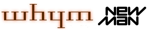
about that eccentric spelling. The explanation? The typography of the word
is such that when you turn it upside down, it still spells whym. It’s
like a visual, vertical palindrome. How whymsical.
But haven’t I seen that kind of "visual, vertical palindrome" somewhere
before? Ah yes…
In London, I took lessons from a bookbinder named Mark Cockram. When you set type to, for example, emboss a title on a spine, you do it backwards. Mark Cockram is a palindrome, so he could set his name without worrying about the back-to-front problem.
Other than Lon Nol, I don’t think I’ve encountered other palindromic names. Certainly not as long as Mark Cockram. A wonderful thing for a bookbinder.
Another palindromic name: “Ola Salo”.
You can check out his band at http://www.theark.nu