CDO Datapoint of the Day

Aaron

Johnson of Total Securitization reports:

  • The first CDO-squared (a CDO of CDOs) has now defaulted. Lancer Funding

    II was issued by ACA Capital, an insurance company you’ve never heard of but

    which still managed to record a $1.7 billion third-quarter structured credit

    market-to-market loss.

  • "Under current market conditions, the high-grade super seniors can

    expect a 55% recovery rate while mezzanine super seniors can expect just a

    32% recovery rate."

  • A CDO called Broderick CDO III defaulted last week; it was $1.5 billion

    alone.

  • Eight CDOs underwritten by UBS have defaulted so far.

(Via Matthew Tubin)

Posted in bonds and loans | Comments Off on CDO Datapoint of the Day

Meme of the Week: Breaking Up Financials

Financial supermarkets sure are out of favor these days. In the wake of an

FT

report that both Citigroup and Merrill are considering issuing shares in

their brokerage arms, the NYT today says that H&R

Block could be broken up, with its Option One mortgage unit topping the

"for sale" list.

None of these things makes a huge amount of sense to me. Smith Barney, at this

point, is a brand name, not a business. Floating a minority stake in Merrill’s

brokerage arm could result in one of those situations like Palm and 3Com, where

the subsidiary was worth more than the parent. And the idea of trying to sell

a mortgage lender in the present climate is just crazy.

But financial stocks are weak right now, and at times like these the financial

engineers start crawling out of the woodwork claiming to be able to "unlock

value" or somesuch. The main thing they normally achieve, of course, is

simply the generation of enormous fee income for themselves.

Posted in stocks | Comments Off on Meme of the Week: Breaking Up Financials

OFHEO’s Part in the Housing Crisis

According to the WSJ, Freddie Mac has serious

capital-adequacy problems, and they’re basically the fault of the Office

of Federal Housing Enterprise Oversight:

The losses have left the company with core capital of $34.6 billion as of

Sept. 30, only $600 million above the minimum amount it is required by regulators

to hold. The regulatory agency, the Office of Federal Housing Enterprise Oversight,

has imposed minimum capital levels for Fannie and Freddie that are 30% above

those required by law. The capital "surcharge" came in the wake

of accounting scandals at both companies in recent years.

Because it had little margin over its capital requirement, Freddie said it

was limited in its ability to take advantage of opportunities to buy mortgages

and sold about $20 billion of them in September and another $25 billion in

October.

That’s right, because OFHEO is being strict with Freddie, it’s being forced

to sell tens of billions of dollars’ worth of mortgages. Freddie should

be part of the solution to this mortgage-bond crisis; instead, it’s contributing

significantly to the magnitude of the problem. Freddie should be a source of

liquidity in the market, not a forced seller.

This is all wrong. The reason why capital-adequacy rules exist is to make sure

that there’s a cushion in times of crisis. Well, guess what – this is

a time of crisis. The capital-adequacy rules should be loosened, but instead

OFHEO is sticking to its decision to impose significantly tighter requirements

on Freddie.

This is no time to be punishing Freddie for past accounting irregularities

– or even present accounting irregularities, for that matter,

if such things existed. Let’s keep our eyes on the prize, people. Fannie and

Freddie can and should be using their deep pockets and their mortgage expertise

to buy up undervalued and fundamentally-curable distressed mortgages, both above

and below $417,000, at less than the mortgages are worth but more than the market

is asking.

Instead, they’re dumping mortgages onto the secondary market in order to comply

with OFHEO’s capital-adequacy requirements. There’s a time and a place for those

kind of requirements, and it is emphatically not now.

Posted in housing | Comments Off on OFHEO’s Part in the Housing Crisis

Expensive ARMs: An Answer

On Friday I asked

why ARMs were so expensive. I got a few responses, but the best was from an

anonymous commenter on Seeking

Alpha, "User 122506". His or her comment is worth quoting in full:

It seems the lending markets have a reduced appetite ARMs right now, with

rates (@3-5 yr) within 1/4% or so of a 30 yr fixed rather than a more "normal"

0.75-0.875% below the fixed. The more "normal" pricing would reflect

the lower cost of funding the ARM off the nearer term yield curve (for say

3-5 year ARMS) versus the longer term cost of the 10 year Treasury (off of

which 30 yr mortgages are priced).

Nomenclature point of order: Properly speaking, those rates you quote aren’t

"teaser" rates; teasers are significantly lower rates for a short

period of time (like a 1% or 2% rate for the first 3 or 6 months) which then

reset to the fully indexed rate, or to an initial fixed rate for some additional

interim period. The rates you list are plain old "hybrid ARM" or

"initial fixed rate converting to floating" ARM rates.

Your friend should stay away LIBOR based ARMs. Most of the time, the typical

pricing (LIBOR+225bp vs. 1-yr Treas+275) is very close to the same rate when

you hit the adjustment. But about once or twice a decade when credit markets

blow up (like recently) the spread of LIBOR-to-Treasury widens substantially,

and if your adjustment happens to occur during such a period you can pay quite

a bit more than if you were tied to the Treasury. (Also, now that I look at

it I think that is what is wrong with your table, which I didn’t quite understand;

after a return to "normalcy" at some point that 323 will pull in

closer to 275).

The short answer, then, is that ARMs aren’t normally as expensive as this –

that right now we’re going through a bit of an aberration. This makes a certain

amount of sense, given that default rates on ARMs are, for various reasons,

significantly higher than default rates on fixed-rate loans. Of course, that

doesn’t mean that any given individual is more likely to default if they get

an ARM as opposed to a fixed-rate loan, but that doesn’t matter: if you’re shopping

for a mortgage today, you should get a fixed-rate loan in any event, not an

ARM.

Now, will there come a point when ARMs become attractive again? I don’t know

– that standard floating rate of Treasury + 275bp still looks expensive

to me. But they will surely become more attractive than they are now.

Posted in bonds and loans, housing | Comments Off on Expensive ARMs: An Answer

The USA’s Ridiculous Border Controls

In order to keep New York attractive as an international financial center,

it has to be reasonably easy for foreigners to get in and out. Not that the

Department of Homeland Security seems to care. Already taking two fingerprints

from every non-citizen entering the country, the DHS has now announced

that it will require ten fingerprints at Dulles from November 29, and

at JFK and eight other airports in early 2008. Because heaven forfend anybody

coming through Dulles not be known to the Authorities by the fingerprint on

their left pinkie. Even if it means even longer lines to get into the country

at the airport.

But wait, it gets better. By the end of 2008, the Department of Homeland Security

wants to fingerprint everybody

exiting the country as well. DHS Secretary Michael Chertoff pledged

as recently as September 5 that deadline would be met. Can you even imagine

where this fingerprinting might happen? The DHS wants the airlines to do it

at the gate, but they hate the idea, which would seem to positively guarantee

further delays. The alternative is to do it at the security screening, which

of course is such a pleasant breeze right now.

The really crazy thing is that all of this fingerprinting realistically achieves

nothing, at least unless and until it is implemented at the land borders with

Mexico and Canada as well. And there’s no

chance of that happening in the foreseeable future. So millions are inconvenienced

to no end. No wonder London is looking increasingly welcoming, Heathrow

notwithstanding.

Posted in cities, immigration | Comments Off on The USA’s Ridiculous Border Controls

Extra Credit, Tuesday Edition

Fed’s

Gary Stern Makes Lame Arguments Against Increased Credit Market Regulation

Washington

Mutual: What I have told you was true… From a certain point of view: A

WaMu bond investor’s lament.

Fox

Business News’s Apple-AMD flub: Apple? Sounds a bit like Abu Dhabi, and

"Dhabi" sounds a bit like "Dubai"…

‘The

Undertaker’ and His Economic Doobie Brothers: Jeff Matthews wonders what

Alan Greenspan has been smoking.

One

Market Remains Sound: Money Is Still There for Best Art: Damien Hirst spent

$33 million on a Francis Bacon self-portrait. Unsurprising. More surprising

is Eli Broad dropping $23.5 million on the Koons heart.

Frequent

Flier Food: Tim Harford defends flying food around the world.

Posted in remainders | Comments Off on Extra Credit, Tuesday Edition

The Voluntary Carbon Standard

Today marks the launch of the Voluntary

Carbon Standard. The VCS is meant to be a kind of Good Housekeeping seal

of approval for carbon offsets: if you want to offset your jet-set lifestyle

or your new SUV, look for the VCS logo first.

After reading the new VCS Carbon Standard specification,

my feeling is that it still leaves a lot of scope for slightly fudgy carbon

accounting. For instance, can the notorious

RCEs, or renewable energy credits, count as VCUs, or voluntary carbon units,

under the VCS? I’m pretty sure the answer is yes, just so long as they aren’t

double-counted elsewhere.

But at least now the system of VCS approval means that not just anybody can

come along and claim to be offsetting carbon emissions without any external

verification. (Hey! I’m not flying to England for Christmas! Now I can sell

you the carbon I’m not emitting!) So file this under "good first step,"

I think, and wait to see how it evolves.

Posted in climate change | Comments Off on The Voluntary Carbon Standard

Opec and the Denomination Fallacy

Okay, let’s try and make this clear, for the umpteenth time. If countries with

large dollar-based foreign-exchange reserves increasingly invest those reserves

in euro-denominated assets rather than dollar-denominated assets, that’s bad

for the dollar. That’s true whether the country in question is an oil importer,

like China, or an oil exporter, like Saudi Arabia. And in general a weak dollar

is bad for countries which export to the US – and it

can be bad for the US as well, in the longer term.

The fact that oil is denominated in dollars, on the other hand, Does

Not Make The Slightest Bit Of Difference to the value of the dollar, the

value of a barrel of oil, or the value of anything else. So when you read a

story

about Opec and the dollar, beware this kind of thing:

Oil is priced in U.S. dollars on the world market, and the currency’s depreciation

has concerned oil producers because it has contributed to rising crude prices

and has eroded the value of their dollar reserves.

Um, why would an oil producer be "concerned" about rising

crude prices? If the fact that oil was denominated in dollars meant anything

at all, those producers would surely be elated about rising crude prices.

And then there’s this:

Iran and Venezuela have proposed trading oil in a basket of currencies to

replace the historic link to the dollar, but they had not been able to generate

support from enough fellow OPEC members – many of whom, including Saudi Arabia,

are staunch U.S. allies.

If oil traded in "a basket of currencies", that would have symbolic

value but no real-world effect. And it would be almost impossible to implement

anyway. So the fight here between Iran and Saudi Arabia is entirely about symbolism,

not about anything with real economic repercussions.

Posted in commodities | Comments Off on Opec and the Denomination Fallacy

Famous Artist + Iconic Painting = High Prices

This morning I spoke to Amy Cappellazzo, co-head of the postwar and contemporary

art department at Christie’s, to ask her about Richard

Prince’s Nurse paintings. How come one sold in London in October for $2.1

million, and then one sold in New York in November for $6.1 million, and then

a third sold in New York a couple of days later for $4.3 million?

Turns out, that’s an easy question: it’s all to do with the size of the paintings.

The Nurse paintings come in four sizes, and the $6.1 million painting was the

largest – 90 inches tall. That’s huge. The $4.3 million painting

was smaller, and the $2.1 million painting was smaller still – although

still pretty sizeable, at 47" tall.

But while the narrow question is easily answered, the bigger question remains

– how come Prince, who made his name and reputation with rephotographed

conceptual pieces, is now getting the highest prices of his career for old-fashioned

painting, valued on its intrinsic aesthetic merit?

Prince "has great painterly abilities," said Cappellazzo, saying

that "the nurse paintings were him showing off his abilities". Besides,

she said, they’re "incredibly iconic: everybody looks at them and loves

them."

I’m half convinced: I do see that Prince is a very good painter, but then again

there’s no shortage of very good painters in this world. What makes Prince important,

art-historically speaking, is his early conceptual work, not his later outsized

paintings. And it’s only because of that early work that he can now command

these multi-million-dollar prices.

But maybe that doesn’t matter. Famous Artist + Iconic Painting = High Prices,

even if the artist isn’t famous for being a painter. Indeed, look at Jeff Koons’s

paintings: they too go for millions of dollars, despite the fact that Koons

has never even pretended to be able to paint.

Posted in art | Comments Off on Famous Artist + Iconic Painting = High Prices

Subprime Datapoint of the Day

The entire market in subprime debt is just 1.4% of the size of global equity

markets. Or, to put it another way, a 1.4% downward fluctuation in stocks erases

the same amount of value as if all subprime-backed bonds were collectively marked

to $0.

Much more here

(via Tett

via Alea).

Posted in housing | Comments Off on Subprime Datapoint of the Day

Corporate Tax Revenue Datapoint of the Day

John Cassidy:

From 2004 to 2006, corporate tax receipts grew at an annual rate of more

than 25 percent. Last year, they totaled $354 billion, compared with just

$132 billion in 2003.

By my calculations, an increase from $132 billion to $354 billion over three

years would constitute an average growth rate of much more than 25% per year:

38.9%, to be precise. I assume the 25% number is the minimum for any given year.

But I have to say I’m surprised at this – have companies really become

that bad at minimizing their taxes? I’m sure their profits didn’t rise as fast

as their tax bills did.

Posted in taxes | Comments Off on Corporate Tax Revenue Datapoint of the Day

Microsoft: It’s Not Our Fault Our Operating System Sucks

Apple has a very good operating system, but minuscule market share. Windows,

by contrast, has a much clunkier operating system, but also much larger market

share. So far so boring. But how about this: Microsoft

admits that Apple’s operating system is much easier to use. That’s

news. And it happens in today’s NYT. But the Microsoft executive in question,

J Allard, isn’t talking about PCs, he’s talking about phones. And he’s not taking

responsibility for the problem, either: instead, he’s blaming the wireless carriers.

“Wireless carriers kept Microsoft from making good phone software,”

Mr. Allard said. “I think the iPhone came out and showed people a great

experience.”

Microsoft is capable of making good software (I’m a fan of the old Word 5.1

for Mac), but it hasn’t demonstrated much ability to make great operating systems,

for PCs or phones or anything else. That said, however, if it really was getting

pushback from the carriers – and I have no doubts that it was –

then we can at least look forward to some kind of incremental improvements in

the much-hated Windows Mobile.

Posted in technology | Comments Off on Microsoft: It’s Not Our Fault Our Operating System Sucks

How Can Index Funds Beat the Market?

Ben Stein loves Dimensional Fund Advisors. They "run the most amazingly

successful, low-cost, unmanaged but somehow deep-value index funds I have ever

found," he says,

adding

that "their returns are amazing, and they charge almost nothing."

It’s a bit weird: how can an index fund have "amazing" returns? Surely

the whole point of an index fund is that it’s more or less the same as the underlying

index?

Michael Lewis has a huge

article on DFA in the December issue of Portfolio, but even he seems a little

unclear on exactly how Dimensional gets its returns.

If all financial advice is worthless and the only sensible strategy is to

buy an index fund that tracks the market, why would anyone need a D.F.A. financial

adviser? Why, for that matter, should anyone pay D.F.A. the 50 basis points

it takes off the top of its oldest fund? D.F.A.’s answer to this is interesting:

It can beat the index. The firm doesn’t ever come right out and say, "We

can beat the market," but over and over again, the financial advisers

in attendance are shown charts of D.F.A.’s large-cap funds outperforming Standard

& Poor’s 500-stock index and D.F.A.’s small-cap fund outperforming

the Russell 2000.

In each case, the reason for D.F.A.’s superior performance is slightly different.

In one instance, D.F.A. found a better way to rebalance the portfolio when

the underlying index changes; in another, it came up with improvements in

capturing small-cap risk. All these little opportunities can be (and are)

rationalized as something other than market inefficiency, but they are hard

to exploit, even with the help of D.F.A. The lesson of efficient-markets theory

is that when anyone from Wall Street calls you up with financial advice, you

should be very afraid. But it isn’t fear that prompts investors to embrace

D.F.A. It’s greed.

It’s a little more obvious why individual investors might choose DFA: they

can talk to a human being who will reassure them on a regular basis that they’re

making extremely intelligent investment decisions. But the question of whether

and how DFA manages to beat the market is still a very interesting one.

My theory, for what it’s worth, is that most index-fund managers beat

the market, but that they tend to keep the excess profits for themselves, rather

than passing them on to investors. If you invest your money with Barclays or

Vanguard, they will return to you the index, plus or minus a tiny fee. If they

themselves make more than that, that’s pure profit for them. Anecdotally, I’ve

heard stories along these lines: that index-fund managers can be extremely aggressive

in the pursuit of their own profits.

And then there’s the whole issue of repos. An individual investor holding a

basket of Dow stocks can’t lend those stocks out to hedge funds. But a massive

institutional investor can and does lend those stocks every day. Wouldn’t you

expect such lending activity to boost a fund’s returns? Are repos the secret

to making money running index funds? And if not, why not?

Posted in investing, stocks | Comments Off on How Can Index Funds Beat the Market?

Thain’s Pay

What does Jack Flack make of the fact that John Thain’s employment

contract with Merrill Lynch was filed on a Friday evening? It seems to me

that Merrill Lynch was trying to bury its details by having them appear on the

slowest news day of the week. And also, possibly, by having the contract written

in such insanely circumlocutory legalese that no one can make out what on earth

he’s meant to be paid in any case.

Bloomberg and the NYT and the WSJ all tried. But it’s a bit worrying that they

came to startingly different conclusions. Bloomberg’s headline is clear: "Merrill

to Pay Thain at Least $44 Million This Year," it says. The New

York Times says that Thain "can expect an initial pay package of nearly

$50 million" which "could be worth more than $120 million"; its

photo caption is unambiguous that Thain "will get neraly $50 million a

year". The Wall

Street Journal, on the other hand, is much more cautious: Merrill "awarded

John Thain $43.1 million in cash and stock payable over five years," it

says.

Obviously, there’s a huge difference between $43 million over five years and

$50 million per year. Chalk one up for corporate obfuscation.

Posted in pay | Comments Off on Thain’s Pay

Pinot Contest

Last night, a dozen or so friends and I discovered one of the best-value wines in America.

I’ll tell you what it is in a minute. But first, it’s worth explaining how we came to that conclusion: Michelle and I held a Pinot Contest at our apartment. The structure was pretty much the same as the wine contest we held last year: each contestant brought two identical bottles of wine. One was tasted blind, while the other was kept for the prize pool. This year, every bottle had to be either a Pinot Noir or a Burgundy.

Everybody scored every wine out of 20, and we added up the results, which you can download as an Excel spreadsheet with a wealth of information in it.

With 14 people tasting 12 wines, the maximum score was 280. In the end, the scores ranged from 115 to 212. And it’s worth emphasizing that the overall quality was extremely high: much higher, actually, than it was last year, when people could bring any red wine they liked. If you make a bit of an effort with a Pinot, it seems, you’re likely to be well rewarded.

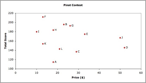
But the other thing which really sprang out from the tasting was that there was absolutely no correlation whatsoever between price and quality. Here’s the chart:

Pinot

If you plug these numbers into a correlation calculator, you actually get a negative correlation of -0.2: the higher the price, the worse the wine, on average.

As you can see from the chart, the real standout wine was Wine F, which got the best score of the evening (212 points) while costing just $13 per bottle. It’s not a typical Pinot: it was full-bodied, and fruity, and utterly delicious. “A Burgundy probably,” wrote Jay on his scoring/tasting sheet, adding “expensive” and scoring the wine 20/20. “Simon?” wrote Seth, knowing that Simon had brought a very expensive Burgundy, and also giving the wine the full 20 points. “Yummy,” wrote Gaby, giving it her top score of 17. When she poured too much of the wine into her glass by mistake, she asked for a second glass: it was simply too good to pour away, but she did need to carry on tasting.

Wine F turned out, to everybody’s surprise, to be the 2005 Heron Pinot Noir, made in California from French grapes by Laely Heron. It cost just $13 a bottle, or $11 if you buy by the case — which I assure you I am going to do. Meanwhile, Simon’s expensive Burgundy (Wine D) managed to get a total score of just 146: only three wines scored lower.

This contest was emphatically not a triumph of cheap New World wine over expensive Burgundies. In the bang-for-the-buck ratings, the top wine in terms of points per dollar was mine (Wine I), a 2004 Burgundy which got 180 points and cost just $9.99 at Warehouse Wines on Broadway. Simon gave it 20/20, while giving his own $52 Burgundy just 12/20. The Heron was in second place in the bang-for-the-buck ranking (it was made with French grapes, of course), while in third place was Seth’s 2005 Burgundy (Wine K) which also cost $13, and which received a score of 154 points.

At the other end of the scale, Wine J was a $50 El Molino Pinot from Napa, which scored a fair-to-middling 167 points, making it the second-worst value after Simon’s Burgundy. As you might expect, in general the cheaper wines did better in the bang-for-the-buck stakes, but it’s worth noting that Michelle’s Pinot (Wine G) — which came from Germany, of all places, scored 193 points and cost $26 — ranked higher than Gaby’s $18 Pinot Nero from Italy (Wine A), which garnered a mere 115 points despite the fact that I, personally, loved it.

In general, the Burgundies were clustered right in there with the non-French Pinots. While Burgundy has a reputation for being very expensive and rather unreliable, in fact its wines seem to be consistent with Pinots globally. And the second-place wine was a Burgundy: Wine B was a 2006 Alain & Julien Guillot Clos des Vignes du Maynes, brought by Rory but chosen by Jay. Since the winning wine was brought by Savannah, Jay’s wife, that meant that Jay and his party ended going home with all the bounty — although they were generous enough to let me keep the two winning bottles.

Thanks to everybody for coming and making the contest so fun and successful. And remember: sometimes the cheapest wines are also among the best.

Heron

Update: Josh Reich does some seriously high-end statistical analysis on the scores, and concludes that “price is not a significant predictor of wine score”.

Posted in Not economics | 12 Comments

Extra Credit, Weekend Edition

CPDO Cash-In

Newsflash:

The Law Matters! Elizabeth Warren on the Deutsche

Bank case.

Trusting

the birth/death model

GM

Watch: The Flap Continues: All you ever wanted to know about third-party

document custody. It’s interesting, really!

What

Will $1 Million Buy? About a 3.7" square of Matisse’s Odalisque, if

you really want to know.

TheFunded.com’s

"Ted" is revealed to be some guy you’ve never heard of. Notorious

anonymous internet personalities nearly always are.

Starbucks’

Story Covered in Whipped Cream: "So far this morning, The Business

Press Maven has found precisely 17 mistakes in coverage of Starbucks’ earnings,

released Thursday."

And finally:

Posted in remainders | Comments Off on Extra Credit, Weekend Edition

Fannie Mae Datapoint of the Day

Peter Eavis, who started

the Fannie Mae ball rolling on Wednesday, moves

the story further today, with this rather startling and scary datapoint:

Using fair value accounting, Fannie Mae’s capital — the company’s net worth

— has declined sharply this year. According to a fair value version of its

balance sheet contained in a recent filing, Fannie Mae’s capital was $34 billion

on Sept. 30, a 20% drop from the end of last year.

Now, $34 billion in capital is still a lot of capital. But $8.5 billion is

an enormous amount of capital to lose in less than one year – especially

when you don’t seem to be making any effort to be particularly aggressive in

terms of accounting. Fannie should, by rights, be part

of the solution to the subprime crisis; at the moment, it’s looking more

like part of the problem.

Posted in housing | Comments Off on Fannie Mae Datapoint of the Day

Gay Demographics Datapoint of the Day

Gary

Gates:

Since 1990, the Census Bureau has tracked the presence of same-sex "unmarried

partners," commonly understood to be lesbian and gay couples. From an

initial count of about 145,000 same-sex couples in 1990, the 2006 data show

that this population

has increased fivefold to nearly 780,000 couples. The number of same-sex

couples grew more than 21 times faster than the U.S.

population did…

The bellwether state might be Utah. In 2005, Salt Lake City approved

a benefits program for lesbian and gay couples. Identifying openly as

gay no longer

represents an honor code violation at Brigham Young University. And, perhaps

most striking, the state now has three openly

gay state legislators. That’s one more

than in the U.S. Congress.

(Via Florida)

Posted in statistics | Comments Off on Gay Demographics Datapoint of the Day

Art Market Datapoint of the Day

Alexandra

Peers at the fall auctions in New York:

All told, the auctions at Sotheby’s, Christie’s, and Phillips

de Pury totaled $1.7 billion, compared to $1.4 billion six months ago at a

similar round of spring sales.

Posted in art | Comments Off on Art Market Datapoint of the Day

Why Are ARMs So Expensive?

A friend of mine is shopping for a mortgage right now, and I just had a very

frustrating conversation with her mortgage broker. What I’d like to do is be

able to choose between a fixed-rate mortgage and an adjustable-rate mortgage.

If I take the adjustable-rate mortgage, I expect to pay a lower interest rate

in return for taking on interest-rate risk. But it seems that the only ARMs

on offer are all "teaser rate" products, where the mortgage resets

to a significantly higher spread once the initial teaser period is over. And

even the teaser rates, on closer examination, don’t look particularly attractive

compared to the fixed-rate mortgage on offer.

The broker offered three ARMs to my friend: a 7/1 ARM at 6%, a 5/1 ARM at 5.875%,

and (after I asked about it specifically) a 1/1 ARM at 5.75%. All three of them,

he said, reset to 225bp over one-year Libor at the end of the initial period.

The reason I asked about the 1/1 ARM, of course, was to get an idea of what

happens to the spread over Libor. At the moment, 1-year Libor is 4.47%, which

means that the 1/1 ARM starts off for the first year at 128bp over Libor, and

then jumps all the way up to 225bp over thereafter. If one-year interest rates

stay where they are, that means my friend will be paying interest of 6.72%.

Even the 30-year fixed-rate mortgage is much lower than that: just 6.125%. And

of course my friend would be paying well over 7% once one-year rates go above

4.75%, which is entirely possible.

The broker was quite clear that you should never buy an adjustable-rate mortgage

with an intial rate any longer than the amount of time you intend to own your

home. If you’re going to sell within five years, then get the 5/1 ARM: it’s

cheap money. But if you’re intending to stay in your house and pay off the mortgage

over time, then don’t even think about it: you’ll be killed once that adjustable

rate of 225bp over Libor kicks in.

Libor doesn’t go out beyond one year, but Treasury rates do; the one-year Treasury

trades today at 3.49%. So let’s look at spreads over Treasuries

as opposed to spreads over Libor: that way we can compare all the options on

a like-for-like basis. And let’s assume that 225bp over one-year Libor is the

same as 323bp over Treasuries.

Product Initial spread Spread after reset
1/1 ARM 226bp 323bp
5/1 ARM 216.5bp 323bp
7/1 ARM 210bp 323bp
30yr fixed 158.5bp N/A

This is just incredibly counterintuitive to me: the spread curve on mortgages

seems to be pretty steeply inverted. The more-floating and less-fixed the mortgage,

the higher the spread is – even before you take into account the seemingly-penal

interest rate once the initial period is over. Are these numbers remotely similar

to the ones that Alan Greenspan looked at when he famously said that adjustable-rate

mortgages made more sense than fixed-rate mortgages? How can it make sense for

adjustable-rate mortgages to reset to 323bp over Treasuries, while a 30-year

fixed-rate mortgage for the same borrower is quoted at 158.5bp over Treasuries?

Indeed, looking at this table, even the initial rates offered on the ARMs look

pretty underwhelming: they’re "teaser rates" only in comparison to

the really high rate charged after they reset. If anybody can provide

an explanation of what’s going on here, I would be extremely grateful, because

I can’t make heads nor tails of it. Why is it that a borrower pays more when

the borrower is taking interest-rate risk than when the lender takes interest-rate

risk?

Update: The fixed interest rate on a 15-year fixed

rate mortgage is 5.875% – the same as the teaser rate on the 5/1 ARM.

Posted in bonds and loans, housing | Comments Off on Why Are ARMs So Expensive?

Ignore Short-Term Market Moves

Accrued Interest today has a great post about what

really drives markets over short stretches of time. He uses the phrase "technicals",

by which he means not drawing lines on charts, but rather the simple dynamics

of how traders make and lift prices. And he has a slogan for the ages:

Trying to graft fundamental meaning on technical movement is a good way to

be completely wrong.

This, of course, is what journalists do all the time. There are basically four

ways that the market can behave: it can go up on good news, down on bad news,

up on bad news, or down on good news. And when I say "on", I mean

"after": journalists, concerned as they are with the news, invariably

overestimate the importance of news in driving prices.

Portfolio’s very own Jeff Cane put his finger on the ridiculousness of trying

to draw causal connections, in a stock-market

report he wrote on Tuesday:

A big bank announces a $3 billion write-down. Wal-Mart shows slow growth

in same-store sales in the United States.

So stocks rocket, breaking a four-session slump, in a rally led by financial

shares and Wal-Mart.

Huh?

"Huh?" is right. There’s a simple lesson to be drawn from such stock-market

behavior, and it’s that markets are volatile and sometimes go in weird and unexpected

directions. If you look at a chart of the stock market over time, the long-term

ups and downs are clear, and equally clear is the fact that all those little

zigs and zags along the way are basically irrelevant. So it’s silly to fixate

on a zig or a zag and try to explain its meaning.

So Cane gets two gold stars for his lede, but then loses one of them for this:

The write-down announced by Bank of America was not an unnerving, run-for-the-exit-doors

event. Instead, the write-down was seen as a sign of a bank coming to grips

with a known problem, the possibility of further write-downs having already

been priced into the stock.

The fact is that no one has a clue what is "priced in" to any stock,

with the possible exception of merger-arb candidates. As Jeff

Matthews says,

Companies that comment on their stock valuation generally run towards single-digit

NASDAQ shooters, not NYSE-listed mega-caps.

If companies don’t know what’s priced in to their own stock valuation, I can

assure you that journalists don’t know either. Yesterday, I spoke to the head

of investor relations at a large financial institution which, impressively enough,

is trading at an extremely healthy multiple of almost four times book value.

Yet he still explained to me that the market wasn’t fully valuing various bits

of his institution’s empire.

Of course, the market could start fully valuing the undervalued bits of the

empire while still sending the stock downwards, just because there’s no way

of kowing what a reasonable multiple for this kind of institution should be.

In other words, even the long-term trend can be very misleading: look at tech

stocks in the late 1990s. Short-term trends, on the order of a day or two, almost

never have much in the way of useful information. As a result, "what the

stock market did today" reports should be of interest only to traders,

never to long-term investors.

Posted in stocks | Comments Off on Ignore Short-Term Market Moves

Blogging Datapoint of the Day

Dan

Frommer reports:

WordPress is now the No. 2 most-visited blog host, passing rival SixApart’s

TypePad last month, according to the latest tally from Nielsen Online.

WordPress is the anti-MySpace. It’s clean, easy to use, easy to read, and generally

does everything you want a blogging tool to do. You can import blogs very easily

from the likes of Blogger, LiveJournal, and Moveable Type; what’s more, you

can export your blog in a non-proprietary XML format even more easily. The only

thing WordPress doesn’t do, and this is very annoying, is allow its free users

to serve up full RSS feeds which include everything after the "jump".

WordPress came very late to the blogging party, which is why its growth is

so impressive. Blogger, with the full weight of Google behind it, grew 58% year-on-year;

WordPress, by contrast, grew 444%.

According to Frommer, WordPress’s executives are cashing out a little: good

for them. They’ve made a hugely successful and excellent product, they deserve

it.

Posted in technology | Comments Off on Blogging Datapoint of the Day

Currency Devaluation Datapoint of the Day

Justin

Fox reads research from Merrill’s David Rosenberg:

While the loonie plummeted against the dollar between 1992 to 2002, Rosenberg

says, inflation in Canada declined from 4.5% to 1.3%, the short term interest

rate set by the Bank of Canada dropped from 7% to 3%, and ten-year bond yields

dropped from 8% to 5%.

Posted in foreign exchange | Comments Off on Currency Devaluation Datapoint of the Day

Did Anyone Other Than Citigroup Have Liquidity Puts?

Why hasn’t this "liquidity put" thing gotten greater play? I never

made it down to the 11th paragraph of Carol

Loomis’s interview with Bob Rubin, where she introduces the concept more

than 900 words into her article. Floyd Norris, today, does

a bit better, taking less than 400 words to get to them. A gold star, then,

should go to Peter Cohan of BloggingStocks, who read the Loomis article, realized

what he was looking at, and promoted

the liquidity puts to headline status back on Monday.

Liquidity puts are a big thing, and indeed it seems that they were more or

less singlehandedly responsible for the downfall of Chuck Prince at Citi. Basically,

Citi told the world – and kidded itself – that it had sold billions

of dollars in CDOs to investors. In reality, however, those CDOs had "liquidity

puts" attached, which essentially transformed the CDO "sales"

into glorified (or debased) repos. Any time that the investor found the CDO

difficult to sell – and CDOs are always difficult to sell –

he had the option to put the CDO back to Citi at par. And that’s exactly what

happened; it was those return-to-sender CDOs which were written down the same

weekend Prince resigned.

Now, do you remember the WSJ

attack on Merrill back on November 2? The dealings that Merrill is having

with its hedge funds sound a little bit like a liquidity put without the liquidity

part. Merrill

denies any wrongdoing, but if I were John Thain I’d certainly look into

this. If banks like Citi were selling structured products to investors with

the promise that they’d buy them back in the future if the investment didn’t

work out, then I can imagine Merrill – and other Wall Street banks –

doing the same thing.

Update: Brad DeLong says

he does not understand this whole liquidity put thing, while Alea, in the

comments, says "it’s complete nonsense". Given that all the recent

talk of liquidity puts seems to be based on a Loomis article which wasn’t really

about them, maybe we should all take a deep breath and work out, first of all,

whether these things even existed.

Posted in banking, derivatives | Comments Off on Did Anyone Other Than Citigroup Have Liquidity Puts?

Extra Credit, Friday Edition

Life,

liberty and the right to play online poker: Andrew Leonard watches the Family

Research Council’s Tom McClusky get slapped down by Steve Cohen, D-Tenn.

Why

I’m Prepared to Become Citigroup’s Next CEO: Michael Lewis

The

making of a UPS driver

Wall Street Journal

Hearts Digg: Yes, you can read WSJ stories for free, now. But not by going

to WSJ.com: you need to go to digg.com first. Silly.

MPs

abuse credit agencies as ‘shower’: Moody’s makes the mistake

of sending French representatives to a UK parliamentary committee hearing.

The Predatory Lending

Association

Yes,

Virginia, the Fed Has an Inflation Target … And It’s Missing It

Posted in remainders | Comments Off on Extra Credit, Friday Edition