
Chart of the day comes from Deloitte’s Carl Steidtmann. You wanna see what a bubble looks like? He’ll show you what a bubble looks like.
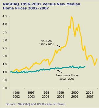
There’s much more where that came from, and of course the comparison isn’t really fair: when you consider the amount of leverage that most new homes come burdened with, the return on investment can approach Nasdaq levels. Even so, the chart does put a smile on my face.
Also, that chart is ridiculous because it includes many non bubbled areas.
Draw the same chart for the SF bay area, San Diego, LA, etc housing prices…
“New houses.” I was not aware that the NASDQ only tracked IPO issues in its’ index.
New houses actually appreciated *more* than houses generally.
?? can you explain this graph to me? What’s on the y-axis? How does one compare a stock market index to a house prices–apples/oranges? The Deloitte guy doesn’t explain his own graph, maybe you can?
Of course he (nor you) don’t talk about Shiller’s inflation-adjusted home prices which would convey a different picture. Steidtmann though speaks for the retailers for whom he is an “expert” while you genuinely appear to believe in the “no housing bubble” hypothesis. Check out itulip.com’s cover feature for the gossip and you could perhaps spice it up by offering your own commentary.
Har har… what a difference a few months make.
offer you brand sport shoes with low price,pls see the web: http://www.cntradecity.com