
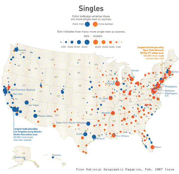
The Creativity Exchange finds this chart from National Geographic, wonderfully described by Mark Thoma as “like a 7th grade dance with the boys huddled together on one side of the room, the girls on the other”.
Equally wonderfully, Thoma’s commenters are on the case, before you start drawing too many conclusions. Bruce Wilder shows that the numbers involved are tiny:
We are talking about comparatively tiny surpluses: L.A. tops the male surplus list with 40,000 in an area that has a workforce of 6,500,000 and a total population of almost 13,000,000.
And another commenter rips apart the magazine’s hilarious description of more females than males being a “plurality”:
What is that – something like 49% female, 47% male, 4% other?
Eventually, the chart gets nominated for submission to the Junk Charts blog.
But still, it was fun while it lasted. And there’s obviously something going on, even if it’s very small.
Looking at this map, you’d think that San Francisco was a great place for a single young woman to find a date, but you’d be wrong. The map probably just shows that there are more single gay men in California and more elderly widows in the Northeast?