
When I posted an entry
on 2 Columbus Circle last month, I said that "The lack of windows gives
it the feel of a prison: you imagine yourself stuck inside, unable to look out.
It is an exercise in claustrophobia, and the new design [with lots of glass
and light] constitutes a vast improvement." I also said that "the
mood in the city these days is that brand-new buildings are usually pretty good".
 Maybe
Maybe
I spoke too soon. Lockhart Steele has gotten
himself a press kit for the new New Museum building, which is going up on
the site of what is now a parking lot across from Prince Street on the Bowery.
And far from being a "pretty good" improvement on the brutalist nightmares
of the past, it seems determined to make every old mistake in the book all over
again.
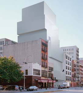
Lock quotes the New Museum describing its new home as "a dramatic stack
of rectangular boxes, each with a different height, shifted slightly off axis
in different directions and clad in textured, galvanized zinc-plated steel".
The point of all this architectural cleverness, it would seem from reading
the New Museum website,
is to ensure that the building doesn’t have to bother with windows at all. After
all, they explain, "SANAA’s concept for the site proposes a series of shifting
sculptural boxes that allow for skylights on every level". And who needs
windows when you’ve got skylights?
Of course, art museums need wall space; they don’t need windows – although
places with great views, like the Tate Modern or Dia:Beacon,
use their windows to fantastic effect. The problem is not so much how things
feel on the inside, since with sunlight from above and intelligently-designed
lighting, the spaces will probably work perfectly well. Rather, my issue is
with the way the museum presents itself: it looks to the world like a dark fortress.
Added to the windowlessness is the problem of scale: the museum is going to
tower over its neighboring buildings without any attempt to integrate itself
in terms of either the street wall or the vernacular of the downtown tenement
building. There is no chance that the local residents are going to embrace this
building; rather, they are (rightly) going to consider it an eyesore and a bad
neighbour.
Here’s what the architects have to say on the subject:
We wanted to be as consistent as possible with the scale of the existing
surroundings. However, our building has to accommodate a much bigger program
than its neighbors do. By shifting the different levels of the structure in
relation to one another, we are also diminishing the bulk and establishing
a more effective, dynamic relationship with the buildings in the area. On
the other hand, because this area is in transition, we believe the New Museum
building should have a strong identity of its own in order to survive, especially
on a street as tough as the Bowery… To us the Bowery is less a boundary
than a neutral "demilitarized" zone between neighborhoods that have
very distinctive personalities—Nolita, the East Village, Chinatown.
This is gruesome stuff. I can’t for the life of me think how the shifting levels
establish any kind of effective or dynamic relationship with the buildings in
the area, none of which have any shifting levels at all. As for the idea that
the building "should have a strong identity" because it lies on a
"tough" street without a "distinctive personality" –
this is simply crazy. Architecturally, Nolita and the East Village are very
similar, characterised by low-rise, brick-built residential structures with
retail on the ground floor. The Bowery is much the same, enlivened by the Bowery
Mission and by the competing signage of the restaurant-supply and lighting shops.
It has a very strong and distinct character, none of which is reflected in this
design at all.
You might remember that when the New Museum bought this site and announced
that it was moving there, it made a big song and dance about how happy it was
to be remaining downtown and helping to revitalise Lower Manhattan in the wake
of September 11. Of course, Prince and Bowery is a world away from Lower Manhattan,
and many of us, at the time, thought that the New Museum was clearly trying
to come up with reasons to push the site after they’d already decided to move
there.
The rhetoric surrounding this building is similar: a Japanese architectural
firm comes up with a "bold" design, and then pays lip service to the
neighborhood, despite the fact that they obviously couldn’t care less. This
building would be equally ugly anywhere, but it certainly doesn’t belong in
residential downtown New York, where commercial high-rise structures are unheard
of.
In fact, it feels like nothing so much as Marcel Breuer’s Whitney
Museum, complete with windowlessness and cantilevered upper stories. The
only difference is in the cladding: zinc-plated steel as opposed to concrete.
No, I have no idea how or whether zinc-plated steel will age on a street full
of belching trucks rumbling to and from the Manhattan Bridge. Breuer’s building
is not well loved, and even architects generally admire it more as an important
piece of avant-garde 1960s architecture than as a perfectly-formed
art gallery. It’s squat, ugly, and generally pretty depressing; it certainly
can’t hold a candle to Frank Lloyd Wright’s Guggenheim a few blocks uptown.
I have a feeling that the New Museum got sick of people walking straight past
its present location on Broadway without even noticing them, and decided that
in their new digs they were going to make a splash. But it would have been nice
if they did so by commissioning something beautiful and interesting, rather
than sentencing their new neighborhood to cower under a teetering pile of metal
boxes.
 Meanwhile,
in Birmingham, the new
Selfridges has opened, and it, too, has no windows. Here, rather than a
neo-brutalist tower we have a biomorphic alien spacecraft. Both, however, are
primarily illuminated by skylights, and utterly fail to even try to fit in with
their surroundings.
Now I’m no curmudgeon who hates all new
buildings unless they look old and hates them even more if they try to do something
interesting. But if you’re open to the possibility that contemporary architecture
is good, you also have to be open to the possibility that it’s bad. And as a
rule, buildings without windows are bad buildings. (Of course, there are truly
great exceptions to the rule.) So just because a department store don’t
need windows, doesn’t mean it shouldn’t have them. Indeed, department
store windows can look fantastic – just consider Peter
Jones in London, whose undulating curtain wall still feels very contemporary
despite the fact that it’s almost 70 years old.
It’s a psychological thing. When we look at a building, we naturally imagine
ourselves inside it, and no one wants to live in a building without windows.
The fact that no one does live in a museum or a department store is
irrelevant: when we’re simply looking at the outside of the structure, we want
to be able to look in, and, more importantly, we want the people inside to be
able to look out. It takes some kind of architectural genius to make us get
over that initial repulsion, and neither of these two buildings – nor
2 Columbus Circle, for that matter – has it.
A few thoughts: The Frank Gehry Art Museum in Minneapolis forced neighboring offices to put up special shades due to the glare from the aluminum. Also I agree about claustrophobia with no windows.. I think of most art joints at least have a place where one can get relief and look out a window. The Walker in Minneapolis has few windows in it’s galleries, but a room at some point to look outside. I know this place has one but exactly how far away is the question. I can’t answer by looking at the plan or mpeg of the New Museum.
I don’t mind the big boxes look.. Also the scale is due to change with new buildings going up.
Just a note on windowless buildings – as a graduate of the brick prison (otherwise known as Hunter College High School in NYC), windows are not overrated. And if there are problems with AC systems (or a blackout), people will soon regret it.
Where will the farts go?
i think the low-slung ceiling on the les/nolita has been broken enough times to make it not so much of a big deal.
i like the building plans… but then i like the whitney too.
i think this building/museum as scuplture needs to stop. just cause bilbao works (and it too is overated as the gallery spaces have absolutley no relation to the outside artifice) doesn’t mean that everyone has to copy this (including gehry, the one-trick pony himself). this new museum project just looks like a big gray turd. and i like the whitney.
Undergound London has a comment on this.