
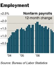
 The NYT has an interesting chart accompanying its payrolls story today. While the text is as upbeat as you’d expect given the excellent figures, and despite the fact that the WSJ is running a story headlined “Economists Wonder if March Is the Peak for 2007 Job Growth”, someone on 43rd Street seems to have decided to run a graphic showing payrolls going down.
The chart violates a basic rule of charting, which is that a bar chart like this should be used to show how quantities change from month to month. Looking at the bar chart, you expect the March bar to refer to March figures, the February bar to refer to February figures, and so on. But in fact they refer to a year-on-year differential, which is better displayed with a line chart.
Still, that’s a quibble: A line chart would still be going down, even as everybody is talking about the payroll numbers going up. What gives? To be honest, I’m not entirely sure. Year-on-year figures obviate the need for seasonal adjustment, so maybe the real trend is down but is being hidden by the seasonal adjustments. Alternatively maybe the enormous revisions that the BLS has been doing to the time series of late make the year-on-year figures less useful than they otherwise would be.
In any case, it’s not immediately clear to me why year-on-year figures should be charted when all of Wall Street concentrates solely on the month-on-month number. If you’re going to use these figures, you should at the very least somewhere explain why.