
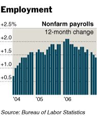
 The NYT has an interesting chart accompanying its payrolls story today. While the text is as upbeat as you’d expect given the excellent figures, and despite the fact that the WSJ is running a story headlined “Economists Wonder if March Is the Peak for 2007 Job Growth”, someone on 43rd Street seems to have decided to run a graphic showing payrolls going down.
The chart violates a basic rule of charting, which is that a bar chart like this should be used to show how quantities change from month to month. Looking at the bar chart, you expect the March bar to refer to March figures, the February bar to refer to February figures, and so on. But in fact they refer to a year-on-year differential, which is better displayed with a line chart.
Still, that’s a quibble: A line chart would still be going down, even as everybody is talking about the payroll numbers going up. What gives? To be honest, I’m not entirely sure. Year-on-year figures obviate the need for seasonal adjustment, so maybe the real trend is down but is being hidden by the seasonal adjustments. Alternatively maybe the enormous revisions that the BLS has been doing to the time series of late make the year-on-year figures less useful than they otherwise would be.
In any case, it’s not immediately clear to me why year-on-year figures should be charted when all of Wall Street concentrates solely on the month-on-month number. If you’re going to use these figures, you should at the very least somewhere explain why.
maybe all of wall street concentrates on the month-to-month number, because wall street earns its living off of bounded volatility, precisely what small changes in a very uncertain and largely random month-to-month number can provide. a year-over-year series avoids seasonal uncertainties, and is likely to show any trend much more clearly. really, the burden of explanation should be on those who wish to make much of seasonally adjusted month to month data with wide confidence intervals, and high model risk especially at economic turning points. i agree that it should have been a line graph, though.
“Alternatively maybe the enormous revisions that the BLS has been doing to the time series of late make the year-on-year figures less useful than they otherwise would be.”
Exactly,the BLS added 752000 jobs to the march 06 number on feb 2nd.If you compare apples to apples the rate of growth is around 1.8% => “In fact” it is re-accelerating.
Reaccelerating? Where?
I ran the numbers, and while this was a fine report, it looks like more of the same to me. I don’t have a pretty chart of the raw numbers online just now, but (“percent of industries with employment increasing plus one-half of the industries with unchanged employment”).
If you can point out the reacceleration, please do.
The march 06 figure was boosted by 752000 on february 2nd,this down-biases the year on year change for march 07.Ex-adjustment {comparing raw to raw numbers},the change year on year would be the highest since may 06 ,around 1.8%+…
The benchmark revision downbiases nothing about the current report. It . Using less-accurate prior-year numbers tells you precisely nothing about current payroll growth rates.
Still, let’s test it. Here’s the . The local YoY peak in early 2006 coincides nicely with a local diffusion-index peak around the same time.
I certainly doesn’t look as though the BLS missed another three-quarter million workers over the last year to me.
Only Liberals and Terrorists Read the
New York Times. The NYT is a Pro-Terrorist
Anti-American Yellow belly cowards that
They are.
The New York Times only writes fiction.
EVERYONE WITH A BRAIN SHOULD CANCELL THEIR
SUBSCRITION TO THE NYT.