
One of the biggest surprises, for myself along with many people, of Dia:Beacon
was the fact that Dan Flavin’s work looks so marvelous in natural light. So
when I heard that the head of Dia, Michael Govan, had curated the new Flavin
the National Gallery of Art in Washington, I was looking forward to more surprises
and new ways of looking at Flavin.
I must say now that it’s a very good retrospective, and if you’re anywhere
near Washington you should check it out. But it’s not a great show, and in fact
it might well look much better when it moves on to Fort Worth and Chicago next
year.
The show starts off well, at least from the outside of the gallery. The National
Gallery of Art does not go in for what James Traub calls
"unthinkably garish and self-aggrandizing" banners on the outside
of its pristine IM Pei building, but if you approach from the other side of
Constitution Avenue, it’s easy to see that something interesting is going on
inside. The big long North-facing window which helps illuminate the gallery’s
atrium has been filled with a beautiful green glow, thanks to the installation
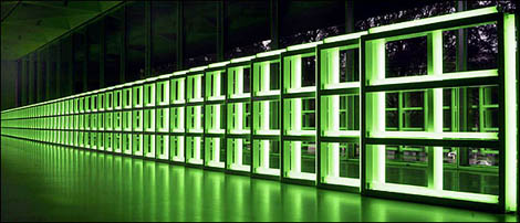
of Untitled (To You, Heiner, With Admiration and Affection) just inside
it. That’s it at the top of this post.
But look at the photograph, which comes from the estate of the artist, and
anybody who’s actually visited the show will notice a couple of things. Firstly,
the photo is taken at dusk, when the interplay with natural light is minimised.
During the height of the day, it becomes obvious that the Flavin has been placed
in the darkest place in the whole atrium, as though the curators didn’t have
faith that it could actually stand up to untrammeled daylight. There’s a big
roof above it, extending both inside and outside the window, so the piece is
permanently in shadow. While it looks great from the outside, it’s less impressive
from the inside, shunted off to the edge of the atrium where it has much less
ability to really dominate the space.
Flavin was a master at dominating light-infused spaces – think of his
twelve-sided tower of pink fluorescent lights rising all the way from the floor
to the very top of the Guggenheim spiral in New York. Obviously, he couldn’t
install something similarly site-specific here: he’s been dead since 1996. But
Dia has shown how even his early works can be spectacular in a large space,
and the rather bland and empty atrium of the National Gallery was crying out
for something much more in-your-face. In the exhibition proper, for instance,
is an enormous installation of red, white and blue lamps which is somewhat uncomfortably
installed in an irregularly-shaped space with a spotlight weirdly shining down
from the ceiling. Could that, perhaps, have been moved to the museum lobby?
The other thing worth noticing about the photograph above is the lamps’ reflection
in the polished museum floor. If you leaf through the catalogue, you’ll find
that’s true of every single piece: a glowing tube, with light reflecting off
the wall, the ceiling, if visible, and always the floor. It’s part of the work:
it’s not only all around you, in the way that an Irwin might be, or a Serra;
it’s also below you, in the manner of an Andre – sometimes you
feel as though you’re floating in light, and frequently over the course of walking
through the exhibition I was reminded of the gallery installations of James
Turrell.
But the lobby installation is the odd work out in the National Gallery’s show:
every other work is exhibited on a dark grey carpet. It’s hard to think of a
floor surface more ill suited to Dan Flavin, and in fact the show is at its
theatrical best when you climb the spiral staircase to the second floor and
find yourself entering, head-first, the pure bright light field emitted by Untitled
(to Henri Matisse) – four lamps, of pink, yellow, blue and green,
which together combine to produce a gloriously rich white.
What’s great about this show is the ability to see a lot of Flavin’s work in
one place, over his entire career. The installation in Beacon is beautiful,
but limited; here, you can get a much better idea of what a first-rate colourist
Flavin was. The range of things he could achieve with stock lamps is astonishing:
by facing some towards the viewer and some back towards the wall, he could fill
different parts of the room, especially if the piece was in a corner, with an
astonishing array of colours and textures.
And at the end of the exhibition is a room of Flavin’s works on paper, which
I had never seen before, many of which are very beautiful indeed. It’s ironic,
though: the studies for light works are gorgeous, while the pieces which are
meant to be more self-contained are of little more than art-historical interest.
Still, the room of drawings is a very weak way to end an exhibition with such
hard-hitting pieces. Most people, I wager, will go back to the corridor works,
or some of the other large-scale virtuoso installations, for their final impression
of Flavin. I retraced my steps, doing the whole show backwards, and noticed
that the few works marked "exhibition copy" seemed brighter and cleaner
– and not necessarily in a good way – than the other pieces in the
show. Even after skimming through the exhibition catalogue, I’m none the wiser:
is this because flourescent lamps have changed since Flavin started using them,
or is it because older lamps fade over time? In other words, which is closer
to the art as Flavin created it: the old work or the new? Can anybody help me
out on this?
the changing light at D.C.
This is interesting: according to Felix Salmon, some of the works in the Dan Flavin retrospective are marked “exhibition copy” and have a different quality of light than those not so labelled. The NGA must discuss what the designation signifies
Much work went in to creating spaces for the Flavin lamps, but they stopped short at the ceilings, which still had the tracks for the museum’s usual track lighting. Ordinarily not a big deal, but the Flavin sculptures make you absorb and notice the entire space of the room and the tracks just looked trashy.
http://www.chinashoeswholesaler.com wholesale nike shoes,wholesale jordan shoes,nike shox,air jordan boot,puma shoes
http://www.chinashoeswholesaler.com wholesale jordan shoes
http://www.chinashoeswholesaler.com wholesale nike shoes,wholesale jordan shoes,nike shox,air jordan boot,puma shoes
http://www.chinashoeswholesaler.com wholesale nike shoes,wholesale jordan shoes,nike shox,air jordan boot,puma shoes
http://www.chinashoeswholesaler.com wholesale nike shoes,wholesale jordan shoes,nike shox,air jordan boot,puma shoes
Nike, originally known as Blue Ribbon Sports (BRS), was founded by University of Oregon track athlete Philip Knight and his coach Bill Bowerman in January 1964.’,’-
Check you later
http://www.healthmedicinedigest.comxxxxxxx-PLEASE-REMOVE-THE-X'S-AFTER-OUR-WEBSITE-LINK-AND-ALSO-THIS-MESSAGE-BY-CLICKING-QUICK-EDIT-IF-YOU-FIND-THIS-BLOG-COMMENT-USEFUL-THANK-YOU-